 Previous Topic
How Data Is Represented in a Chart
This topic introduces how Report represents data in charts.
A single chart (except the Stock type) can generally display one, two, or three-dimensional data, each dimension corresponding to an axis of the chart. A chart displaying three-dimensional data includes the three axes: category axis, series axis, and value axis. The data field in the series axis always holds a higher group level (outer group) than that in the category axis. A chart does not contain the series axis if it only shows two-dimensional data. The data field displayed on the value axis must be of numerical type. When the chart uses a 3-D subtype, or any subtype of Pie, Radar, Gauge, or Surface, its value axis can only show one data field; otherwise, the value axis can show more than one data field.
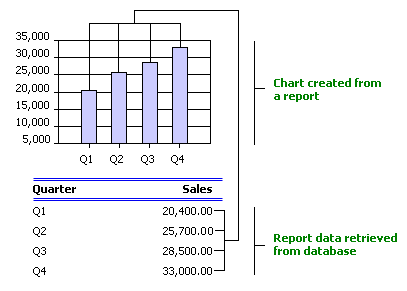
A chart may be based on only detail records of a dataset, meaning it does not calculate any summary information. This type of chart can display either two or three-dimensional data. The following example shows a chart containing two-dimensional data. However, if a chart takes a very long time to run and shows many duplicate categories, you need to rebuild the chart using summaries.
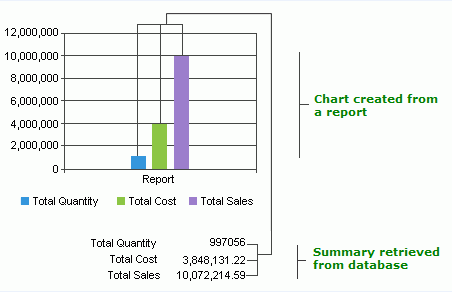
A chart may be based on only summaries, that is, it does not calculate any detail information. This type of chart can display one-dimensional data only, and is often used when you want to compare multiple summary fields in the value axis.
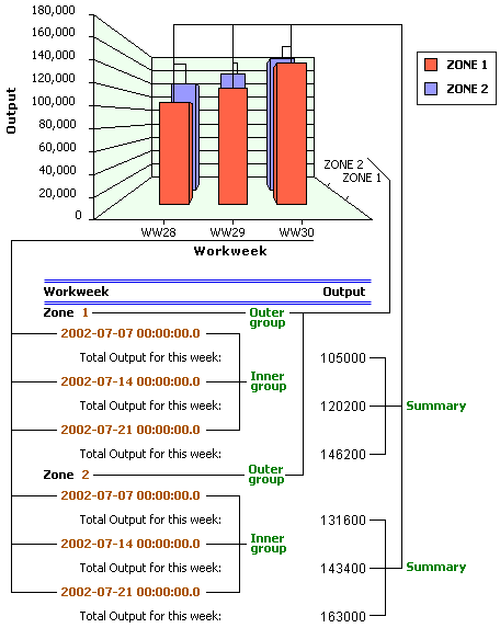
You can also create a chart containing both detail and summary information. This is the most common form of chart. This type of chart can also display either two or three-dimensional data. The following is an example showing a three-dimensional-bar chart. However, three-dimensional charts are often difficult to read, so if you can, you should use a clustered bar chart rather than a three-dimensional bar chart.
If you would like the value axis to display more than one data field, the data fields must be of a same level, that is, all these fields are DBFields or formulas of the dataset (for two-dimensional-data chart), or they are summaries of the same group level (for three-dimensional-data chart).
With respect to a Stock chart, it is designed particularly for representing stock trends. You can think of it as a two-dimensional-data chart which must show more than one data field in its value axis. The subtype of the Stock chart determines the number of data fields.
A combo chart is different from a single chart in that it has two value axes, the primary value axis and the secondary value axis, and each value axis can represent one or more subtypes. You can add one or more data fields to any subtype of the two axes and all data fields in the two value axes must be of a same level. Note that, some subtypes are not applicable for combo charts. The most common combo chart is a bar chart on the primary axis and a line chart on the secondary axis.
 Back to top