Previous Topic
Inserting Charts in a Report
You can create any charts in a report easily using the chart wizard. However, the procedure you use with the wizard varies with the data resource type: business view or query resource. This topic introduces how you can create a chart using the chart wizard when you have different data resources. It also shows you how to define the data to display in some specific chart types.
This topic contains the following sections:
- Creating a Chart Based on a Business View
- Creating a Chart Based on a Query Resource
- Defining Data for an Organization Chart
- Defining Data for a Heat Map
- Defining Values to Compare on a Back-to-Back Chart
 A page report can apply either query resources or business views, which is determined by the Create Using Business View option at the time when you create the page report. Once defined, all data components in the page report can only use the specified data resource type. You can use the 3-D chart types in query-based page reports only.
Creating a Chart Based on a Business View
- Position the mouse pointer at the allowed report location where you want to insert the chart.
- Do either of the following:
- From the Components panel, drag a chart type icon in the Visual category to the destination.
- Navigate to Insert > Chart or Home > Insert > Chart.
Designer displays the Create Chart dialog box. You can use the Back and Next buttons or select the screen name on the screen navigation bar to switch between the screens.
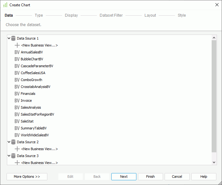
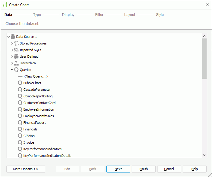
- In the Data screen, specify the dataset you want to use to create the
chart.
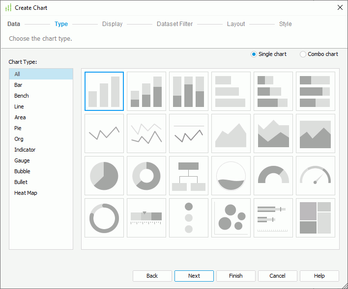
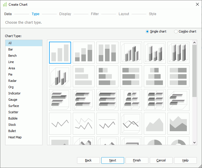
- In the Type screen, specify the type of the chart. Designer automatically filters out the chart types you cannot use in the current report and lists only the available types.
- To create a single chart, select Single chart, and then select the required type from the Chart Type box and its subtype accordingly.
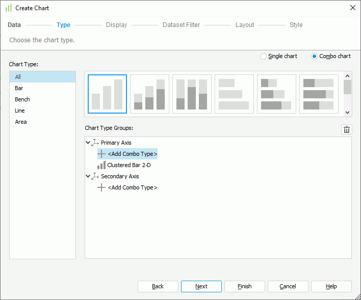
- To create a combo chart, select Combo chart. Designer then displays the Chart Type Groups box listing the two value axes, the primary axis (Y1) and the secondary axis (Y2), with a default chart subtype on the primary axis. To add an additional subtype to an axis, select <Add Combo Type> under the axis node. To change any subtype, select it, then choose a chart type from the Chart Type box and select the thumbnail for the subtype you want; to delete a subtype, select it and select Remove
 . Most often, combo charts use a bar chart on the primary axis and a line chart on the secondary axis to make a readable chart.
- To create a single chart, select Single chart, and then select the required type from the Chart Type box and its subtype accordingly.
- In the Display screen, define the data to display in the chart. You can specify a title for the chart in the Title text box.
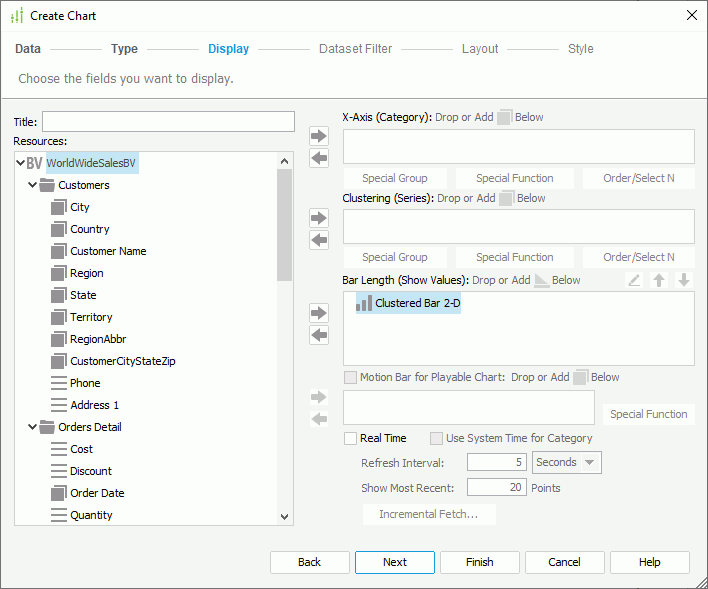
The Resources box lists all view elements in the business view from which the dataset the chart applies is created, and the dynamic formulas and aggregations that you have created for the business view in the current report. Add them to the category, series, and value axes of the chart respectively. You can also create more dynamic resources to use in the chart.
You can use these general instructions to formulate a chart. However, if you have selected the Org or Heat Map chart type, you need to specify data in the chart differently. See Defining Data for an Organization Chart and Defining Data for a Heat Map.
- To add the category field of the chart, select a group object
 , detail object
  , dynamic formula used as Group
  , or dynamic formula used as Detail
  in the Resources box and select Add
  beside the Category box, or drag the object from the Resources box to the Category box. You can define special group, special function, and Order/Select N condition on the category field.
 - To add the series field of the chart, select a group object or dynamic formula used as Group in the Resources box and select Add beside the Series box, or drag the object from the Resources box to the Series box. You can also define special group, special function, and Order/Select N condition on the series field.
- To add a field to the value axis of the chart, select an aggregation object
 , a group object /detail object that is Numeric data type (an indicator chart also supports String or Boolean type), dynamic aggregation , dynamic formula used as Aggregation , dynamic formula used as Group /Detail that returns Numeric values (for an indicator chart, String or Boolean value too), or an additional value in the Resources box and select Add beside the Show Values box, or drag the object from the Resources box to the Show Values box. You can add multiple fields on the value axis and use Move Up
  and Move Down
  to adjust the display order of the fields on the axis. If you are creating a combo chart, specify the fields on the value axis of each subtype respectively.
To add an additional value to the value axis
- From the Resources box, select Constant Value/Average Value in the Additional Value node and select Add beside the Show Values box. Designer displays the Edit Additional Value dialog box.
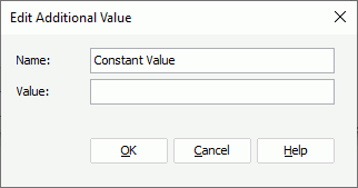
- In the Name text box, specify the display name for the constant/average value.
- Type the constant value with Numeric type in the Value text box, or select a field based on which to calculate the average value from the Based On drop-down list.
- Select OK. Designer adds the defined constant/average value into the Show Values box. If you want to further modify a constant/average value, select it in the Show Values box, then select Edit
 .
.
- From the Resources box, select Constant Value/Average Value in the Additional Value node and select Add
- For a bubble chart, the Show Values box contains three nodes: X-Axis, Y-Axis, and Size. You need to specify the fields to display on the bubble X axis and Y axis, and the field to determine the size of the bubbles respectively. When you add a field for the bubble X axis, the chart displays this field on the category axis instead of the one specified in the Category box, while it still includes the field defined in the Category box in data calculation. See Creating Motion Charts for a bubble chart example.
- You can also make the chart a real time chart or a motion chart.
When you use a detail object as the category field, you cannot use aggregation objects on the value axis, and vice versa. On the value axis, you cannot use group objects and detail objects together with aggregation objects, and for an indicator chart, you cannot mix group objects and detail objects that are of different data types either. - To add the category field of the chart, select a group object
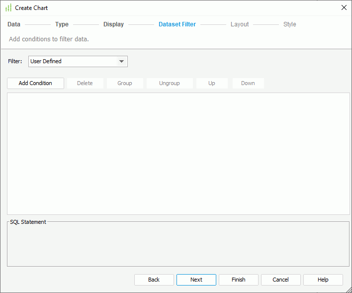
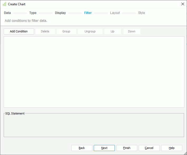
- In the Dataset Filter screen, filter the dataset the chart applies. If you have added filter conditions to the dataset somewhere else, Designer displays the conditions in the screen. You can further edit the conditions. Be aware that a filter on a dataset applies to all data components in the same report that use this dataset.
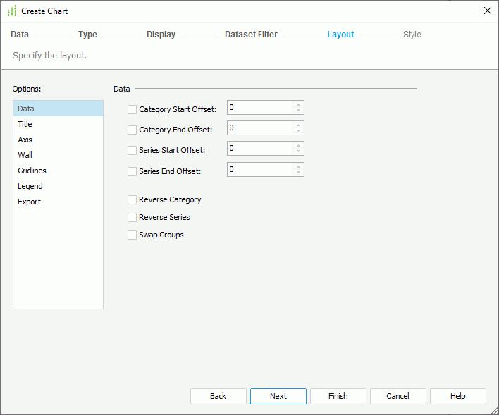
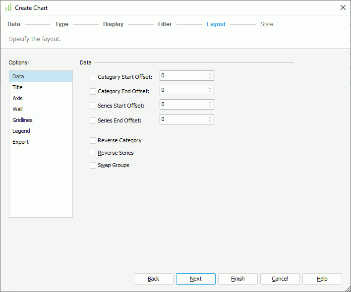
- In the Layout screen, specify the layout of the chart.
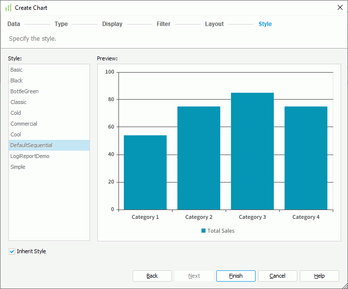
- In the Style screen, select a style for the chart. If you have specified to insert the chart into a banded object, by default, the chart inherits its parent's style; to apply another style to the chart, clear Inherit Style and select the required style from the Style box.

- Select Finish to insert the chart.
- If you have selected a panel in a banded object as the destination, after finishing the Create Chart dialog box, you need to select in the destination once again to insert the chart there.
The following table describes the layout options in general. Some options are not available for certain chart types.
| Option Type | Option Name | Description |
|---|---|---|
| Data | Category Start Offset | Specifies the start offset of the category value in the chart. |
| Category End Offset | Specifies the end offset of the category value in the chart. | |
| Series Start Offset | Specifies the start offset of the series value in the chart | |
| Series End Offset | Specifies the end offset of the series value in the chart. | |
| Reverse Category | Specifies whether to reverse the sequence of the category values. | |
| Reverse Series | Specifies whether to reverse the sequence of the series values. | |
| Swap Groups | Specifies whether to swap groups of the chart. When you select this option:
|
|
| Title | Chart Title | Specifies the title of the chart. |
| Category (X) Axis Title | Specifies the title of the category axis (the X axis). | |
| Value (Y) Axis Title | Specifies the title of the value axis (the Y axis). | |
| Value (Y2) Axis Title | Specifies the title of the secondary value axis (the Y2 axis) for the combo chart. | |
| Axis | Show Category (X) Axis | Specifies whether to display the category axis in the chart. |
| Show Value (Y) Axis | Specifies whether to display the value axis in the chart. | |
| Show Value (Y2) Axis | Specifies whether to display the secondary value axis for the combo chart. | |
| Show Series (Z) Axis | Specifies whether to display the series axis (the Z axis) in the chart. | |
| Wall | Show Wall | Specifies whether to display the chart wall. |
| Show Floor | Specifies whether to display the chart floor. | |
| Gridlines | Show Category (X) Axis Gridlines | Specifies whether to display gridlines of the category axis. |
| Show Value (Y) Axis Gridlines | Specifies whether to display gridlines of the value axis. | |
| Show Value (Y2) Axis Gridlines | Specifies whether to display gridlines of the secondary value axis for the combo chart. | |
| Show Series (Z) Axis Gridlines | Specifies whether to display gridlines of the series axis. | |
| Type | Top Down | Specifies to expand the org chart tree from top to bottom. |
| Bottom Up | Specifies to expand the org chart tree from bottom to top. | |
| Left Right | Specifies to expand the org chart tree from left to right. | |
| Legend | Show Legend | Specifies whether to display the chart legend. |
| Export | Mapping Component | Specifies the component to which you want to map the chart. For more information, see Creating Dynamic Charts in Excel.
|
 Back to top
Creating a Chart Based on a Query Resource
- Position the mouse pointer at the allowed report location where you want to insert the chart.
- Do either of the following:
- From the Components panel, drag a chart type icon in the Visual category to the destination.
- Navigate to Insert > Chart or Home > Insert > Chart.
Designer displays the Create Chart dialog box. You can use the Back and Next buttons or select the screen name on the screen navigation bar to switch between the screens.
- In the Data screen, specify the dataset you want to use to create the
chart.
- In the Type screen, specify the type of the chart. You can create either a single chart or a combo chart.
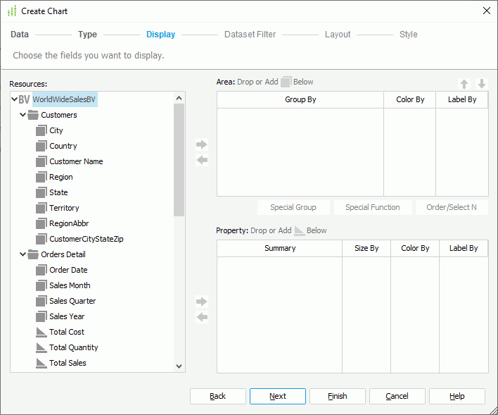
- In the Display screen, specify the fields on the category, series, and value axes of the chart respectively.
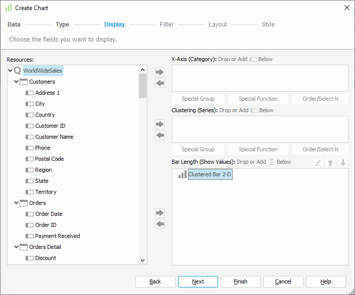
The Resources box lists all DBFields in the query resource from which the dataset the chart applies is created, and the valid formulas and summaries of these DBFields in the current catalog. When the predefined formulas or summaries cannot meet your requirements, you can select <New Formula...> in the Formulas node to create formulas, or <New Summary...> in the Summaries node to create summaries to use in the chart (when you have specified to insert the chart in a banded object and the chart inherits the parent's dataset, make sure the summaries apply the Down group-by level if you want to use dynamic summaries). Add them to the chart axes to define the chart.
You can use these general instructions to formulate a chart. However, if you have selected the Org or Heat Map chart type, you need to specify data in the chart differently. See Defining Data for an Organization Chart and Defining Data for a Heat Map.
- To add a field to the category/series axis of the chart, select a DBField or formula in the Resources box and select Add beside the Category/Series box, or drag the field from the Resources box to the target box. You can define special group, special function, and Order/Select N condition on the category/series field.
- To add a field to the value axis of the chart, select a summary, DBField of Numeric type (an indicator chart also supports String or Boolean type), formula that returns Numeric values (for an indicator chart, String or Boolean values too), or an additional value in the Resources box and select Add beside the Show Values box, or drag the field from the Resources box to the Show Values box. You can add multiple fields on the value axis and use Move Up and Move Down to adjust the display order of the fields on the axis. If you are creating a combo chart, you need to specify the fields on the value axis of each subtype respectively.
- For a bubble chart, the Show Values box contains three nodes: X Axis, Y Axis, and Radius. You need to specify the fields to display on the bubble X axis and Y axis, and the field to determine the size of the bubbles respectively. When you add a field for the bubble X axis, the chart displays this field on the category axis instead of the one specified in the Category box, while it still includes the field defined in the Category box in data calculation. See Creating Motion Charts for a bubble chart example.
- For a back-to-back chart, you need to specify how the comparison on the value axis of the chart is. See Defining Values to Compare on a Back-to-Back Chart.
- Whether you can use DBFields, formulas, and summaries together on the value axis depends on if they have the same group setting. If you add a DBField on the value axis, no summaries and group level formulas are allowed on the value axis; if you add a summary, only formulas calculated on the same group level as the summary are allowed, and vice versa. For an indicator chart, you cannot mix DBFields and formulas that are of different data types on the value axis.
- If you have defined a subtype of the Stock type, you should add fields for the subtype in the order indicated by the subtype name. For example, when defining the Open-High-Low-Close 2-D subtype, you should add four fields to the Show Values box for this subtype, and arrange them to the order of Open-High-Low-Close.
- To add a field to the category/series axis of the chart, select a DBField or formula in the Resources box and select Add
- In the Filter screen, filter the chart by adding conditions based on the fields it contains. Select here for how to define a filter.
- In the Layout screen, specify the layout of the chart.
- In the Style screen, select a style for the chart. If you have specified to insert the chart into a banded object, by default, the chart inherits its parent's style; to apply another style to the chart, clear Inherit Style and select the required style from the Style box.
- Select Finish to insert the chart.
- If you have selected a panel in a banded object as the destination, after finishing the Create Chart dialog box, you need to select in the destination once again to insert the chart there.
Defining Data for an Organization Chart
An organization (org) chart is a tree-structure diagram showing hierarchical relationships of one people to another, one position to another, one department to another, and so on in an organization. You can define the hierarchical relationships by the node field and parent field. Report displays the node field values as nodes in the org chart, and connects two nodes that have hierarchical relationship by a line. All the relationships finally go to one root node which presents the top level position. The closer a node is to the top root node, the higher its level is.
Org chart nodes are also containers in which you can insert data objects, labels, and images. In this way, you can add the information you want to display in the nodes to get data about each node.
To define the data to display in an org chart, in the Display screen of the Create Chart dialog box:
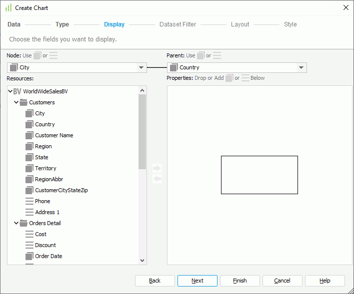
- From the Node drop-down list, select the field to use as the node field.
- From the Parent drop-down list, select the field which defines the ownership or reporting to relationship among the node field values. The parent field should be of the same data type as the node field, and the values of the parent field should be a subset of those of the node field.
In the following example, the node field contains three employee names: Tony, Amanda, and Jack, and the parent field is also about employee names and contains Amanda who is the leader of Tony and Jack the leader of Amanda. Jack is the top root node of the org chart.
Employee Name (node field) Leader Name (parent field) Tony Amanda Amanda Jack Jack - The Properties box displays a node model for specifying the information you want to display in each node in the org chart. You can add data fields available in the Resources box and labels and images to display in the nodes.
- To add an object, select it in the Resources box, then select Add or drag it to the node model.
- Resize the node model and adjust the position and size of the added objects in the node model. You can also perform these operations in the design area after you create the chart.
- To remove an unwanted object from the node model, select it and select Remove
 or select Delete on the keyboard.
- To add an object, select it in the Resources box, then select Add
Defining Data for a Heat Map
A heat map displays data in a matrix as rectangles marked by colors and sizes. Report translates multiple group levels into rectangles representing a higher-level group and further divides them into smaller rectangles that represent the lower-level group. Report refers to the rectangles representing the lowest-level group as the innermost rectangles. You can add group-by fields and summarized data in the innermost rectangles for showing the group values and for calculating data of the groups. Each rectangle has a title which shows the corresponding group value and is by default hidden for better appearance (to show the title of a rectangle, locate its Rectangle Title node in the Report Inspector and set the Invisible property to false).
To define the data to display in a heat map, in the Display screen of the Create Chart dialog box:
- In the Resources box, choose a field as the group-by field and select Add beside the Area box, or drag the field from the Resources box to the Area box to add a group in the heat map. Repeat this to add more groups. You can use Move Up and Move Down to adjust the group levels.
- When the heat map applies a business view-based dataset, you can use the group objects in the business view or the dynamic formulas used as Group created for the business view in the current report as the group-by fields.
- When the heat map applies a query-based dataset, you can use any DBField or formula in the Resources box as the group-by fields.
- When the heat map applies a business view-based dataset, you can use the group objects
- In the Area box, select Color By for the groups that you want to use to determine the fill color of the rectangles, and Label By for the groups you want to display in the innermost rectangles. You can define special group, special function, and Order/Select N condition on each group.
- From the Resources box, add fields to the Property box to calculate data based on the lowest group of the heat map.
- When the heat map applies a business view-based dataset, you can add aggregation objects , dynamic aggregations , and dynamic formulas used as Aggregation to calculate data.
- When the heat map applies a query-based dataset, if you do not add any group to the Area box, you can insert any dynamic summary or static summary, and Designer inserts the group-by field of the static summary into the Area box automatically. When there are multiple groups, the static summaries you want to use should match the lowest-level group. For example, if the group levels are A > B > C, you can insert the static summaries grouped by C, but cannot insert the static summaries grouped by A, B, or other fields.
- When the heat map applies a business view-based dataset, you can add aggregation objects
- In the Property box, select Size By of one field to use it to determine the size of the rectangles (negative values of the size-by field are ignored in the heat map), select Color By of one field to use it to determine the fill color of the rectangles, and select Label By for the fields you want to display in the innermost rectangles. You should select at least one option for a field; otherwise, Designer does not use this field in the heat map.
After you create a heat map, you can further edit it in the design area. Only the first rectangle which represents the lowest group level in the heap map is editable and can contain objects. You can insert the group fields of the heat map from the Data panel, and labels and images from the Components panel into it. For the objects in the rectangle, you can edit or delete them just like they do in a text box. However, the inserted objects do not support absolute position, because the width and height of the rectangle are determined dynamically at runtime.
Defining Values to Compare on a Back-to-Back Bench Chart
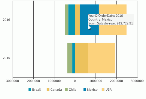
A back-to-back bench chart is for comparing values on the value axis. It displays and compares the contribution of each data value on the origin left and origin right across categories. For example, you may want a chart that compares the sales of each country in Latin America and North America, you can then use a back-to-back chart to display category Year and series Country, and define a condition on the series to make the Latin American countries display on the origin left of the category axis and North American countries on the origin right. Then you get to easily see not only the individual countries but can compare both regions.
When you define how the comparison on the value axis of a back-to-back bench chart is created, you can either add two values on the origin left and origin right of the value axis to compare if it is a 2-D chart, or make the comparison based on the series field values if the chart contains a series field. When the comparison is based on series values, you need to further define the series values to display on the origin left and origin right of the value axis: either manually or use a condition.
To make the comparison based on fields displayed on the value axis of a 2-D back-to-back bench chart
- In the Display screen of the Create Chart dialog box, select Show Values.
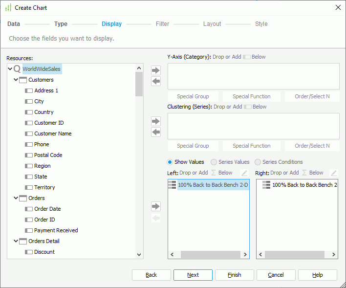
- Specify where you want to display the field on the value axis, the origin left or right by selecting the chart type node in the Left or Right box, then select a DBField of Numeric type, a formula that returns Numeric values, or a summary in the Resources box and select Add or drag the field from the Resources box to the Left or Right box.
- Select the chart type node in the opposite box and add the field to display on the opposite origin of the value axis. Only one field is allowed for one origin.
To compare based on the series field and define the series values manually
- In the Display screen of the Create Chart dialog box, select Series Values.
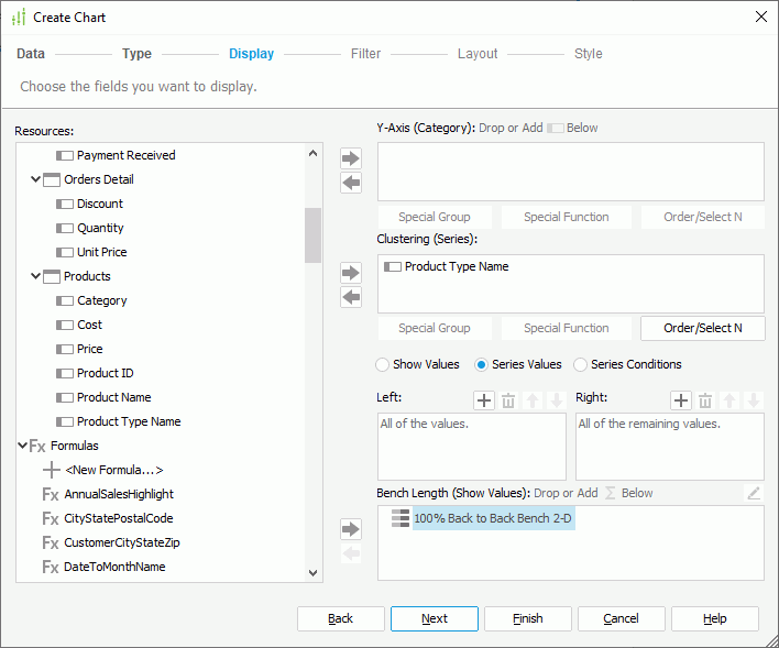
- Select Add
 above the Left or Right box to add a value line, then double-click in the line and type the required value of the series field.
 - Repeat the preceding step to add more values. To delete a value, select it and select Remove . You can also use Move Up and Move Down to adjust the display order of the values.
- In the Show Values box, add a DBField of Numeric data type, a formula that returns Numeric values, or a summary to display on the value axis of the chart.
The chart then shows the specified series values on the origin left/right of the value axis, and displays the undefined values of the series field on the opposite origin.
To compare based on the series field and use a condition to define the series values
- In the Display screen of the Create Chart dialog box, select Series Conditions.
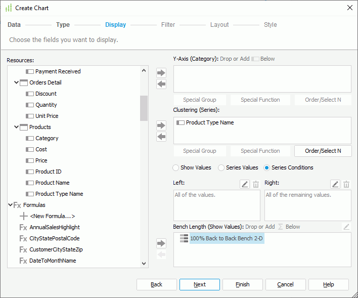
- Select Edit above the Left or Right box. Designer displays the Edit Conditions dialog box.
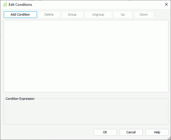
- Select Add Condition to add a condition line.
- Select the series field from the first drop-down list, from the operator drop-down list set the operator with which to compose the condition.
- All values of the series field are available in the third drop-down list. Select the value or values according to the selected operator, or specify the values by yourself. When you type the value, if multiple values are required, you should separate them with ","; if a value contains the character "," or "\", type the character as "\," or "\\".
- Repeat the preceding steps to define more condition lines and specify the logic relationship between the condition lines: "And", "Or", "And Not", or "Or Not".
- To group some condition lines, select them and select Group, Designer then adds the selected condition lines in one group and applies them as one line of filter expression (you can also group conditions and groups together).
- To take out any condition or group from a group, select it and select Ungroup.
- To adjust the priority of the condition lines, select it and select Up or Down.
- To delete a condition line, select it and select Delete.
- Select OK to finish defining the condition. Designer then displays the condition expression in the Left/Right box.
- In the Show Values box, add a DBField of Numeric type, a formula that returns Numeric values, or a summary to display on the value axis of the chart.
The chart then shows the series values that meet the specified condition on the origin left/right of the value axis, and displays the remaining values of the series field on the opposite origin.
Example: Creating a Back-to-Back Bench Chart
Suppose you want to use a chart to compare the sales for individual countries in Latin America and North America, you can create it as follows:
- Make sure SampleReports.cat is the currently open catalog file. If not, navigate to File > Open Catalog to open it from
<install_root>\Demo\Reports\SampleReports. - Navigate to File > New > Page Report.
- In the Select Component for Page Report dialog box, select Chart and select OK. Designer displays the Chart Wizard dialog box.
- In the Data screen, select More Options to expand the dataset selection panel.
- Select Existing Dataset, and select <New Dataset...>.
- In the New Dataset dialog box, select WorldWideSales from the Queries node, then select OK to create the dataset and close the dialog box. Designer adds a new dataset WorldWideSales to the dataset list and selects it by default in the Data screen of the Chart Wizard dialog box.
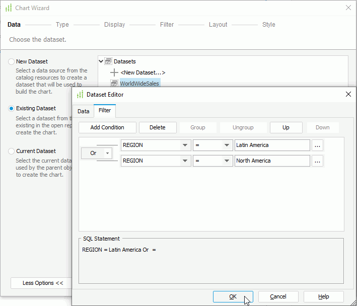
Next, we filter the dataset to use data in the Latin America and North America regions only. By using dataset filter, we can ensure that the filter does not affect other reports applying the same data resource as the dataset.
- Select Edit. In the Dataset Editor dialog box, select the Filter tab, then specify the filter condition as "Region = Latin America Or Region = North America" and select OK.
- Select Next in the Chart Wizard dialog box.
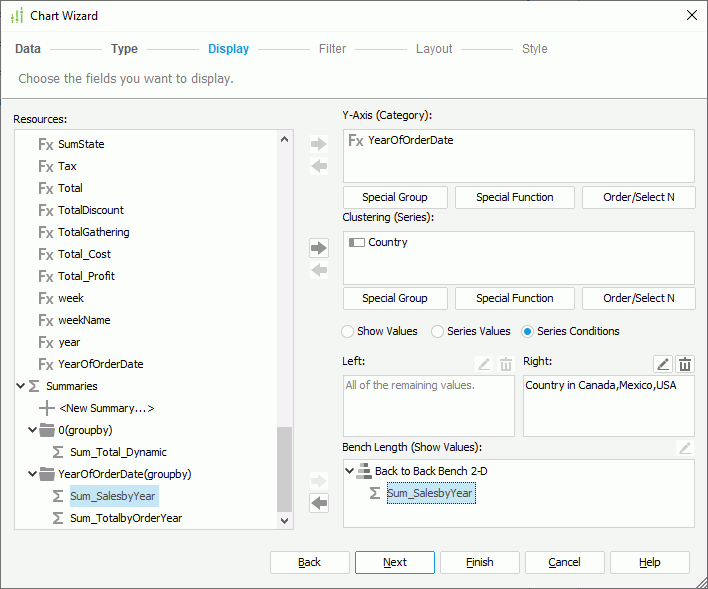
- In the Type screen, select the Bench chart type, then select the Back to Back Bench 2-D subtype. Select Next.
- In the Display screen, add Country in the Customers table to the Clustering (Series) box.
- Select Series Conditions and select Edit above the Right box.
- In the Edit Condition dialog box, specify the filter condition as "Country in Canada,Mexico,USA". Select OK to return to the Chart Wizard dialog box.
- Add the summary Sum_SalesbyYear at the end of the resource tree to the Bench Length (Show Values) box. The summary is grouped by the formula YearOfOrderDate, so Designer adds the formula to the Y-Axis (Category) box automatically.
- Select Finish to create the chart.
- Save the report and select the View tab to preview the chart. You can see sales for countries in Latin America display on the origin left of the value axis and sales of North American countries on the origin right.