 Previous Topic
Formatting Chart Axis Gridlines
This topic describes how you can customize gridlines for the axes of a chart (pie, indicator, heat map, and organization charts do not have gridlines).
- Right-click any chart element and select an option from the Format Gridlines submenu, or double-click any gridline of the target axis. Designer displays one of the following dialog boxes according to your selection:
- Format Category (X) Gridline dialog box
- Format Value (Y) Gridline dialog box
- Format Value (Y2) Gridline dialog box
- Format Series (Z) Gridline dialog box
The following shows a sample dialog box.
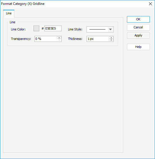
- In the Line Color text box, specify the color of the gridlines. To edit the color, select the color indicator and select a color from the color palette, or type the hexadecimal RGB value of a color (for example, 0xff0000) in the text box.
- From the Line Style drop-down list, select the line style to apply to the gridlines.
- In the Transparency text box, specify the transparency of the gridlines.
- In the Thickness text box, specify the thickness of the gridlines, in pixels.
- Select OK to accept the changes and close the dialog box.
 To display the gridlines for an axis, you need to select the Show Gridlines option in the format dialog box of the axis.
 Back to top