Previous Topic
Using Basic Web Controls in a Report
This topic introduces how you can insert and define values of basic web controls in a report. It also presents an example to demonstrate how you can use basic web controls in a page report to achieve specific goals.
 You cannot use basic web controls in business view-based page reports, nor insert them in banded panels in web reports.
This topic contains the following sections:
Inserting Basic Web Controls in a Report
The following are some tips for you when using basic web controls.
- When defining a basic web control in a query-based page report, you can find the button
 next to some options such as Name and Tool Tip in the Display Type dialog box. When this button is available, you can select it and select a formula or DBField from the given drop-down list to control an option. If you select a DBField as the value of an option, Designer applies the first record of the field in the database.
 - You can also change the display type of a basic web control. You can convert basic web controls other than list and drop-down list to each other and display them as a general type, and you may notice that these web controls have a common Class Type property value "Label" in the Report Inspector, which signifies that these web controls are labels in nature.
Inserting a Text Field/Password
- Position the mouse pointer at the allowed report location where you want to insert the text field/password.
- Do either of the following:
- From the Components panel, drag the Text Field icon
 or Password icon
  in the Web Controls category to the destination.
 - Navigate to Home/Insert > Web Controls > Text Field/Password. If the specified destination is not the report body or the page header/footer panel, move the mouse pointer to the position and select again.
- From the Components panel, drag the Text Field icon
- Right-click the text field/password and select Display Type from the shortcut menu. Designer displays the Display Type dialog box, showing the web options for the Text Field type.
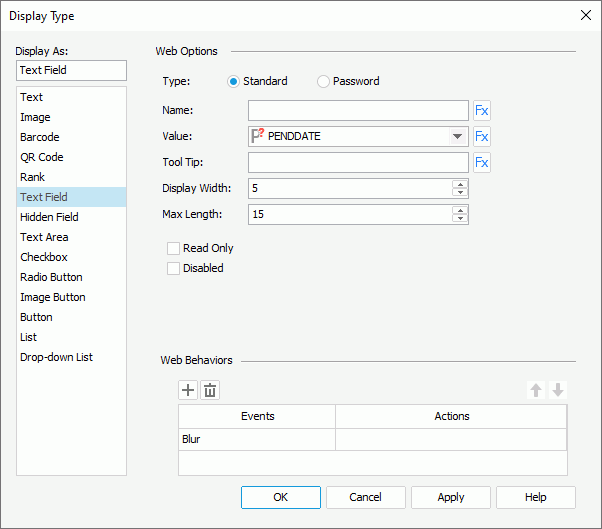
- In the Web Options panel, specify options of the text field/password.
- In the Name text box, specify the name of the text field/password.
- From the Value drop-down list, select <Input...> and type the value of the text field/password.
- In the Tool Tip text box, type the tool tip you want to show for the text field/password. The tool tip displays when users hover the mouse over the text field/password at runtime or in HTML output.
- Set the number of characters in the Display Width text box, and the maximum number of characters the user can specify in the Max Length text box.
- Select Read Only if you would like to set this text field/password to be read-only.
- Select Disabled if you want to disable the text field/password at runtime.
- In the Web Behaviors panel, specify web behaviors of the text field/password.
- Select OK to insert the text field/password.
Inserting a Text Area
- Position the mouse pointer at the allowed report location where you want to insert the text area.
- Do either of the following:
- From the Components panel, drag the Text Area icon
 in the Web Controls category to the destination.
 - Navigate to Home/Insert > Web Controls > Text Area. If the specified destination is not the report body or the page header/footer panel, move the mouse pointer to the position and select again.
- From the Components panel, drag the Text Area icon
- Right-click the text area and select Display Type from the shortcut menu. Designer displays the Display Type dialog box, showing the web options for the Text Area type.
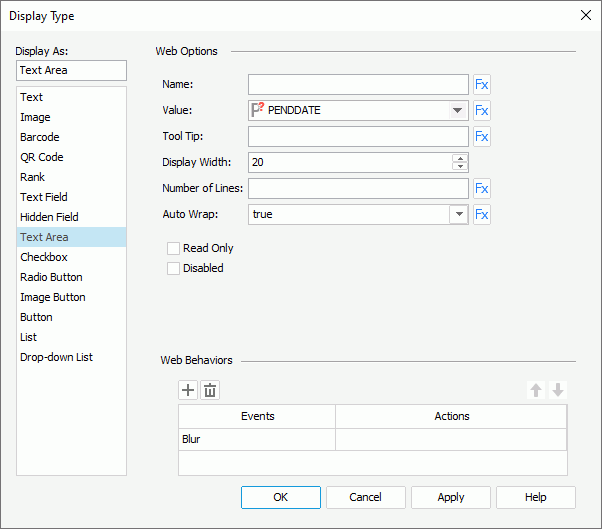
- In the Name text box, specify the name of the text area.
- From the Value drop-down list, select <Input...> and type the value of the text area.
- In the Tool Tip text box, type the tool tip you want to show for the text area. The tool tip displays when users hover the mouse over the text area at runtime or in HTML output.
- In the Display Width text box, specify the maximum number of characters allowed in the text area.
- In the Number of Lines text box, type the number of lines that is allowed in the text area.
- Set Auto Wrap to true if you want to automatically wrap the text in the text area.
- Select Read Only if you would like to set this text area to be read-only.
- Select Disabled if you want to disable the text area at runtime.
- In the Web Behaviors panel, specify web behaviors of the text area.
- Select OK to insert the text area.
Inserting a Checkbox/Radio Button
- Position the mouse pointer at the allowed report location where you want to insert the checkbox/radio button.
- Do either of the following:
- From the Components panel, drag the Checkbox icon
 or Radio Button icon
  in the Web Controls category to the destination.
 - Navigate to Home/Insert > Web Controls > Checkbox/Radio Button. If the specified destination is not the report body or the page header/footer panel, move the mouse pointer to the position and select again.
- From the Components panel, drag the Checkbox icon
- Right-click the checkbox/radio button and select Display Type from the shortcut menu. Designer displays the Display Type dialog box, showing the web options for the Checkbox/Radio Button type.
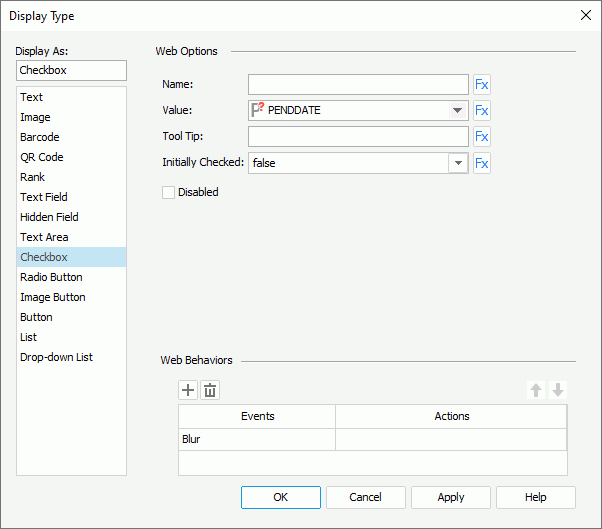
- In the Name text box, specify the name of the checkbox/radio button.
- From the Value drop-down list, select <Input...> and type the value of the checkbox/radio button.
- In the Tool Tip text box, type the tool tip you want to show for the checkbox/radio button. The tool tip displays when users hover the mouse over the checkbox/radio button at runtime or in HTML output.
- Set Initially Checked to true if you want to select the checkbox/radio button by default at runtime.
- Select Disabled if you want to disable the checkbox/radio button at runtime.
- In the Web Behaviors panel, specify web behaviors of the checkbox/radio button.
- Select OK to insert the checkbox/radio button.
Inserting an Image Button
- Position the mouse pointer at the allowed report location where you want to insert the image button.
- Do either of the following:
- From the Components panel, drag the Image Button icon
 in the Web Controls category to the destination.
 - Select Web Controls > Image Button in the Home or Insert ribbon. If the specified destination is not the report body or the page header/footer panel, move the mouse pointer to the position and select again.
- From the Components panel, drag the Image Button icon
- In the Select an image dialog box, select the image to use for the image button.
- Right-click the image button and select Display Type from the shortcut menu. Designer displays the Display Type dialog box, showing the web options for the Image Button type.
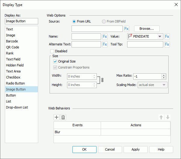
- You can select Browse to change the image source.
When you create an image button by editing the display type of a DBField, formula, or summary to Image Button, you can also select From DBField to use the value of the DBField/formula/summary as the image source. If you choose this option, Designer enables the Decode Type drop-down list, from which you can specify the type for decoding the image.
- Type the name of the image button in the Name text box.
- From the Value drop-down list, select <Input...> and type the value of the image button.
- Type a string in the Alternate Text text box to serve as the content when the image cannot display.
- In the Tool Tip text box, type the tool tip you want to show for the image button. The tool tip displays when users hover the mouse over the image button at runtime or in HTML output.
- Select Disabled if you want to disable the image button at runtime.
- In the Max Ratio text box, specify the maximum scaling ratio of the image. By default, the scaling ratio of the image is not limited. If you set the ratio to any value greater than 0, the actual scaling ratio is less than or equal to it.
- By default, Designer displays the image in its original size. Clear Original Size if you want to use customized image size, then specify the following:
- Set the width and height of the area for displaying the image in the Width and Height text boxes.
- Select Constrain Proportion to constrain the aspect ratio when setting the width and height.
- Specify the scaling mode of the image from the Scaling Mode drop-down list.
The following are the available scaling modes. The specified scaling mode controls the image behavior when you adjust the size of the area for displaying the image.
- actual size
Select to show the image in its actual size. If the size of the area for displaying the image is smaller than that of the image, part of the image will be cut off. - fit image
Select to adjust the image to fill up the area for displaying the image, with its original perspective remained but under the limitation of Max Ratio. - fit width
Select to adjust the image to fit the width of the area for displaying the image but under the limitation of Max Ratio. - fit height
Select to adjust the image to fit the height of the area for displaying the image but under the limitation of Max Ratio. - customize
Select to adjust the image according to the width and height that you specify in the Width and Height text boxes, regardless of Max Ratio.
- actual size
- In the Web Behaviors panel, specify web behaviors of the image button.
- Select OK to insert the image button.
Inserting a Button
- Position the mouse pointer at the allowed report location where you want to insert the button.
- Do either of the following:
- From the Components panel, drag the Button icon
 in the Web Controls category to the destination.
 - Select Web Controls > Button in the Home or Insert ribbon. If the specified destination is not the report body or the page header/footer panel, move the mouse pointer to the position and select again.
- From the Components panel, drag the Button icon
- Right-click the button and select Display Type from the shortcut menu. Designer displays the Display Type dialog box, showing the web options for the Button type.
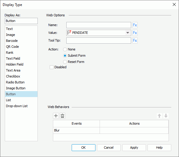
- In the Name text box, specify the name of the button.
- From the Value drop-down list, select <Input...> and type the value of the button.
- In the Tool Tip text box, type the tool tip you want to show for the button. The tool tip displays when users hover the mouse over the button at runtime or in HTML output.
- Select the action of the button: None, Submit Form, or Reset Form.
- Select Disabled if you want to disable the button at runtime.
- In the Web Behaviors panel, specify web behaviors of the button.
- Select OK to insert the button.
Inserting a List/Drop-down List
- Position the mouse pointer at the allowed report location where you want to insert the list/drop-down list.
- Do either of the following:
- From the Components panel, drag the List
 or Drop-down List
  icon in the Web Controls category to the destination.
 - Navigate to Home/Insert > Web Controls > List/Drop-down List. If the specified destination is not the report body or the page header/footer panel, move the mouse pointer to the position and select again.
- From the Components panel, drag the List
- Right-click the list/drop-down list and select Display Type from the shortcut menu. Designer displays the Display Type dialog box, showing the web options for the List/Drop-down List type.
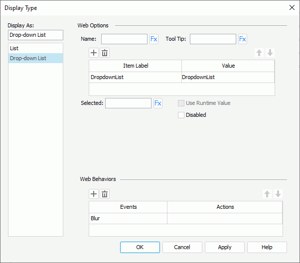
- In the Name text box, specify the name of the list/drop-down list.
- In the Tool Tip text box, type the tool tip you want to show for the list/drop-down list. The tool tip displays when users hover the mouse over the list/drop-down list at runtime or in HTML output.
- Specify the item labels and the value of each item in the item box by inputting some strings as the labels and values respectively. If you want to use a DBField, formula field, or parameter field to control the value, select the ellipsis
 in the Value cell to insert one using the Insert Fields dialog box, and then select the format for the inserted field from the drop-down list in the Item Label cell. Select All in the Insert Field dialog box if you want to add an "All" value to the list/drop-down list. Then, when users select "All" as value of the list/drop-down list at runtime, all filter actions defined on the list/drop-down list will not take effect, and if you apply some other web action that needs value from the list/drop-down list, Report Engine returns a "Null" value.
 - In the Selected text box, specify the selected value for the list/drop-down list.
- Designer enables the Use Runtime Value option, when you create a list/drop-down list by editing the display type of a parameter to List/Drop-down List. You can select it to use the runtime value as the selected value of the list/drop-down list.
- Select Disabled if you want to disable the list/drop-down list at runtime.
- For a list web control, you can also specify the following:
- Select Allow Multiple Selections if you want to allow multiple items to be selected in the list.
- If you insert the list in a web report or library component, you can further specify to display the list as Text, Button, Checkbox, or Radio Button, use the vertical or horizontal layout to display items in the list, and specify the width/height of each item and the vertical/horizontal gap between two adjacent items in the list.
- In the Web Behaviors panel, specify web behaviors of the list/drop-down list.
- Select OK to insert the list/drop-down list.
If you specify a tool tip for a basic web control, on Firefox, the tool tip displays in one line with the maximal tip width the browser allows. Firefox cuts the text that cannot display within the width and replaces it with an ellipsis (...).
 Back to top
Example: Using Web Controls in a Page Report
In the following example, we create a page report to guide you through the process of using web controls and applying web actions step by step. The example contains the following tasks:
- Task 1: Create the sample report
- Task 2: Apply a web action without parameters
- Task 3: Apply web actions with parameters
- Task 4: Apply a web action using the Action Builder
- Task 5: Preview the report in Page Report Studio and apply the web actions
Task 1: Create the sample report
- Make sure SampleReports.cat is the currently open catalog file. If not, navigate to File > Open Catalog to open it from
<install_root>\Demo\Reports\SampleReports. - Navigate to File > New > Page Report to create a page report with a banded object in its first report tab.
- Define the banded object as follows:
- Use the query WorldWideSales in Data Source 1 of the catalog.
- Display these detail fields: the DBFields Customer ID, Product Name, Unit Price, and Quantity, Discount, and the formula Total.
- Apply the filter "COUNTRY = Canada AND PRODUCT TYPE NAME = Decaf".
- Use the Classic style.
- Insert a crosstab into the report and place it below the banded object. The crosstab shares the same dataset with the banded object, contains the column field Product Type Name, row field Region, and aggregate field Total with the aggregate function Sum, and applies the Classic style too.
- Navigate to View > Page Header to display this panel, then set its Height property to 1.5 in the Report Inspector to hold all the web controls.
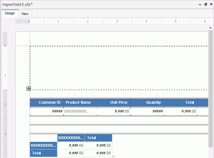
- Save the report.
Task 2: Apply a web action without parameters
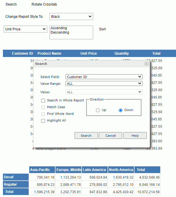
First, we want to enable users to select a button in the report to show the Search dialog box of Page Report Studio.
- Select the page header panel.
- Navigate to Insert > Web Controls > Button to insert a Button web control in it.
- Right-click the button and select Display Type from the shortcut menu.
- In the Web Behaviors box of the Display Type dialog box, specify the event to Click, then select in the Actions column and select the ellipsis .
- In the Web Action List dialog box, select user_showSearchDialog and select OK.
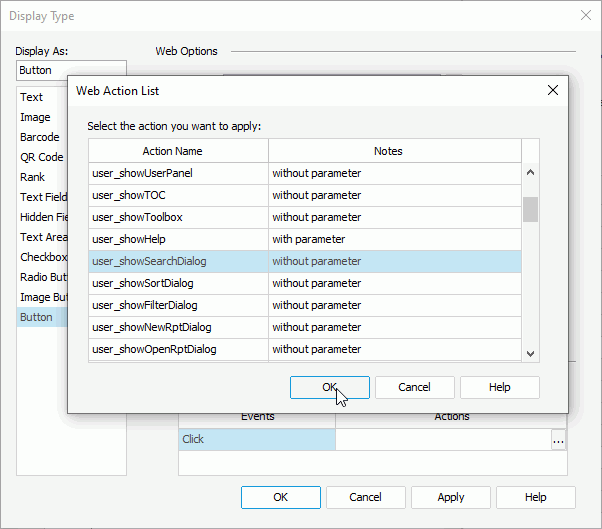
- Select OK in the Display Type dialog box to confirm the settings.
- Double-click the button and edit its text set to Search.
- Save the report.
Task 3: Apply web actions with parameters
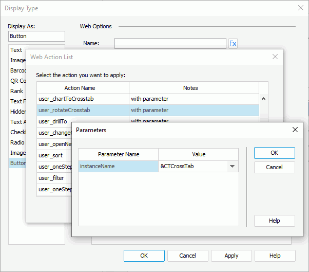
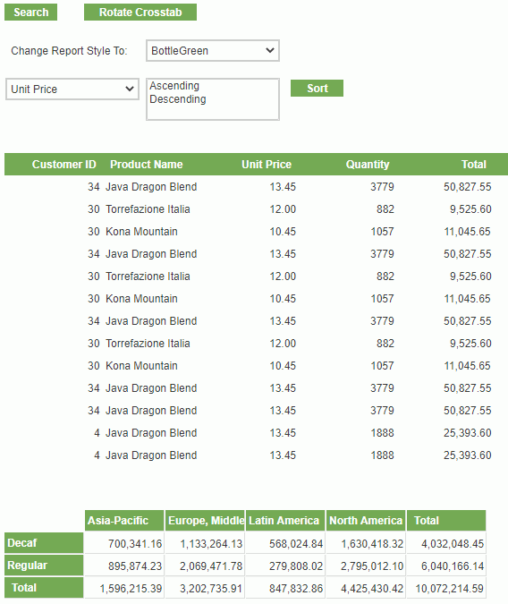
Now we want to enable users to rotate the crosstab in the report and to change the report style.
- Insert another Button web control in the page header panel of the report and place it next to the Search button.
- Right-click the new button and select Display Type from the shortcut menu.
- Specify the Click event and user_rotateCrosstab web action to the button, then set &CTCrossTab as the value of the action parameter instanceName (you can get the instance name of an object via its Instance Name property in the Report Inspector, and you should prefix the "&" symbol to the name when setting the instanceName parameter).
- In the Report Inspector, edit the Text property of the new button to Rotate Crosstab, and Width property to 1.5.
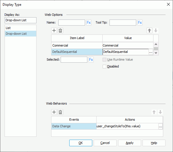
- Insert a Label object in the page header panel and place it below the two buttons, then resize the label and edit its text to "Change Report Style To:".
- Insert a Drop-down List web control next to the label.
- Right-click the drop-down list and select Display Type shortcut menu.
- In the Display Type dialog box, add these items and corresponding values to the drop-down list (to add an item line, select Add
 ):
):
Item Label Value Black Black BottleGreen BottleGreen Classic Classic Commercial Commercial DefaultSequential DefaultSequential - In the Web Behaviors box, specify the Data Change event and user_changeStyleTo web action to the drop-down list, then specify the value of the action parameter styleName to this.value.
- Save the report.
Task 4: Apply a web action using the Action Builder
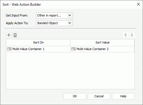
Some web actions have its own Action Builder. Now we want to use the Sort Action Builder to enable users to sort the banded object by one of the specified fields.
- Insert another Drop-down List web control into the page header panel, and place it below the existing web controls. The drop-down list displays as "Multi-Value Container 1" in the Report Inspector.
- Right-click the drop-down list and select Display Type from the shortcut menu.
- In the Display Type dialog box, add these items and corresponding values to the drop-down list:
Item Label Value Unit Price UNIT PRICE Quantity QUANTITY - Insert a List web control next to the drop-down list. The list displays as "Multi-Value Container 2" in the Report Inspector.
- In the Display Type dialog box for this list, add these items and corresponding values:
Item Label Value Ascending Ascending Descending Descending - Change the height of the list to display its values completely.
- Insert another Button web control and place it next to the list, then right-click the button and select Display Type on the shortcut menu.
- In the Display Type dialog box, specify the event to Click and action to Sort, then in the Sort - Web Action Builder dialog box, keep the default selection for Apply Action To to sort the banded object, select Multi-Value Container 1 from the Sort On column, and Multi-Value Container 2 from the Sort Value column. Confirm the settings.
- Double-click the button and edit its text to Sort.
- Save the report.
Task 5: Preview the report in Page Report Studio and apply the web actions
- Navigate to View > Preview As > Page Report Result to run the report in Page Report Studio.
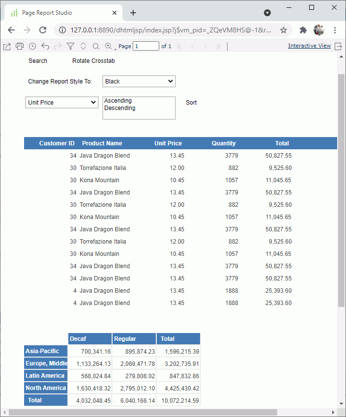
- Select Search. Page Report Studio displays the Search dialog box.
- Select Rotate Crosstab. Page Report Studio rotates the columns and rows of the crosstab.
- Select a style from the Change Report Style To drop-down list, for example, select BottleGreen. The report now applies the new style.
- Select a field name from the second drop-down list and then the sort direction from the list. Here we select Quantity and Descending respectively, then select Sort.
Page Report Studio sorts the banded object based on the Quantity values in descending order.