 Previous Topic
Display Type Dialog Box
You can use the Display Type dialog box to edit the display type of an object in a report, or specify the web options of a basic web control. This topic describes the options in the dialog box.
Designer displays the Display Type dialog box when you right-click a label, data field, special field, or basic web control in a report and select Display Type from the shortcut menu.
You can change the display type of an object to one of the following depending on the type of the report containing the object and the type of the object itself.
- Text
- Image
- Barcode
- QR Code
- Rank
- Text Field
- Hidden Field
- Text Area
- Checkbox
- Radio Button
- Image Button
- Button
- List
- Drop-down List
Designer displays these buttons for all the display types:
OK
Select to apply your settings and close the dialog box.
Cancel
Select to close the dialog box without saving any changes.
Apply
Select to apply all changes and leave the dialog box open.
Help
Select to view information about the dialog box.

- Designer displays the two display types: List and Drop-down List in the Display Type dialog box, only when you use the dialog box for defining the display type of a parameter field, or a List or Drop-down List web control.
- Designer displays the button
 for some options when the object is in a query-based page report. It indicates that you can use a formula or a DBField to control the value of an option.
Text Display Type
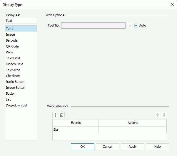
Designer displays these options for the Text display type:
Tool Tip
Specify the tool tip of the text that you want to display when users hover the mouse over the text in the HTML output of the report or at runtime.
- Auto
Designer selects this option by default, which means using the full content of the text in the tool tip. Clear it if you want to customize the tool tip.
Web Behaviors
You can specify the web behaviors that you want to bind to the text in this panel.
Designer does not display the Web Behaviors panel when you use the dialog box to change the display type of a label, data field, or special field that is not directly contained in a tabular cell for web reports.
-
 Add button
Select to add a new web behavior line. -
 Remove button
Select to delete the specified web behavior. -
 Move Up button
Select to move the specified web behavior higher in the list. When an event bound with more than one action happens at runtime, Report Engine triggers the upper action first. -
 Move Down button
Select to move the specified web behavior lower in the list. - Events
This column shows the trigger events that you select for the web behaviors. - Actions
This column shows the web actions that you specify to trigger when the events occur at runtime. Select the ellipsis in each cell to bind the web action using the Web Action List dialog box.
 Back to top
Image Display Type
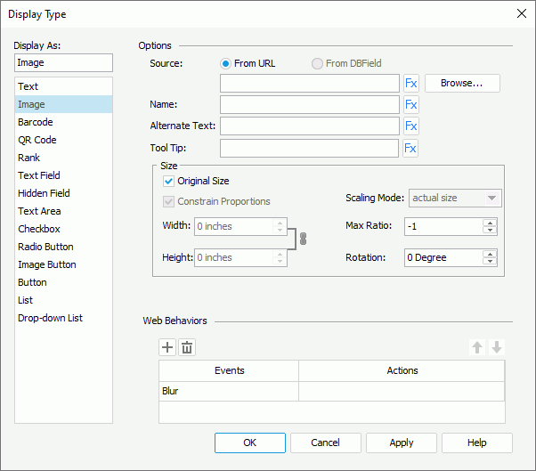
Designer displays these options for the Image display type:
Source
Specify where the image you want to use comes from.
- From URL
Select to use an image from a URL. Select Browse to specify the path or type the URL in the text box. You can use these types of images: GIF, BMP, JPG, and PNG. - From DBField
Designer enables this option for a DBField, formula, or summary. Select it to use the current data field as the image source.- Decode Type
This drop-down list contains the types that you can apply for decoding the image: GIF or JPG, Bitmap, SVG, and Auto Detect (this is to detect an image type saved in the database automatically). Select the type you want to use. - Data URI Scheme
Select if you want to parse the image using the data URI scheme.
- Decode Type
Name
Specify the name of the image.
Alternate Text
Specify the text you want to show instead when the image cannot display.
Tool Tip
Specify the tool tip of the image that you want to display when users hover the mouse over the image in the HTML output of the report or at runtime.
You can specify the size of the image in this box. Designer disables this box when you select From DBField as the image source and SVG as Decode Type.
- Original Size
Select to use the original size of the image. To use customized size for the image, clear it and Designer enables the following options:- Constrain Proportions
If you select this option, when you set the width or height of the area for displaying the image, Designer adjusts the other accordingly based on the specified width-to-height ratio. - Width
Specify the width of the area for displaying the image. - Height
Specify the height of the area for displaying the image. - Scaling Mode
Select the scaling mode of the image, which controls the image behavior when you adjust the size of the area for displaying the image.- actual size
Select to show the image in its actual size. If the size of the area for displaying the image is smaller than that of the image, part of the image will be cut off. - fit image
Select to adjust the image to fill up the area for displaying the image, with its original perspective remained but under the limitation of Max Ratio. - fit width
Select to adjust the image to fit the width of the area for displaying the image but under the limitation of Max Ratio. - fit height
Select to adjust the image to fit the height of the area for displaying the image but under the limitation of Max Ratio. - customize
Select to adjust the image according to the width and height that you specify in the Width and Height text boxes, regardless of Max Ratio.
- actual size
- Constrain Proportions
- Max Ratio
Specify the maximum scaling ratio of the image. By default, the scaling ratio of the image is not limited. If you set the ratio to any value greater than 0, the actual scaling ratio is less than or equal to it. - Rotation
Specify the angle, at which to rotate the image, in degrees. 0 means no rotation; a positive value means to rotate the image clockwise; a negative value means to rotate the image anticlockwise.
You can specify the web behaviors that you want to bind to the image in this panel.
Barcode Display Type
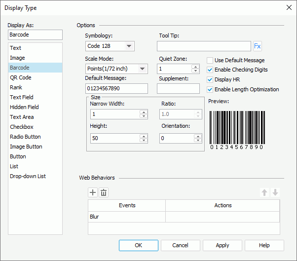
Designer displays these options for the Barcode display type:
Symbology
Select the type of the barcode: UPC A, UPC E, EAN 13, EAN 8, CODE 39, CODE 128, Codabar, Code 128A, Code 128B, or Code 128C.
Tool Tip
Specify the tool tip of the barcode that you want to display when users hover the mouse over the barcode in the HTML output of the report or at runtime. You can also use a formula to control the tool tip.
Scale Mode
Select the unit for the values of Quiet Zone, Narrow Width, Supplement, Height, and Ratio.
Quiet Zone
Specify the space around the barcode.
Default Message
Specify the default value for the barcode, which Designer applies for the barcode in design mode.
Supplement
Specify the supplement for the barcode. The barcode types, Code 39, Code 128, Code 128A, Code 128B, Code 128C, and Codabar, don't have supplements.
Use Default Massage
Select to use the value that you specify in the Default Message text box as the barcode value; otherwise, Designer only applies the value in design mode.
Enable Checking Digits
Select to include check digits in the barcode.
Display HR
Designer enables this option for the following barcode types: Code 39, Code 128, Code 128A, Code 128B, Code 128C, and Codabar. Select it to display the barcode numbers together with the barcode.
Enable Length Optimization
Designer displays this option for the barcode type Code 128 only. Select it to enable optimizing the length of the barcode.
Size
You can specify the size of the barcode in this box.
- Narrow Width
Specify the width between the barcode bars. - Ratio
Designer enables this option only for the CODE 39 and Codabar barcode types. Use it to specify the width ratio of the thick bar to the thin bar in the barcode. You can set the ratio to one of the following two effective values only: 2.0 or 3.0. Designer regards any ratio values that are not equal to 2.0 or 3.0 as 2.0. - Height
Specify the height for the bars of the barcode. - Orientation
Specify the orientation for the barcode.
Preview
This box displays the format of the selected symbology.
You can specify the web behaviors that you want to bind to the barcode in this panel.
QR Code Display Type
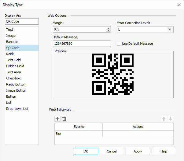
Designer displays these options for the QR Code display type:
Margin
Specify the margin between the image in the middle of the QR Code and the border of the QR Code.
Error Correction Level
Select the level of error correction for the QR Code: L, M, Q, or H.
Default Message
Specify the default value for the QR Code.
Use Default Massage
Select to generate the QR Code using the default value.
Preview
This box displays a preview of the QR Code.
You can specify the web behaviors that you want to bind to the QR Code in this panel.
Rank Display Type
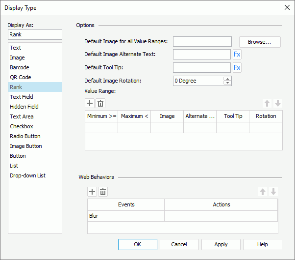
Designer displays these for the Rank display type:
Default Image for All Value Ranges
Specify the default image for all value ranges, which Designer applies when the value of a field does not fall into any of the defined ranges. You can select Browse to specify the image path or type the path and file name of the image in the text box.
Default Image Alternate Text
Specify the text you want to show instead when the default image cannot display.
Default Tool Tip
Specify the tool tip of the default image that you want to display when users hover the mouse over the image in the HTML output of the report or at runtime.
Default Image Rotation
Specify the angle, at which to rotate the default image, in degrees. 0 means no rotation; a positive value means to rotate the image clockwise; a negative value means to rotate the image anticlockwise.
Value Range
You can specify the value ranges for the rank in this box.
-
Add button
Select to add a new value range. -
Remove button
Select to delete the specified value range. -
Move Up button
Select to move the specified value range higher in the list. -
Move Down button
Select to move the specified value range lower in the list. - Minimum (>=)
This column shows the minimum values that you specify for the ranges. - Maximum (<)
This column shows the maximum values that you specify for the ranges. - Image
This column shows the images that you specify for the value ranges, which display when the field's values fall into the ranges. - Alternate Text
This column shows the alternate text that you specify for the images of the value ranges, which shows when the images cannot display. - Tool Tip
This column shows the tool tips that you specify for the images of the value ranges, which display when users hover the mouse over the images in the HTML output of the report or at runtime. - Rotation
This column shows the rotation angles that you specify for the images of the value ranges, in degrees.
You can specify the web behaviors that you want to bind to the rank in this panel.
Text Field Display Type
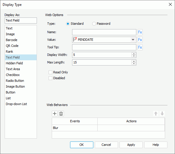
Designer displays these options for the Text Field display type:
Type
Specify the type of the text field.
- Standard
Select to display the text field as a standard text field. - Password
Select to display the text field as a password text field, which means that the value specified in the text field is hidden using asterisks.
Name
Specify the name of the text field.
Value
Select the value of the text field.
Tool Tip
Specify the tool tip of the text field that you want to display when users hover the mouse over the text field in the HTML output of the report or at runtime.
Display Width
Specify the display width of the text field.
Max Length
Specify the maximum length of the string that is allowed in the text field.
Read Only
Select to make the field read-only to others.
Disabled
Select if you want to disable the text field.
You can specify the web behaviors that you want to bind to the text field in this panel.
Hidden Field Display Type
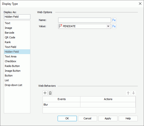
Designer displays these options for the Hidden Field display type:
Name
Specify the name of the hidden field.
Value
Select the value of the hidden field.
You can specify the web behaviors that you want to bind to the hidden field in this panel.
Text Area Display Type
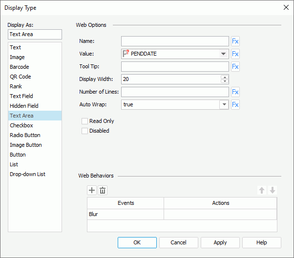
Designer displays these options for the Text Area display type:
Name
Specify the name of the text area.
Value
Select the value of the text area.
Tool Tip
Specify the tool tip of the text area that you want to display when users hover the mouse over the text area in the HTML output of the report or at runtime.
Display Width
Specify the display width of the text area.
Number of Lines
Specify the number of lines that is allowed in the text area.
Auto Wrap
Specify whether to wrap the text in the text area.
Read Only
Select to make the text area read-only to others.
Disabled
Select if you want to disable the text area.
You can specify the web behaviors that you want to bind to the text area in this panel.
Checkbox Display Type
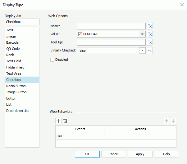
Designer displays these options for the Checkbox display type:
Name
Specify the name of checkbox.
Value
Select the value of the checkbox.
Tool Tip
Specify the tool tip of the checkbox that you want to display when users hover the mouse over the checkbox in the HTML output of the report or at runtime.
Initially Checked
Specify whether the checkbox is selected by default.
Disabled
Select if you want to disable the checkbox.
You can specify the web behaviors that you want to bind to the checkbox in this panel.
Radio Button Display Type
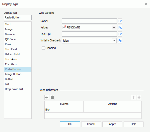
Designer displays these options for the Radio Button display type:
Name
Specify the name of radio button.
Value
Select the value of the radio button.
Tool Tip
Specify the tool tip of the radio button that you want to display when users hover the mouse over the radio button in the HTML output of the report or at runtime.
Initially Checked
Specify whether the radio button is selected by default.
Disabled
Select if you want to disable the radio button.
You can specify the web behaviors that you want to bind to the radio button in this panel.
Image Button Display Type
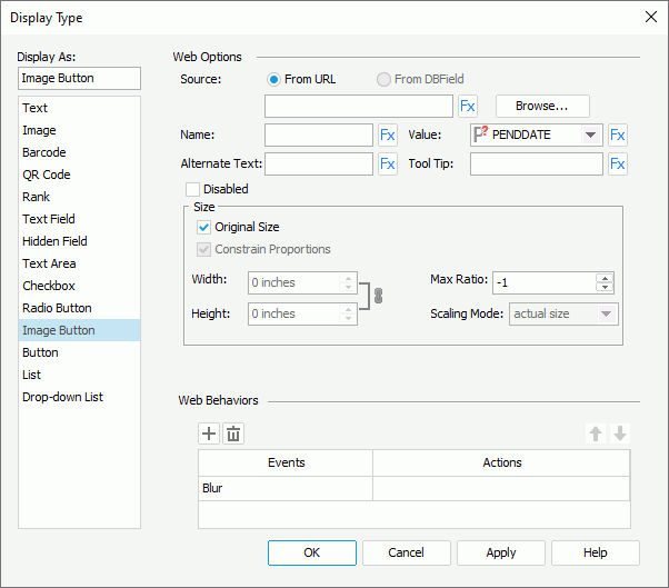
Designer displays these options for the Image Button display type:
Source
Specify where the image you want to use for the image button comes from.
- From URL
Select to use an image from a URL. Select Browse to specify the path or type the URL in the text box. You can use these types of images: GIF, BMP, JPG, and PNG. - From DBField
Designer enables this option for a DBField, formula, or summary. Select it to use the current data field as the image source.- Decode Type
This drop-down list contains the types that you can apply for decoding the image: GIF or JPG, BITMAP, SVG, and AUTODETECT (this is to detect an image type saved in the database automatically). Select the type you want to use.
- Decode Type
Name
Specify the name of the image button.
Value
Select the value of the image button.
Alternate Text
Specify the text you want to show instead when the image cannot display.
Tool Tip
Specify the tool tip of the image button that you want to display when users hover the mouse over the image button in the HTML output of the report or at runtime.
Disabled
Select if you want to disable the image button.
Size
You can specify the size of the image in this box.
- Original Size
Select to use the original size of the image. To use customized size for the image, clear it and Designer enables the following options:- Constrain Proportions
If you select this option, when you set the width or height of the area for displaying the image, Designer adjusts the other accordingly based on the specified width-to-height ratio. - Width
Specify the width of the area for displaying the image. - Height
Specify the height of the area for displaying the image. - Scaling Mode
Select the scaling mode of the image.- actual size
Select to show the image in its actual size. If the size of the area for displaying the image is smaller than that of the image, part of the image will be cut off. - fit image
Select to adjust the image to fill up the area for displaying the image, with its original perspective remained but under the limitation of Max Ratio. - fit width
Select to adjust the image to fit the width of the area for displaying the image but under the limitation of Max Ratio. - fit height
Select to adjust the image to fit the height of the area for displaying the image but under the limitation of Max Ratio. - customize
Select to adjust the image according to the width and height that you specify in the Width and Height text boxes, regardless of Max Ratio.
- actual size
- Constrain Proportions
You can specify the web behaviors that you want to bind to the image button in this panel.
Button Display Type
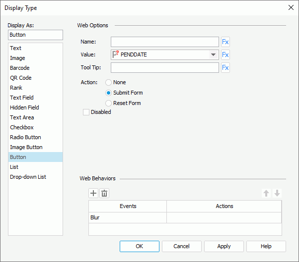
Designer displays these options for the Button display type:
Name
Specify the name of the button.
Value
Select the value of the button.
Tool Tip
Specify the tool tip of the button that you want to display when users hover the mouse over the button in the HTML output of the report or at runtime.
Action
Specify the default action that happens when users select the button at runtime.
- None
Select if you do not want any action to happen. - Submit Form
Select if you want to submit a form. - Reset Form
Select if you want to reset a form.
Disabled
Select if you want to disable the button.
You can specify the web behaviors that you want to bind to the button in this panel.
List Display Type
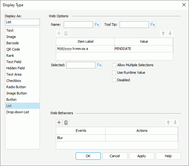
Designer displays these options for the List display type:
Name
Specify the name of the list.
Tool Tip
Specify the tool tip of the list that you want to display when users hover the mouse over the list in the HTML output of the report or at runtime.
Add button
Designer enables this button when you use the dialog box for defining the web options of a List web control. You can select it to add a new item in the list.
Remove button
Designer enables this button when you use the dialog box for defining the web options of a List web control. You can select it to delete the specified item.
Move Up button
Designer enables this button when you use the dialog box for defining the web options of a List web control. You can select it to move the specified item higher in the list.
Move Down button
Designer enables this button when you use the dialog box for defining the web options of a List web control. You can select it to move the specified item lower in the list.
Item Label
This column shows the display text or format that you select for the item values. Select in the cell to select the item label you need from the drop-down list.
Value
This column shows the values that you specify for the items.
If you are using the dialog box for defining the web options of a List web control, you can either type the value in the cell or select the ellipsis to specify a field to control the value using the Insert Fields dialog box.
Selected
Specify the value to be selected in the list by default.
Allow Multiple Selections
Select to allow selecting multiple items in the list at the same time.
Use Runtime Value
Designer enables this option when you use the dialog box for changing the display type of a parameter to List. Select it to use the runtime value of the parameter as the selected value of the drop-down list.
Disabled
Select if you want to disable the list.
You can specify the web behaviors that you want to bind to the list in this panel.
Designer displays the following options when the object is in a web report or library component:
Display
Specify to display the list as Text, Button, Checkbox, or Radio Button. When you select Radio Button, Designer disables the Allow Multiple Selections option.
Vertical
Select to display items in one column vertically in the list, and add a vertical scroll bar in the list if it cannot completely display all the items within the specified height.
Horizontal
Select to display the items horizontally following the Z order in the list.
Item Width
Designer enables this option when you select Horizontal. You can use it to specify the width of each item in the list.
Item Height
Specify the height of each item in the list.
Horizontal Gap
Designer enables this option when you select Horizontal. You can use it to specify the horizontal gap between two adjacent items in the list.
Vertical Gap
Specify the vertical gap between two adjacent items in the list.
Drop-down List Display Type
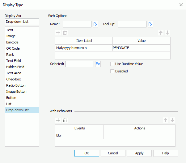
Designer displays these options for the Drop-down List display type:
Name
Specify the name of the drop-down list.
Tool Tip
Specify the tool tip of the drop-down list that you want to display when users hover the mouse over the drop-down list in the HTML output of the report or at runtime.
Add button
Designer enables this button when you use the dialog box for defining the web options of a Drop-down List web control. You can select it to add a new item in the drop-down list.
Remove button
Designer enables this button when you use the dialog box for defining the web options of a Drop-down List web control. You can select it to delete the specified item.
Move Up button
Designer enables this button when you use the dialog box for defining the web options of a Drop-down List web control. You can select it to move the specified item higher in the drop-down list.
Move Down button
Designer enables this button when you use the dialog box for defining the web options of a Drop-down List web control. You can select it to move the specified item lower in the drop-down list.
Item Label
This column shows the display text or format that you select for the item values. Select in the cell to select the item label you need from the drop-down list.
Value
This column shows the values that you specify for the items.
If you are using the dialog box for defining the web options of a Drop-down List web control, you can either type the value in the cell or select the ellipsis to specify a field to control the value using the Insert Fields dialog box.
Selected
Specify the value to be selected in the drop-down list by default.
Use Runtime Value
Designer enables this option when you use the dialog box for changing the display type of a parameter to Drop-down List. Select it to use the runtime value of the parameter as the selected value of the drop-down list.
Disabled
Select if you want to disable the drop-down list.
You can specify the web behaviors that you want to bind to the drop-down list in this panel.