 Previous Topic
Format Legend Dialog Box
You can use the Format Legend dialog box to format the legend of a chart. This topic describes the options in the dialog box.
Designer displays the Format Legend dialog box when you right-click the legend of a chart and select Format Legend from the shortcut menu, or double-click the legend of a chart.
The dialog box contains the following tabs (Designer displays the Behaviors tab only when the chart is in a library component):
- Fill Tab
- Border Tab
- Placement Tab
- Font Tab
- Orientation Tab
- Format Tab
- Mark Tab
- Label Tab
- Behaviors Tab
Designer displays these buttons in all the tabs:
OK
Select to apply your settings and close the dialog box.
Cancel
Select to close the dialog box without saving any changes.
Apply
Select to apply all changes and leave the dialog box open.
Help
Select to view information about the dialog box.
Fill Tab
Use this tab to specify the fill pattern of the legend.
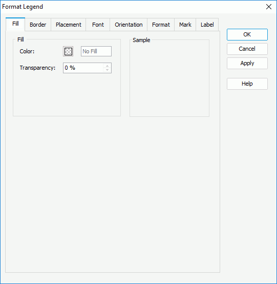
Color
Specify the color of the legend. To edit the color, select the color indicator and select a color from the color palette, or type the hexadecimal RGB value of a color (for example, 0xff0000) in the text box.
Transparency
Specify the transparency of the legend.
Sample
This box displays a preview sample based on your selections.
 Back to top
Border Tab
Use this tab to specify properties for the border of the legend.
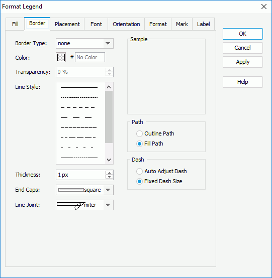
Border Type
Select the type of the border.
- none
Select if you do not want to show the border. - raised
Select to show 3-D border that appears as if it is raised off the page. - recess
Select to show 3-D border that appears as if it is pressed into the page. - shadow
Select to show two shadowed borders, beneath and to the right of the object. - solid
Select to use single-line border.
Color
Specify the color of the border. To edit the color, select the color indicator and select a color from the color palette, or type the hexadecimal RGB value of a color (for example, 0xff0000) in the text box.
Transparency
Specify the transparency of the border.
Line Style
Select the line style of the border.
Thickness
Specify the width of the border, in pixels.
End Caps
Select the ending style of the border.
- butt
Select to end unclosed subpaths and dash segments with no added decoration. - round
Select to end unclosed subpaths and dash segments with a round decoration that has a radius equal to half of the line width. - square
Select to end unclosed subpaths and dash segments with a square projection that extends beyond the end of the segment to a distance equal to half of the line width.
Line Joint
Select the joint style of the border.
- miter
Select to join path segments by extending their outside edges until they meet. - round
Select to join path segments by rounding off the corner at a radius of half the line width. - bevel
Select to join path segments by connecting the outer corners of their wide outlines with a straight segment. - joint round
Select to join path segments by rounding off the corner at the specified radius.
Sample
This box displays a preview sample based on your selections.
Path
You can specify the fill pattern of the border in this box.
- Outline Path
Select to use outline path for the border. - Fill Path
Select to use whole path for the border.
You can specify the dash size of the border in this box if you select a dash line style for the border.
- Auto Adjust Dash
Select to adjust the dash size automatically. - Fixed Dash Size
Select to use fixed dash size.
Designer displays this option when you select the Line Joint option of "joint round". You can use it to specify the radius of the joint.
Placement Tab
Use this tab to specify the location of the legend in the chart.
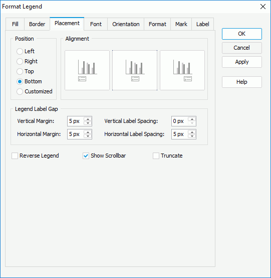
Position
Specify the position of the legend to be on the left, right, top, or bottom of the chart, or customized by manually dragging on the chart.
Alignment
Specify the alignment of the legend at the selected position.
Legend Label Gap
You can specify the margin between the legend entries and legend border, and the spacing between the legend entry labels in this box.
- Vertical Margin
Specify the minimum vertical distance between the legend entries and legend border, in pixels. - Horizontal Margin
Specify the minimum horizontal distance between the legend entries and legend border, in pixels. - Vertical Label Spacing
Specify the vertical distance between two adjacent entry labels in the legend, in pixels. - Horizontal Label Spacing
Specify the horizontal distance between two adjacent entry labels in the legend, in pixels.
Reverse Legend
Select to arrange the legend entries in a reverse order.
Show Scrollbar
Select to show a scroll bar in the legend to fully view the legend content when the content does not fit into the legend.
Truncate
Select to truncate the legend entry label text when the text overflows the labels.
Font Tab
Use this tab to specify the font style of the text in the legend entry labels.
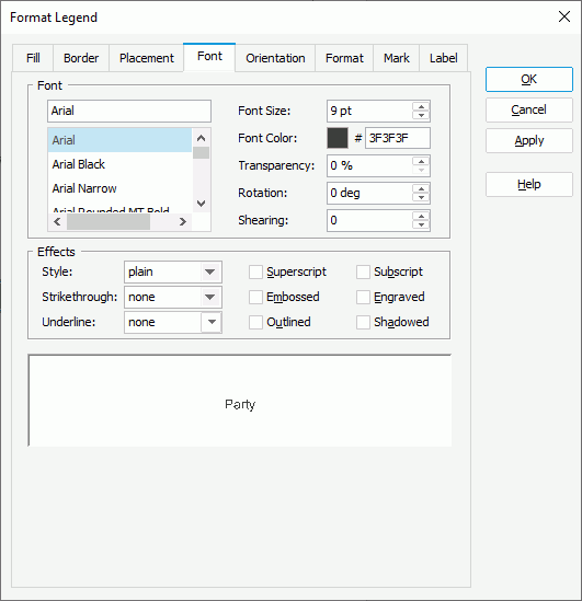
Font
You can specify the font style of the text in the legend entry labels in this box.
- Font list
This drop-down list contains all the font faces you can select to apply to the text. - Font Size
Specify the font size of the text. - Font Color
Specify the font color of the text. To edit the color, select the color indicator and select a color from the color palette, or type the hexadecimal RGB value of a color (for example, 0xff0000) in the text box. - Transparency
Specify the transparency of the text. - Rotation
Specify the rotation angle of the text around its center, in degrees. The default value is 0. - Shearing
Specify the gradient of the text.
Effects
You can specify the special effects of the text in the legend entry labels in this box.
- Style
Select the font style of the text. It can be one of the following: plain, bold, italic, and bold italic. - Strikethrough
Select the style of the horizontal line using which to strikethrough the text. It can be one of the following: none, thin line, bold line, and double lines. - Underline
Select the style of the horizontal line under the text. It can be one of the following: none, single, single lower, bold line, bold lower, double lines, bold double, patterned line, and bold patterned. When you select "patterned line" or "bold patterned", Designer draws a line or bold line in the pattern of the text. - Superscript
Select to raise the text above the baseline and change the text to a smaller font size, if a smaller size is available. - Subscript
Select to lower the text below the baseline and change the text to a smaller font size, if a smaller size is available. - Embossed
Select to make the text appear to be raised off the page in relief. - Engraved
Select to make the text appear to be imprinted or pressed into the page. - Outlined
Select to display the exterior border around each character of the text. - Shadowed
Select to add a shadow beneath and to the right of the text.
 Web Report Studio and JDashboard do not support underlining chart text, therefore, this property is ignored when the chart runs in Web Report Studio or is used in a dashboard.
Sample
This box displays a preview sample based on your selections.
Orientation Tab
Use this tab to specify the rotation angle for the legend entry labels.
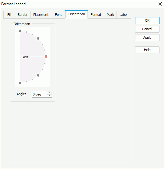
Angle
Specify the rotation angle for the legend entry labels. When you change the rotation angle in the text box, the red line in the spin box changes correspondingly, and vice versa.
Format Tab
Use this tab to specify the data format of the legend entry labels. Designer applies the specified format only when you set the Label Format Source property of the chart legend to "Legend Label Format" in the Report Inspector.
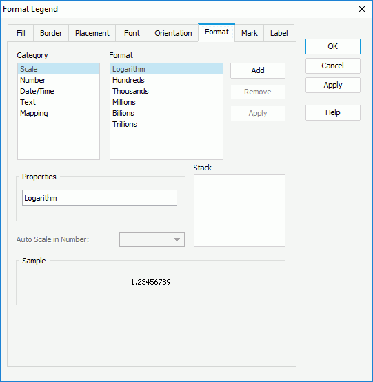
Category & Format
These two boxes list the category types and the formats of each category that Designer provides by default. Select a category and a format for this category, then select Add to add it as the format of the category. You can add only one format for each category.
Properties
This text box shows the properties of the format that you select in the Format box. If the default formats Designer provides for a category cannot meet your requirement, you can define your own format in the text box and select Add to add it as the format of the category.
Auto Scale in Number
Specify whether to automatically scale the Number values that fall into the two ranges:
- When 1000 <= value < 10^15, Designer applies the following quantity unit symbols of the International System of Units to scale the values: K (10^3), M (10^6), G (10^9), and T (10^12).
- When 0 < value < 0.001 or value >= 10^15, Designer uses scientific notation to scale the values.
By default, Designer selects "auto" for the option, meaning, Designer applies the setting that you specify for the same property on the chart in the Report Inspector for the values. If you select "true", Designer applies the specified format to the integer part of the values after scaling them; however, if the specified format conflicts with the logic of Auto Scale in Number, for example, the values display in percentage, Designer ignores the Auto Scale in Number setting. Select "false" if you do not want to scale the values.
Sample
This box displays a sample for the selected format.
Stack
This box lists all the formats that you select from different categories.
Add
Select to add a format to the Stack box.
Remove
Select to remove the specified format from the Stack box.
Apply
Select to apply the specified format to the legend entry labels.
Mark Tab
Use this tab to specify the format of the legend entry marks.
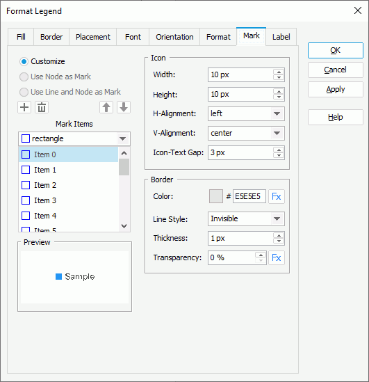
Customize
Select to customize the style of the legend entry marks.
Use Node as Mark
Designer enables this option only when the chart is a line chart. Select it if you want to apply the formatting of line nodes to the legend entry marks, meaning, the legend entry marks automatically inherit the style and color of the line nodes.
Use Line and Node as Mark
Designer enables this option only when the chart is a line chart. Select it if you want to apply the formatting of the lines and line nodes to the legend entry marks, meaning the legend entry marks automatically inherit the style and color of the lines and line nodes.
Mark Items
You can specify the style of the legend entry marks in this box. Select the mark item from the box one by one and choose the style for each item from the drop-down list. Designer disables this box when you select Use Node as Mark or Use Line and Node as Mark.
-
 Add button
Select to add a mark item to the box. -
 Remove button
Select to delete a specified mark item from the box. -
 Move Up button
Select to move a specified mark item higher in the box. -
 Move Down button
Select to move a specified mark item lower in the box.
Icon
You can specify properties of the legend entry marks in this box.
- Width
Specify the width of the marks, in pixels. - Height
Specify the height of the marks, in pixels. - H-Alignment
Select the horizontal alignment of the marks relative to the legend entry labels: left, center, or right. - V-Alignment
Select the vertical alignment of the marks relative to the legend entry labels: top, center, or bottom. - Icon-Text Gap
Specify the distance between each legend entry mark and entry label, in pixels.
Border
You can specify the border properties of the marks in this box. Designer disables this box when you select Use Node as Mark or Use Line and Node as Mark.
- Color
Specify the color of the border. To edit the color, select the color indicator and select a color from the color palette, or type the hexadecimal RGB value of a color (for example, 0xff0000) in the text box. - Line Style
Select the line style of the border. - Transparency
Specify the transparency of the border. - Thickness
Specify the width of the border, in pixels.
Designer displays the button  for some options if the chart uses a query resource. It indicates that you can use a formula to control the value of an option.
Preview
This box displays a preview of your settings.
Label Tab
Designer enables options in the Label tab only when the legend entry labels show values of the category or series field. You can use this tab to customize the text of the legend entry labels.
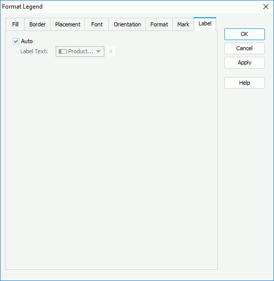
Auto
Designer selects this option by default, meaning, the legend entry labels display values of the category/series field.
- Label Text
Specify the text of the legend entry labels. Select a field from the drop-down list to use its values as the label text or select to type the label text manually.
Behaviors Tab
Designer displays the Behaviors tab only when the chart is in a library component. You can use it to specify web behaviors to the legend.
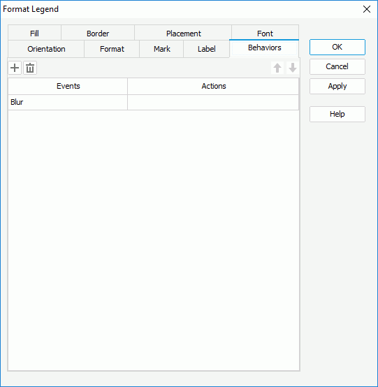
Add button
Select to add a new web behavior line.
Remove button
Select to delete the specified web behavior.
Move Up button
Select to move the specified web behavior higher in the list. At runtime, when an event bound with more than one action happens, JDashboard triggers the upper action first.
Move Down button
Select to move the specified web behavior lower in the list.
Events
This column shows the events that you select to trigger the web actions.
Actions
This column shows the web actions that you specify for the events to trigger. Select the ellipsis  in each cell to bind the web action using the Web Action List dialog box.