 Previous Topic
Format Line Dialog Box
You can use the Format Line dialog box to format the lines in a line chart. This topic describes the options in the dialog box.
Designer displays the Format Line dialog box when you right-click a line in a line chart and select Format Line from the shortcut menu, or double-click any line in a line chart.
The dialog box contains the following tabs (Designer displays the Node tab for a 2-D line chart, the Border tab for a 3-D line chart, and the Behaviors tab when the chart is in a library component):
Designer displays these buttons in all the tabs:
OK
Select to apply your settings and close the dialog box.
Cancel
Select to close the dialog box without saving any changes.
Apply
Select to apply all changes and leave the dialog box open.
Help
Select to view information about the dialog box.
General Tab
Designer displays different options in the General tab for a 2-D line chart and a 3-D line chart. You can use it to specify general properties of the lines.
For 2-D Line Chart
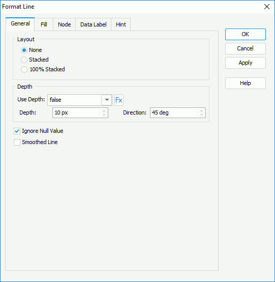
Layout
You can specify the layout of the lines in this box.
- None
Select to display trend over categories on the lines. - Stacked
Select to display the trend of the contribution of each data value over categories on the stacked lines. - 100% Stacked
Select to display the trend of the percentage that each data value contributes over categories on the 100% stacked lines.
Depth
You can specify the depth of the lines in this box.
- Use Depth
Specify whether to add a 3-dimensional effect to the lines. You can also select to use a formula to control the property if the chart uses a query resource.
- Depth
Specify the 3-dimensional depth effect of the lines, in pixels. - Direction
Specify the direction of the depth, in degrees.
- Depth
Ignore Null Value
Select to ignore the null data values when drawing lines in the chart. If you select this option, when a null data value appears on a line, Designer ignores the value and draws the line from the previous data value to the next data value directly; otherwise, the line is broken at the point of the null data value.
Smoothed Line
Select to draw the lines smoothly without sharp joints.
For 3-D Line Chart
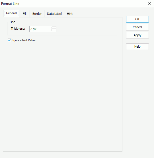
Thickness
Specify the thickness of the lines, in pixels.
Ignore Null Value
Select to ignore the null data values when drawing lines in the chart. If you select this option, when a null data value appears on a line, Designer ignores the value and draws the line from the previous data value to the next data value directly; otherwise, the line is broken at the point of the null data value.
 Back to top
Fill Tab
Use this tab to specify the fill pattern of the chart lines.
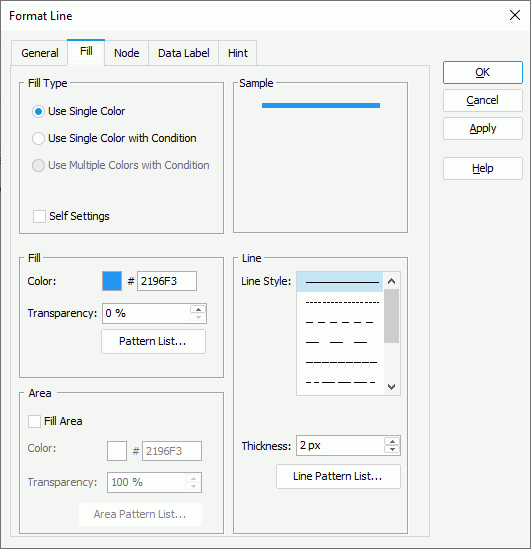
Use Single Color
Select to apply single color pattern to fill the chart lines.
- Self Settings
Select to apply the color pattern to the chart lines themselves only. When this option is cleared, Designer synchronizes the color pattern that you specify here with the Pattern List property of the chart in the Report Inspector, which data markers of other subtypes can also apply if the chart is a combo chart. - Fill/Normal Fill
You can specify the fill pattern of the chart lines in this box. Designer disables this box for a 2-D line chart when you select Apply Color to Line in the Node tab.- Color
Specify the color of the selected chart line. To edit the color, select the color indicator and select a color from the color palette, or type the hexadecimal RGB value of a color (for example, 0xff0000) in the text box. - Transparency
Specify the transparency of the color. - Pattern List/Color List
Select to open the Color List dialog box to modify the color pattern for each line in the chart.
- Color
- Area
Designer displays the box for a 2-D line chart. You can use it to specify properties of the areas that are formed by the chart axes and the lines.- Fill Area
Select to fill the areas. Designer enables the other options in the box when you select this option. - Color
Specify the color to fill the selected chart line area. To edit the color, select the color indicator and select a color from the color palette, or type the hexadecimal RGB value of a color (for example, 0xff0000) in the text box. - Transparency
Specify the transparency of the color. - Area Pattern List
Select to open the Color List dialog box to modify the color pattern of the areas formed by each chart line and the axes.
- Fill Area
- Line
Designer displays the box for a 2-D line chart. You can use it to specify the line pattern of the chart lines.- Line Style
Select the style of the selected chart line. - Thickness
Specify the thickness of the selected chart line, in pixels. - Line Pattern List
Select to open the Line Pattern List dialog box to modify the line pattern for each line in the chart.
- Line Style
Use Single Color with Condition
Designer enables this option for a 2-D line chart. Select it if you want to make each line apply its own single color pattern based on the defined conditions. You can select Advanced or Normal to switch between the two editing modes to edit the conditions.
- Normal
- Select Field
This drop-down list contains all the available fields to which you can apply the conditional fill. Select the field on which you want to define the conditions. -
 Add button
Select to add a new condition. -
 Edit button
Select to open the Edit Line Style dialog box to edit the line style for values that meet the specified condition. -
 Remove button
Select to delete the specified user-defined condition. - Value
Designer displays the column when you select the category or series field of the chart, or a field the values of which are not numbers from the Select Field drop-down list. It shows the values that you specify for each condition. - Start Value
Designer displays the column when you select a value field of the chart, or a field containing numeric values from the Select Field drop-down list. It shows the start values that you specify for each condition. - End Value
Designer displays the column when you select a value field of the chart, or a field containing numeric values from the Select Field drop-down list. It shows the end values that you specify for each condition. - Color
This column shows the colors you specify to apply to values that meet the conditions. To edit the color, select the color indicator and select a color from the color palette, or type the hexadecimal RGB value of a color (for example, 0xff0000) in the text box. - Transparency
This column shows the transparency of the colors that you specify for the conditions. - Style
This column shows the line styles that you specify for the conditions. - Value
Designer displays this option after you select a value field of the chart, or a field containing numeric values from the Select Field drop-down list. Select it if you want to display data in the condition expression as value. - Percent
Designer displays this option after you select a value field of the chart, or a field containing numeric values from the Select Field drop-down list, and enables it only when the chart applies the 100% Stacked Line 2-D type. Select it if you want to display data in the condition expression in percent.
- Select Field
- Advanced
-
Add button
Select to open the Edit Conditions dialog box to create a condition and define line style for values that meet the condition. -
Edit button
Select to open the Edit Line Style dialog box for editing the line style if you select the default condition Other; or open the Edit Conditions dialog box to edit the condition and line style for values that meet the condition, if you select a user-defined condition. -
Remove button
Select to delete the specified user-defined condition. - Condition
This column shows the default condition Other and the expressions of the conditions you add. - Color
This column shows the colors you specify to apply to values that meet the conditions. To edit the color, select the color indicator and select a color from the color palette, or type the hexadecimal RGB value of a color (for example, 0xff0000) in the text box. Designer disables the column when you select Apply Color to Line in the Node tab. - Transparency
This column shows the transparency of the colors you specify for the conditions. Designer disables the column when you select Apply Color to Line in the Node tab. For a user-defined condition, Designer disables the Color and Transparency columns for it, if you edit the condition using Imported Condition. You can only use the Edit Conditions dialog box to edit the two properties for the condition.
 - Style
This column shows the line styles you specify for the conditions. - Value
This option indicates that Designer displays data in the condition expressions as value. You cannot change it. - Percent
Designer does not support this option when you edit conditions in the advanced mode.
-
Use Multiple Colors with Condition
Designer does not support this fill type for line charts.
Sample
This box displays a preview sample based on your selections.
Node Tab
Designer displays the Node tab when the chart is a 2-D line chart. You can use it to specify properties of the nodes on chart lines.
Use Single Color
Select to apply single color pattern to fill the nodes.
- Self Settings
Select to apply the color pattern to the nodes themselves only. When this option is cleared, Designer synchronizes the color pattern that you specify here with the Pattern List property of the chart in the Report Inspector, which data markers of other subtypes can also apply if the chart is a combo chart. - Shape
You can specify shape properties of the nodes in the selected chart line in this box.- Style
Select the style of the nodes in the selected chart line. - Transparency
Specify the transparency of the nodes in the selected chart line. - Width
Specify the width of the nodes in the selected chart line, in pixels. - Height
Specify the height of the nodes in the selected chart line, in pixels. - Show Node
Specify whether to show nodes in the selected chart line. The node related properties for the line take effect only when you select "true" for this option. However, it does not control the options Show High Point and Show Low Point and the Color property for each.- Color
Specify the color of the nodes in the selected chart line. To edit the color, select the color indicator and select a color from the color palette, or type the hexadecimal RGB value of a color (for example, 0xff0000) in the text box.
- Color
- Show High Point
Specify whether to show the line node in the highest point in the selected chart line.- Color
Specify the color of the node in the highest point in the selected chart line. To edit the color, select the color indicator and select a color from the color palette, or type the hexadecimal RGB value of a color (for example, 0xff0000) in the text box.
- Color
- Show Low Point
Specify whether to show the line node in the lowest point in the selected chart line.- Color
Specify the color of the node in the lowest point in the selected chart line. To edit the color, select the color indicator and select a color from the color palette, or type the hexadecimal RGB value of a color (for example, 0xff0000) in the text box.
- Color
- Show Highlight Point
Specify whether to show the highlight point when you hover the mouse over a node in the selected chart line.- Color
Specify the color of the highlight point in the selected chart line. To edit the color, select the color indicator and select a color from the color palette, or type the hexadecimal RGB value of a color (for example, 0xff0000) in the text box.
- Color
- Style
- Border
Designer displays the box when you select a node style other than any of the following: plus, multiplication, star1, or star2. You can use it to specify the border properties of the nodes in the selected chart line.- Border Color
Specify the color for the border of the nodes in the selected chart line. To edit the color, select the color indicator and select a color from the color palette, or type the hexadecimal RGB value of a color (for example, 0xff0000) in the text box. - Transparency
Specify the transparency for the border of the nodes in the selected chart line. - Thickness
Specify the thickness for the border of the nodes in the selected chart line, in pixels. - Line Style
Select the line style for the border of the nodes in the selected chart line.
- Border Color
- Line
Designer displays the box when you select the node style as one of the following: plus, multiplication, star1, and star2. You can use it to specify the line properties of the nodes in the selected chart line.- Line Style
Select the line style of the nodes in the selected chart line. - Thickness
Specify the line thickness of the nodes in the selected chart line.
- Line Style
- Node Pattern List
Select to open the Node Pattern List dialog box to modify the node pattern for each chart line.
Designer displays the button for some options if the chart uses a query resource. It indicates that you use a formula to control the value of an option.
Use Single Color with Condition
Select to make each node apply its own single color pattern based on the defined conditions. You can select Advanced or Normal to switch between the two editing modes to edit the conditions.
- Normal
- Select Field
This drop-down list contains all the available fields to which you can apply the conditional fill. Select the field on which you want to define the conditions. -
Add button
Select to add a new condition. -
Edit button
Select to open the Edit Node Style dialog box to edit the node style for the selected condition. -
Remove button
Select to delete the specified user-defined condition. - Value
Designer displays the column when you select the category or series field of the chart, or a field the values of which are not numbers from the Select Field drop-down list. It shows the values that you specify for each condition. - Start Value
Designer displays the column when you select a value field of the chart, or a field containing numeric values from the Select Field drop-down list. It shows the start values that you specify for each condition. - End Value
Designer displays the column when you select a value field of the chart, or a field containing numeric values from the Select Field drop-down list. It shows the end values that you specify for each condition. - Color
This column shows the colors you specify to apply to values that meet the conditions. To edit the color, select the color indicator and select a color from the color palette, or type the hexadecimal RGB value of a color (for example, 0xff0000) in the text box. - Transparency
This column shows the transparency of the colors that you specify for the conditions. - Style
This column shows the node styles that you specify for the conditions. - Label
Select to modify the legend entry label for values of the specified condition. - Value
Designer displays this option after you select a value field of the chart, or a field containing numeric values from the Select Field drop-down list. Select it if you want to display data in the condition expression as value. - Percent
Designer displays this option after you select a value field of the chart, or a field containing numeric values from the Select Field drop-down list, and enables it only when the chart applies the 100% Stacked Line 2-D type. Select it if you want to display data in the condition expression in percent.
- Select Field
- Advanced
-
Add button
Select to open the Edit Conditions and Label dialog box to create a condition, and specify the node style and legend entry label for values that meet the condition. -
Edit button
Select to open the Edit Node Style dialog box for editing the node style if you select the default condition Other; or open the Edit Conditions and Label dialog box to edit the specified condition, and the node style and legend entry label for values of the condition, if you select a user-defined condition. -
Remove button
Select to delete the specified user-defined condition. - Condition
This column shows the default condition Other and the expressions of the conditions you add. - Color
This column shows the colors you specify to apply to values that meet the conditions. To edit the color, select the color indicator and select a color from the color palette, or type the hexadecimal RGB value of a color (for example, 0xff0000) in the text box. - Transparency
This column shows the transparency of the colors you specify for the conditions. For a user-defined condition, Designer disables the Color and Transparency columns for it, if you edit the condition using Imported Condition. You can only use the Edit Conditions and Label dialog box to edit the two properties for the condition. - Style
This column shows the node styles you specify for the conditions. - Label
Specify the legend entry label for values of the specified condition. You can edit the label in the text box, or select Customized and then select Edit to customize the label in the Label Editor dialog box. - Value
This option indicates that Designer displays data in the condition expressions as value. You cannot change it. - Percent
Designer does not support this option when you edit conditions in the advanced mode.
-
Use Multiple Colors with Condition
Designer does not support this fill type for line charts.
Apply Color to Line
Select to apply the color pattern that you specify on the nodes apply to the corresponding lines.
Sample
This box displays a preview sample based on your selections.
Border Tab
Designer displays the Border tab when the chart is a 3-D line chart. You can use it to specify properties for the border of the 3-D lines.
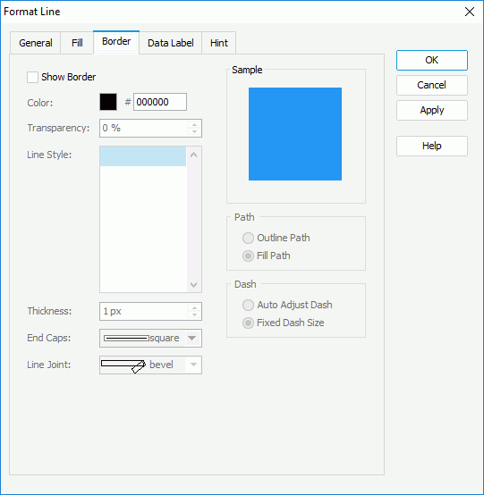
Show Border
Select to show the border of the 3-D lines. Designer enables the other border properties in this tab after you select this option.
Color
Specify the color of the border. To edit the color, select the color indicator and select a color from the color palette, or type the hexadecimal RGB value of a color (for example, 0xff0000) in the text box.
Transparency
Specify the transparency of the border.
Line Style
Select the line style of the border.
Thickness
Specify the width of the border, in pixels.
End Caps
Select the ending style of the border.
- butt
Select to end unclosed subpaths and dash segments with no added decoration. - round
Select to end unclosed subpaths and dash segments with a round decoration that has a radius equal to half of the line width. - square
Select to end unclosed subpaths and dash segments with a square projection that extends beyond the end of the segment to a distance equal to half of the line width.
Line Joint
Select the joint style of the border.
- miter
Select to join path segments by extending their outside edges until they meet. - round
Select to join path segments by rounding off the corner at a radius of half the line width. - bevel
Select to join path segments by connecting the outer corners of their wide outlines with a straight segment.
Sample
This box displays a preview sample based on your selections.
Path
You can specify the fill pattern of the border in this box.
- Outline Path
Select to use outline path for the border. - Fill Path
Select to use whole path for the border.
You can specify the dash size of the border in this box if you select a dash line style for the border.
- Auto Adjust Dash
Select to adjust the dash size automatically. - Fixed Dash Size
Select to use fixed dash size.
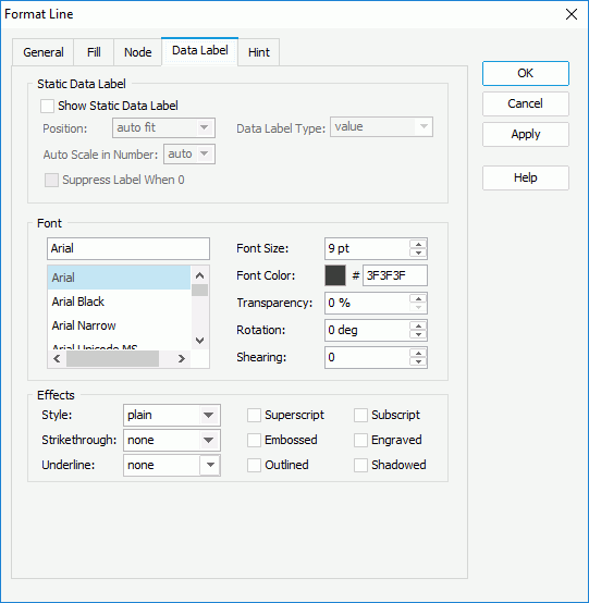
Data Label Tab
Use this tab to specify properties of the data labels on the lines.
Static Data Label
You can specify properties of the static data labels on the lines in this box. Designer disables this box for a 3-D line chart.
- Show Static Data Label
Select to show the static data labels. Designer enables the other static data label properties after you select this option. - Position
Select the position of the static data labels on the lines.- auto fit
Select to display the static data labels automatically. - top center
Select to display the static data labels on the top center of the line nodes. - top left
Select to display the static data labels on the top left of the line nodes. - top right
Select to display the static data labels on the top right of the line nodes. - bottom left
Select to display the static data labels at the bottom left of the line nodes. - bottom center
Select to display the static data labels at the bottom center of the line nodes. - bottom right
Select to display the static data labels at the bottom right of the line nodes.
- auto fit
- Data Label Type
Select in which way to display the values in the static data labels.- value
Select to show the value for each line node. - percent
Select to show the percentage of each line node to the total. - value and percent
Select to show the value and the percentage for each line node.
- value
- Auto Scale in Number
Specify whether to automatically scale the Number values in the static data labels that fall into the two ranges:- When 1000 <= value < 10^15, Designer applies the following quantity unit symbols of the International System of Units to scale the values: K (10^3), M (10^6), G (10^9), and T (10^12).
- When 0 < value < 0.001 or value >= 10^15, Designer uses scientific notation to scale the values.
By default, Designer selects "auto" for the option, meaning, Designer applies the setting that you specify for the same property on the chart in the Report Inspector for the values. If you select "true", Designer applies the specified format to the integer part of the values after scaling them; however, if the specified format conflicts with the logic of Auto Scale in Number, for example, the values display in percentage, Designer ignores the Auto Scale in Number setting. Select "false" if you do not want to scale the values.
- Suppress Label When 0
Select if you do not want to display the static data label when its value is 0.
Font
You can specify the font style of the text in the static data labels in this box.
- Font list
This drop-down list contains all the font faces you can select to apply to the text. - Font Size
Specify the font size of the text. - Font Color
Specify the font color of the text. To edit the color, select the color indicator and select a color from the color palette, or type the hexadecimal RGB value of a color (for example, 0xff0000) in the text box. - Transparency
Specify the transparency of the text. - Rotation
Specify the rotation angle of the text around its center, in degrees. The default value is 0. - Shearing
Specify the gradient of the text.
Effects
You can specify the special effects for the text in the static data labels in this box.
- Style
Select the font style of the text. It can be one of the following: plain, bold, italic, and bold italic. - Strikethrough
Select the style of the horizontal line using which to strikethrough the text. It can be one of the following: none, thin line, bold line, and double lines. - Underline
Select the style of the horizontal line under the text. It can be one of the following: none, single, single lower, bold line, bold lower, double lines, bold double, patterned line, and bold patterned. When you select "patterned line" or "bold patterned", Designer draws a line or bold line in the pattern of the text. - Superscript
Select to raise the text above the baseline and change the text to a smaller font size, if a smaller size is available. - Subscript
Select to lower the text below the baseline and change the text to a smaller font size, if a smaller size is available. - Embossed
Select to make the text appear to be raised off the page in relief. - Engraved
Select to make the text appear to be imprinted or pressed into the page. - Outlined
Select to display the exterior border around each character of the text. - Shadowed
Select to add a shadow beneath and to the right of the text.
Web Report Studio and JDashboard do not support underlining chart text, therefore, this property is ignored when the chart runs in Web Report Studio or is used in a dashboard.
Hint Tab
Use this tab to specify properties for the hint of the lines.
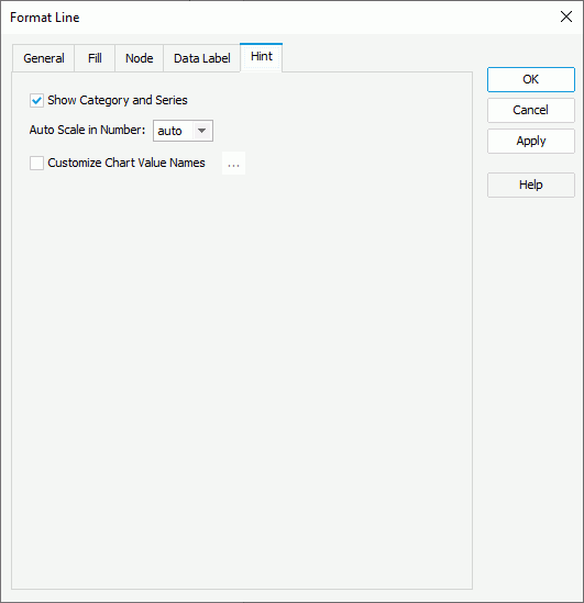
Show Category and Series
Select to include the category and series values in the hint.
Auto Scale in Number
Specify whether to automatically scale the Number values in the hint that fall into the two ranges:
- When 1000 <= value < 10^15, Designer applies the following quantity unit symbols of the International System of Units to scale the values: K (10^3), M (10^6), G (10^9), and T (10^12).
- When 0 < value < 0.001 or value >= 10^15, Designer uses scientific notation to scale the values.
By default, Designer selects "auto" for the option, meaning, Designer applies the setting that you specify for the same property on the chart in the Report Inspector for the values. If you select "true", Designer applies the specified format to the integer part of the values after scaling them; however, if the specified format conflicts with the logic of Auto Scale in Number, for example, the values display in percentage, Designer ignores the Auto Scale in Number setting. Select "false" if you do not want to scale the values.
Customize Chart Value Names
Select to customize the names of the fields on the value axis which you want to display in the hint. By default, Designer applies the display names of the fields in the hint to label the values which may be not intuitive to users. You can select the option and select the ellipsis  to customize the names in the Customize Chart Value Names dialog box to help users better understand the values.
Behaviors Tab
Designer displays the Behaviors tab only when the line chart is in a library component. You can use it to specify web behaviors to the lines.
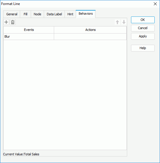
Add button
Select to add a new web behavior line.
Remove button
Select to delete the specified web behavior.
 Move Up button
Select to move the specified web behavior higher in the list. At runtime, when an event bound with more than one action happens, JDashboard triggers the upper action first.
 Move Down button
Select to move the specified web behavior lower in the list.
Events
This column shows the events that you select to trigger the web actions.
Actions
This column shows the web actions that you specify for the events to trigger. Select the ellipsis  in each cell to bind the web action using the Web Action List dialog box.