 Previous Topic
Setting Report Object Properties Using the Inspector Panel
You can update the properties of report objects in Web Report Studio and Report Studio using the Inspector panel. This topic describes how you can use all the properties.
The following table describes the properties of report objects in the Inspector panel of Web Report Studio and Report Studio, except chart properties. For properties specific to charts, see Chart Properties.
Keep in mind the following while browsing the properties:
- Some properties or property values are available to some objects.
- Some properties only show related information, and you cannot edit them.
- Some properties are in different categories for different objects.
- The ways of setting property values described in the Description column of the following properties table are available to Web Report Studio. You may need to use other ways when setting property values in Report Studio. For example, for a Boolean type property, you should select the radio button in the value field to set the value to "true".
- You can control some properties by a formula or expression. If you select a formula to control a property, Report automatically generates an expression with the prefix @. Also, you must let Report Engine know some properties before a page break, so that it can lay out the object. In a formula or expression, the special field PageNumber is the switch for setting the page break calculation time. If you use PageNumber in the formula or expression, then the calculation time will be after the page break, if you do not use PageNumber, the calculation time will be before the page break. For this reason, Report will set the calculation time for controlling whether to mark the formula or expression as before page break or after page break. For most properties, you can control the property by formula or expression at any time without concern about the page break.
| Property Name | Description |
|---|---|
| General Properties | |
| Data Inherit | Server shows whether this object inherits the dataset from another object. This property is read only. |
| Display Name |
Specify the display name of the object.
Data type: String |
| Instance Name | Server shows the instance name of the object. This property is read only. |
| Reference | Server shows the instance name of the field if the label is related to a field. This property is read only. |
| Geometry Properties | |
| Autofit | Specify whether to automatically adjust the width of a vertical banded object or the height of a horizontal banded object according to the contents. Data type: Boolean |
| Height |
Specify the height of the object, in inches. Type a numeric value to change the height.
Data type: Float |
| Width |
Specify the width of the object, in inches. Type a numeric value to change the width.
Data type: Float |
| X |
Specify the horizontal coordinate of the upper-left corner of the object, relative to its parent container. Type a numeric value to change the position in inches.
Data type: Float |
| Y |
Specify the vertical coordinate of the upper-left corner of the object, relative to its parent container. Type a numeric value to change the position in inches.
Data type: Float |
| Bottom Attach Pos X | Specify the horizontal coordinate of the bottom (or right when the line is horizontal) end point of the line in a banded panel. A drawing object can cross panels and the coordinate indicates the relative position in the involved panel. If you exchange the top and bottom end points, this property works on the bottom end point after the exchange.
Data type: Float |
| Bottom Attach Pos Y | Specify the vertical coordinate of the bottom (or right when the line is horizontal) end point of the line in a banded panel. A drawing object can cross panels and the coordinate indicates the relative position in the involved panel.
If you exchange the top and bottom end points, this property works on the bottom end point after the exchange.
Data type: Float |
| Top Attach Pos X | Specify the horizontal coordinate of the top (or left when the line is horizontal) end point of the line in a banded panel. A drawing object can cross panels and the coordinate indicates the relative position in the involved panel.
If you exchange the top and bottom end points, this property works on the top end point after the exchange.
Data type: Float |
| Top Attach Pos Y | Specify the vertical coordinate of the top (or left when the line is horizontal) end point of the line in a banded panel. A drawing object can cross panels and the coordinate indicates the relative position in the involved panel.
If you exchange the top and bottom end points, this property works on the top end point after the exchange.
Data type: Float |
| Color Properties | |
| Background |
Specify the background color of the object.
Select a color from the drop-down list or select Custom to define a color in the Color Picker dialog box. You can also type a hexadecimal RGB value (when the alpha value is 255, for example, 0xff0000) or RGBA value ( when the alpha value is not 255, for example, 0x64ffff33) to specify a color. Data type: String |
| Default Foreground |
Specify the default font color for the new text you type in the object. Select a color from the drop-down list or select Custom to define a color in the Color Picker dialog box. You can also type a hexadecimal RGB value (for example, 0xff0000) to specify a color. Data type: String |
| Fill Type | Specify the fill pattern for the object.
Data type: Enumeration |
| Foreground |
Specify the foreground color of the object. Select a color from the drop-down list or select Custom to define a color in the Color Picker dialog box. You can also type a hexadecimal RGB value (for example, 0xff0000) to specify a color. Data type: String |
| Text Format Properties | |
| Autofit/Auto Fit |
Select true if you want to expand the width and height of the object according to the contents.
Data type: Boolean |
| Auto Map Field Name | This property is available when the label is related to a field. Select true if you want to automatically map the label text to the dynamic display name of the field. Server will ignore the Text property.
Data type: Boolean |
| Auto Scale in Number |
Select true if you want to automatically scale the values that are of the Number data type when the values fall into the two ranges:
The value auto means that the setting follows that of the parent data container. Data type: Boolean |
| Bold | Select true to make the text bold.
Data type: Boolean |
| Default Font Face | Specify the default font face for the new text you type in the object. Choose an option from the drop-down list.
Data type: Enumeration |
| Default Font Size | Specify the default font size for the new text you type in the object. Type an integer value or select a value from the drop-down list to change the size.
Data type: Integer |
| Font Face | Select the font of the text.
Data type: Enumeration |
| Font Size | Specify the font size of the text. Type or select an integer value to change the size.
Data type: Integer |
| Format |
Specify the format in which you want to display the text. It varies with data type, and you can manually define it.
Data type: String
|
| Format Locale |
Specify the locale for displaying and formatting values of the object when its data type is locale sensitive, such as the date and time formats, and number and currency formats. Default is the locale of your JVM or the language of the NLS report. Choose an option from the drop-down list if you want to change the locale.
Data type: String |
| Horizontal Alignment | Select the horizontal justification of the text in the object. Data type: Enumeration |
| Ignore HTML Tag | Specify whether to ignore the HTML tag elements in the text at runtime and in the HTML output.
Data type: Boolean |
| Italic | Select true to make the text italic.
Data type: Boolean |
| Maximum Width |
Specify the maximum width of the text you want to display in the object. Type a numeric value to change the width. This property often works together with the Auto Fit property. When you set Auto Fit of the object to "true" and the value of Maximum Width is not equal to 0, the text extends in the object until the width is this value. Data type: Float |
| Reduce Width When Autofit | Select true if you want to reduce the width of the object according to its content when you specify to automatically adjust its width (the object's Autofit being true) and the actual width of the content is smaller than that of the object.
Data type: Boolean |
| Strikethrough | Select true to add a strikethrough line to the text.
Data type: Boolean |
| Text | Type the text of the label. Data type: String |
| Underline | Select true to underline the text.
Data type: Boolean |
| Vertical Alignment | Select the vertical justification of the text in the object. Data type: Enumeration |
| Word Wrap | Select true to wrap the text to the object width.
Data type: Boolean |
| Border/Title Border/Body Border Properties | |
| Border Color |
Specify the color of the border of the object. Select a color from the drop-down list or select Custom to define a color in the Color Picker dialog box. You can also type a hexadecimal RGB value (for example, 0xff0000) to specify a color. Data type: String |
| Border Thickness | Specify the width of the border in inches. Type a numeric value to change the thickness.
Data type: Float |
| Bottom Line | Select the line style of the bottom border of the object. Data type: Enumeration |
| Box Shadow | Server maps this property to the CSS property box-shadow, as specified by w3.org. Data Type: String |
| Has Border |
Specify whether to show cell borders in the crosstab. Data type: Boolean |
| Left Line | Select the line style of the left border of the object. Data type: Enumeration |
| Right Line | Select the line style of the right border of the object. Data type: Enumeration |
| Shadow |
Specify whether to add a drop shadow effect to the border. Data type: Boolean |
| Shadow Color |
Specify the color of the border shadow. Choose a color from the drop-down list, or select Custom to customize a color in the Color Picker dialog box. You can also type a hexadecimal RGB value (for example, 0xff0000) to specify a color. Data type: String |
| Top Line | Select the line style of the top border of the object. Data type: Enumeration |
| Border Radius Properties | |
| Bottom Left Radius | Specify the radius for the bottom left joint of the borders. Type a numeric value to change the radius. Data type: Float |
| Bottom Right Radius | Specify the radius for the bottom right joint of the borders. Type a numeric value to change the radius. Data type: Float |
| Top Left Radius | Specify the radius for the top left joint of the borders. Type a numeric value to change the radius. Data type: Float |
| Top Right Radius | Specify the radius for the top right joint of the borders. Type a numeric value to change the radius. Data type: Float |
| Padding Properties | |
| Bottom Padding | Specify the space between the text and the bottom border of the object, in inches. Type a numeric value to change the padding.
Data type: Float |
| Left Padding | Specify the space between the text and the left border of the object, in inches. Type a numeric value to change the padding.
Data type: Float |
| Right Padding | Specify the space between the text and the right border of the object, in inches. Type a numeric value to change the padding.
Data type: Float |
| Top Padding | Specify the space between the text and the top border of the object, in inches. Type a numeric value to change the padding.
Data type: Float |
| Others Properties | |
| Bind Column |
Specify the field to bind with the label so you can use the label's shortcut menu to filter and sort records of the bound field at runtime. When you bind a label with a field, you can further set the label's Filterable and Sortable properties to "true" to display the corresponding buttons beside the label for easy filtering and sorting. Data type: String |
| Cache | Specify whether to cache the dataset for this object in the data buffer so other objects which use the same dataset can share the data rather than perform their own SQL query.
Data type: Boolean |
| Cache Section | Select true to cache the objects in the detail panel.
Data type: Boolean
|
| Cache Value |
Specify whether to cache the value of the field instead of obtaining it repeatedly. Data type: Boolean |
| CellPaddingBottom | Specify the space between the text and the bottom border of the filter control. Type a numeric value to change the padding.
Data type: Float |
| CellPaddingTop | Specify the space between the text and the top border of the filter control. Type a numeric value to change the padding.
Data type: Float |
| Column Name |
Server enables this property when you have cleared "Forbid changing column" in the Panel category of the Options dialog box in Designer. You can use it to specify another field to substitute the current one. Choose the field from the drop-down list. Data type: String |
| Cross Page | Select true if you want to split the panel across a page break when the panel exceeds the page height. Default is false. Server will display the panel in the next page, when the panel spans vertically beyond the page. Data type: Boolean |
| Current Block Index | The two properties, Current Block Index and Items per Block, work together to control the data of the object to display in the continuous page mode.
Use Current Block Index to specify the index of the data block you want to display. 0 means the first block index, 1 the second, and so on. Data type: Integer |
| Current Column Block Index |
You can use the four properties together to control the data of the crosstab you want to display in the continuous page mode: Current Column Block Index, Current Row Block Index, Items per Column Block, and Items per Row Block. Current Column Block Index specifies the horizontal index of the data block. 0 means the first block index, 1 means the second, and so on. Data type: Integer |
| Current Row Block Index | You can use the four properties together to control the data of the crosstab you want to display in the continuous page mode: Current Row Block Index, Current Column Block Index, Items per Row Block, and Items per Column Block. Current Row Block Index specifies the vertical index of the data block. 0 means the first block index, 1 means the second, and so on. Data type: Integer |
| Data Mapping File |
Specify the data mapping file (without the locale part) you want to apply to the object for for NLS use. For example, if the data mapping file is Product_de_DE.properties, type Product in the value cell. Data type: String |
| Default for Filter |
Specify whether to display the object as the default data component in the Apply To drop-down list of the Filter dialog box at runtime. Data type: Boolean
|
| Detail Target Frame | Server enables this property after you set Go to Detail of the object to "true". You can use it to specify the target window or frame to display the detail information. Choose an option from the drop-down list.
Data type: String |
| Display Null | Specify the text you want to display if the field value is null. Data type: String |
| Enable Hyperlink in Excel |
Specify whether to enable the link that you have added on the object in the Excel output. Data type: Boolean
|
| Enable Hyperlink in HTML |
Specify whether to enable the link that you have added on the object in the HTML output. Data type: Boolean
|
| Enable Hyperlink in PDF |
Specify whether to enable the link that you have added on the object in the PDF output. Data type: Boolean
|
| Enable Navigation | Specify whether to enable page navigation for a table, or enable scroll bars for a crosstab or banded object, when the parent container cannot fully display its data.
By default, the property value is true. You can further specify the height and width of the frame for holding the object, by setting the two properties Navigation Height and Navigation Width. If later you resize the object, Server will reset the two properties to use the resized values. If the table contains more than one page, a page navigation bar specific to the table will be available under it. You can use the bar to view the pages you want. Data type: Boolean |
| Expand Data |
Specify whether to enable users to expand/collapse the column/row groups in the crosstab. Data type: Boolean |
| Expand Detail Data | Specify whether to expand the groups to show the details when you open the report in Web Report Studio. This property only works in the continuous page mode.
Data type: Boolean |
| Export as Text |
Enable this property if you want to export the parameter control as text. Otherwise, Report will export the parameter control as an image.
When you enable this property, depending on the properties of the parameter in the parameter control, Report will export the parameter control as follows:
Data Type: Boolean |
| Export to CSV | Specify whether to include the object when exporting the report to CSV.
Data type: Boolean |
| Export to Excel | Specify whether to include the object when exporting the report to Excel.
Data type: Boolean |
| Export to HTML | Specify whether to include the object when exporting the report to HTML.
Data type: Boolean |
| Export to PDF | Specify whether to include the object when exporting the report to PDF.
Data type: Boolean |
| Export to PostScript | Specify whether to include the object when exporting the report to PostScript.
Data type: Boolean |
| Export to Report Result |
Specify whether to include the object when you open the report in Web Report Studio or in the Web Report Result.
Data type: Boolean |
| Export to RTF | Specify whether to include the object when exporting the report to RTF.
Data type: Boolean |
| Export to Text | Specify whether to include the object when exporting the report to Text.
Data type: Boolean |
| Export to XML | Specify whether to include the object when exporting the report to XML.
Data type: Boolean |
| Field Type | Select another special field you want to substitute the current special field. Data type: Enumeration |
| Fill Whole Page | Select true to extend the row/panel to the bottom of the page, so that the next row/panel starts on a new page.
Data type: Boolean |
| Filter Options |
Specify the filter commands that you want to display on the object's shortcut menu in Page Report Studio. Data type: Integer |
| Filterable | Specify whether to display a filter button beside the label at runtime, so you can select the button to filter the records based on values of the field that you specify via the Bind Column property. Data type: Boolean |
| Go to Detail |
Specify whether to show the detail information about the group when you select the object in Page Report Studio. Data type: Boolean |
| Horizontal Alignment | Select the horizontal justification of the contents in the object, or of the image in the container.
Data type: Enumeration |
| Invisible |
Select true to hide the object. Server will still perform all formulas and calculations. You can also use a formula to control this property. Data type: Boolean
|
| Invisible for Filter Dialogs |
Specify whether to display the object in the Apply To drop-down list of the Filter dialog box at runtime. Server disables this property when you set Default for Filter of the object to "true". Data type: Boolean |
| Items per Block | The two properties, Current Block Index and Items per Block, work together to control the data of the object to display in the continuous page mode.
Use Item per Block to specify the number of records in each data block. Data type: Integer |
| Items per Column Block |
You can use the four properties together to control the data of the crosstab you want to display in the continuous page mode: Current Row Block Index, Current Column Block Index, Items per Row Block, and Items per Column Block. Items per Column Block specifies the number of the column records in each data block. Data type: Integer |
| Items per Row Block |
You can use the four properties together to control the data of the crosstab you want to display in the continuous page mode: Current Row Block Index, Current Column Block Index, Items per Row Block, and Items per Column Block. Items per Row Block specifies the number of the row records in each data block. Data type: Integer |
| Label | Specify the text you want Server to pop up when you hover over the left edge of the panel.
Data type: String |
| Link |
Specify the target that you want to link the object to, which can be another report, a website, an email address, or a Blob data type field. Data type: String |
| Merge to Next Panel | Select true to merge the panel into the next panel in the Excel output.
Data type: Boolean |
| Minimum Leaf Distance | Specify the minimum distance between two adjacent leaf nodes on the same level. For top-down and bottom-up layouts, it means horizontal distance. For left-right layout, it means vertical distance. Type a numeric value to specify the distance.
Data type: Float |
| Minimum Level Distance | Specify the minimum distance between two adjacent levels. For top-down and bottom-up layouts, it means vertical distance. For left-right layout, it means horizontal distance. When running the report in the Web Report format, if the value of Minimum Level Distance is less than that of Line Thickness on org chart line, the latter will replace the former.
Data type: Float |
| Navigation Height | Specify the height of the frame for holding the object. Type a numeric value to specify the height. If you don't provide a value here, Report will calculate the frame height.
Data type: Float |
| Navigation Width | Specify the width of the frame for holding the object. Type a numeric value to specify the width. If you don't provide a value here, Report will calculate the frame width.
Data type: Float |
| On New Page | Select true to display the row/panel on a new page. Default is false, and the row/panel starts on a new page only if the previous page is filled.
Data type: Boolean |
| Order By |
Server displays this property when you use the DBField as a column/row field in a crosstab. You can use it to specify the field by which you want to sort the crosstab column/row header. Data type: String |
| Overflow | This property is mapped to the CSS property overflow, as specified by w3.org. Report's default behavior is doing nothing for the overflow content. You can select how you want the web browser to handle overflow in the text. Data type: Enumeration |
| Page Background | Specify the background color of the report page. Select a color from the drop-down list or select Custom to define a color in the Color Picker dialog box. You can also type a hexadecimal RGB value (for example, 0xff0000) to specify a color. Data type: String |
| Position | Specify the position of the object.
Data type: Enumeration
|
| Record Location | Specify the calculation point for the properties of the object which you control by formulas.
Data type: Enumeration |
| Remove Blank Row | Select true to remove blank rows in the panel in the Excel output.
Data type: Boolean |
| Remove Extra Quotes from First Line | Select true to remove the quotation marks and commas from the first line of the report's Text and CSV outputs.
Data type: Boolean |
| Repeat | Specify whether to display the group header on every page. For one detail panel which spans a large space vertically to display in several pages, Report supports the Repeat property if you want to see the group header information in each page. When the Repeat property is true and group header is visible, Server duplicates the group header on every page.
Data type: Boolean |
| Repeat in Detail Panel | Select true to make the objects in the panel repeated in the detail panel in the Excel output.
Data type: Boolean |
| Repeat on Pages | Specify whether to display the table header on every page of the report.
Data type: Boolean |
| Shrink Footer | Specify whether to hide the group footer panel when collapsing a group. This property only works in the continuous page mode.
Data type: Boolean |
| Sortable | Specify whether to display a sort button beside the label at runtime, so you can select the button to sort records of the field you specify via the Bind Column property in ascending or descending order. Data type: Boolean |
| Split Overflow Columns | Select true to display a big table with many columns on multiple pages if one page cannot hold all the columns, instead of cutting the overflow columns off - the default behavior.
When the property is true, the table object containing overflow columns on subsequent pages inherits the same Y value in its container, so that it keeps the same number of records as the table in the original page. However, Server resets its X value to 0 for both static and absolute positions, to show as many columns as possible. The height of each table row for overflow columns is the same as the corresponding row height in the original page. Data type: Boolean |
| Suppress | Select true if you want to hide the object in the report. Server will skip all formulas and calculations. If you see the formula button  in the value box, you can also use a formula to control this property. in the value box, you can also use a formula to control this property.Data type: Boolean
|
| Suppress Aggregate | This property is available to labels (excluding summary labels) in a crosstab. Select true to hide the Total row or column.
Data type: Boolean |
| Suppress Blank Panel | Select true to hide the panel if it contains no data. Data type: Boolean |
| Suppress Object Space If Not Exported | Select true to suppress the space for holding the objects in the report output if you don't include them for exporting. Data type: Boolean |
| Suppress When Empty | Select true to hide the object in the report when it contains no contents.
Data type: Boolean |
| Suppress When No Records | Select true to hide the object in the report when no records return to its parent data component.
Data type: Boolean |
| Suppress When Null |
Specify whether to suppress the field in the report when its value is null. Data type: Boolean |
| Tile Detail Panel | Select true to tile records in the detail panel.
For a vertical banded object, you can tile each set of records in the detail panel when viewing the report if you set this property to true and set the detail panel's width/height equal to or less than 1/2 that of the banded object. The detail panel width determines the width of each record tile. You will find this property is useful when you are making a mail-label format report. You can insert a blank banded object in a report, then in the Inspector panel, select the detail panel, and set the properties: Tile Detail Panel = true Data type: Boolean
|
| Tile Horizontal | If you set the Tile Detail Panel property of the detail panel to true, you can further specify the direction for tiling records in the detail panel.
Data type: Boolean |
| To Bottom | Select true to move the banded object footer panel to the bottom of the page. Default is false, which means that the banded object footer displays at the end of the banded object.
Data type: Boolean |
| Transfer Style |
Specify whether to apply the style group of the primary report to the linked report, when the object is linked to another report. Data type: Boolean |
| Underlay | Select true if you want to layer the panel beneath the next panel in the banded object. You can use a panel layered beneath a subsequent panel to contain a background picture or watermark. Data type: Boolean
|
| Value Delimiter |
Specify the separator for DBArray data. Type the delimiter in the value cell. Data type: String |
| Vertical Alignment | Select the vertical justification of the contents in the object, or of the image in the container. Data type: Enumeration |
| White Space | Server maps this property to the CSS property white-space, as specified by w3.org. Report's default behavior is doing nothing for the white spaces. You can select how you want the web browser to handle white spaces in the text area. |
| Alternating Line Color Properties | |
| Direction | Specify whether the color defined by the Pattern List property will apply to the fields in the same rows or columns in the crosstab.
This property takes effect when the Show property is true.
Data type: Enumeration |
| Include Header and Footer | When the property is false, alternating color only applies to the table detail rows. Select true if you want to also apply alternating color to the footer, group headers, and group footers of the table. All table rows except the table header will use alternating color. It takes effect when the Show property is true. Data type: Boolean |
| Pattern List | Specify the color patterns of the alternating color for the table rows. Select the ellipsis button  in the value cell to specify the patterns in the Color List dialog box. in the value cell to specify the patterns in the Color List dialog box.This property takes effect when the Show property is true. Data type: String |
| Show | Specify whether to enable setting alternating line color for the crosstab, or for the table rows. Data type: Boolean
|
| Crosstab Property | |
| Avoid Orphan Header |
Specify whether to display the column headers together with the data. When you enable this property, if the column headers happen to be at the bottom of a page, Server displays them together with the data on the next page. Data type: Boolean |
| Block Gap |
Specify the space between each part when the crosstab is split into more than one part. Type a numeric value to change the gap. Data type: Float |
| Boundary Value |
Specify the number of columns in one aggregate cell when the crosstab displays horizontally, or the number of rows in one aggregate cell when the crosstab displays vertically. Type an integer value to change the number. Data type: Integer |
| Column Totals on Left | Select true to display the Total columns on the left of the aggregates.
Data type: Boolean |
| Horizontal Gap |
Specify the space between the left/right edge of a crosstab cell and the content in it. Type a numeric value to change the gap. Data type: Float |
| Outside Aggregate Title |
Specify whether to place the aggregate field labels on the leftmost column when the aggregate layout is vertical, or on the topmost row of the crosstab when the aggregate layout is horizontal. Enabling this property would make the labels of the aggregate fields far from their values. Data type: Boolean |
| Repeat Aggregate |
Specify whether to repeat the crosstab for different aggregate fields. Data type: Boolean |
| Repeat Column Header |
Specify whether to display the column headers on every page when the crosstab spans more than one page. Data type: Boolean |
| Row Totals on Top | Select true to display the Total rows on the top of the aggregates.
Data type: Boolean |
| Suppress Column Header | Select true to suppress the column header of the crosstab.
Data type: Boolean |
| Suppress Row Header | Select true to suppress the row header of the crosstab.
Data type: Boolean |
| Use Table Style |
Specify whether to add labels to the Total rows and columns. Enabling this property may make the row and column labels repeated too much. Data type: Boolean |
| Vertical Gap |
Specify the space between the top/bottom edge of a crosstab cell and the content in it. Type a numeric value to change the gap. Data type: Float |
| Vertical Layout | Specify whether to display the aggregate fields vertically in the crosstab. Data type: Boolean |
| CSS Properties | |
| Class | Specify the name of the Class Selector to apply to the object, which you define in the CSS file of the style the report applies in the Report Designer Guide. For example, if you define the CSS file as follows:
To apply the Class Selector in the file to the object, type C in the value cell. Data type: String |
| ID |
Specify the name of the ID Selector to apply to the object, which you define in the CSS file of the style the report applies. For example, to apply the ID Selector in the preceding sample CSS file to the object, type W in the value cell. Data type: String |
| Style | Specify the style you want to apply to the object. Type the style which should be an Attribute Selector whose attribute is "style" in the CSS file of the style the report applies.
For example, to apply the style in the preceding sample CSS file to the object, type LabelX in the value cell. Data type: String |
| Excel Properties | |
| Columned | Select true if you want to improve the engine performance when exporting the report to CSV and Excel.
Right after you set the Columned property to true from false each time, Report will recalculate the values of the other Excel properties of the line objects in the report and reset the values to the defaults: Top Attach Column, Top Attach Row, Bottom Attach Column, and Bottom Attach Row. Server calculates the default values based on the position of each line object in the report. There is an exception: if both the Export to Excel and Export to CSV properties of a line object are false, Server will not recalculate the values of these properties and will preserve them as before. When you set the Columned property to true:
When the property is false, the specified values for the preceding Excel properties of the line objects in the report do not apply when you export the report to CSV or Excel. Data type: Boolean |
| Column Index | Specify the X coordinate of the object relative to its parent container in the Excel and CSV outputs of the report, measured in cells. This property takes effect only when the Columned property of the web report is "true" and Position of the object is not "static".
Data type: Integer |
| Row Index | Specify the Y coordinate of the object relative to its parent container in the Excel and CSV outputs of the report, measured in cells. This property takes effect only when the Columned property of the web report is "true" and Position of the object is not "static".
Data type: Integer |
| Bottom Attach Column | Specify the X coordinate of the lower right corner of the object in the Excel output file, measured in cells.
Data type: Float |
| Bottom Attach Row | Specify the Y coordinate of the lower right corner of the object in the Excel output file, measured in cells.
Data type: Float |
| Top Attach Column | Specify the X coordinate of the upper-left corner of the object in the Excel output file, measured in cells.
Data type: Float |
| Top Attach Row | Specify the Y coordinate of the upper-left corner of the object in the Excel output file, measured in cells.
Data type: Float |
| Group Layout Properties | |
| Keep Group Together | Select true to keep the whole group together.
Data type: Boolean |
| Repeat While Group Footer | Select true if you want to repeat the group header when a page break occurs on the group footer, after you set the group header to be repeated.
Data type: Boolean |
| Image Property | |
| Alternate Text | Specify the text that will display instead if Server cannot display the image.
Data type: String |
| Disabled | Select true to disable the actions on the image.
Data type: Boolean |
| Image Name | Specify the file name of the image. The image can be one on your local file system or retrieved using a URL. Data type: String |
| Maximum Scaling Ratio | Specify the maximum ratio up to which you can scale the image. By default, the scaling ratio of the image is not limited. If you set the ratio to any value greater than 0, the actual scaling ratio is less than or equal to it. Data type: Float |
| Name | Specify the name of the image.
Data type: String |
| Rotation | Specify the angle at which you want to rotate the image, in degrees. The following is the meaning of different values:
Data type: Float |
| Scaling Mode |
Data type: Enumeration |
| Title | Specify the tip information about the image, which will display when you hover over the image in the Web Report result.
Data type: String |
| Line Property | |
| Enable Bottom Arrow | Specify whether to use an arrow as the bottom (or right when the line is horizontal) end of the line. If you exchange the top and bottom ends, this property works on the bottom end after the exchange.
Data type: Boolean |
| Enable Top Arrow | Specify whether to use an arrow as the top (or left when the line is horizontal) end of the line. If you exchange the top and bottom ends, this property works on the top end after the exchange.
Data type: Boolean |
| Line Color | Specify the color of the line. Select a color from the drop-down list or select Custom to define a color in the Color Picker dialog box. You can also type a hexadecimal RGB value (for example, 0xff0000) to specify a color. Data type: String |
| Line Style | Select the style of the line. Data type: Enumeration |
| Line Thickness | Specify the thickness of the line. Type a numeric value to change the thickness.
Data type: Float |
| Object Settings Properties | |
| Archive | Specify the character string that you can use to implement your own archive functionality for the object.
Data type: String |
| Class ID | Specify the class identifier of the object.
Data type: String |
| Code Base | Specify the base path you use to resolve relative URI specified by the Class ID and Archive properties. When null, its default value is the base URI of the current report.
Data type: String |
| Value Type | Specify the MIME (Multipurpose Internet Mail Extensions) type of the object.
Data type: String |
| Paper Properties | |
| Height | Specify the height of the page in inches or centimeters. The Width and Height values change when Orientation changes. The Page Type setting determines the Width and Height values, but you can change the latter as you want. Type a numeric value to change the height.
Data type: Float |
| Height Autofit | Specify whether to dynamically calculate the page height according to the height of the contents within the page.
Data type: Boolean |
| Orientation | Specify how to position the report page. The Orientation setting affects the Width and Height values.
Data type: Enumeration |
| Page Type | Specify the report page dimensions. Choose a size from the drop-down list.
Data type: Enumeration |
| Width | Specify the width of the page in inches or centimeters. The Width and Height values change when Orientation changes. The Page Type setting determines the Width and Height values, but you can change the latter as you want. Type a numeric value to change the width.
Data type: Float |
| Width Autofit | Specify whether to dynamically calculate the page width according to the width of the contents within the page.
Data type: Boolean |
| Pattern Properties | |
| Pattern Color |
Specify the color in which you want to draw a pattern to fill the object. Choose a color from the drop-down list, or select Custom to customize a color in the Color Picker dialog box. You can also type a hexadecimal RGB value (for example, 0xff0000) to specify a color. Data type: String |
| Pattern Style |
Specify the style of the pattern. Choose an item from the drop-down list.
Data type: String |
| Margin Properties | |
| Bottom Margin | Specify the distance in inches or centimeters between the bottom page edge and the data area (the report for Banded Page Panel in a banded object). Type a numeric value to change the margin.
Data type: Float |
| Left Margin | Specify the distance in inches or centimeters between the left page edge and the data area (the report for Banded Page Panel in a banded object). Type a numeric value to change the margin.
Data type: Float |
| Right Margin | Specify the distance in inches or centimeters between the right page edge and the data area (the report for Banded Page Panel in a banded object). Type a numeric value to change the margin.
Data type: Float |
| Top Margin | Specify the distance in inches or centimeters between the upper page edge and the data area (the report for Banded Page Panel in a banded object). Type a numeric value to change the margin.
Data type: Float |
| Title Properties | |
| Background |
Specify the background color of the title bar. Select a color from the drop-down list or select Custom to define a color in the Color Picker dialog box. You can also type a hexadecimal RGB value (for example, 0xff0000) to specify a color. Data type: String |
| Bold | Select true to make the text bold in the title bar.
Data type: Boolean |
| Font Face | Select the font of the text in the title bar. Data type: Enumeration |
| Font Size | Specify the font size of the text in the title bar. Type or select an integer value to change the size.
Data type: Integer |
| Foreground | Specify the foreground color of the title bar. Select a color from the drop-down list or select Custom to define a color in the Color Picker dialog box. You can also type a hexadecimal RGB value (for example, 0xff0000) to specify a color. Data type: String |
| Horizontal Alignment | Select the horizontal justification of the text in the title bar. Data type: Enumeration |
| Italic | Select true to make the text italic in the title bar.
Data type: Boolean |
| Map Name | Specify whether you want to display the name of the field you added to the filter control as the title in the title bar.
Data type: Boolean |
| Show Title | Specify whether to show the title bar. It is meaningful to set all the other properties in the Title category when this property value is true.
Data type: Boolean |
| Title Height | Specify the height of the title, to ensure larger font sizes display without being cut off. Type a numeric value to change the height.
Data type: Float |
| Text | Type the text you want to display in the title bar. For a filter control, you can edit this property only when you set Map Name to "false".
When you add only one DBField to the text list filter control and insert the On-screen Filter special field in a data container that uses the same data resource as the DBField, Report also applies the text in the filter expression of the special field. Data type: String |
| Underline | Select true to underline the text in the title bar.
Data type: Boolean |
| Body Properties | |
| Background |
Specify the background color for the body of the object. Select a color from the drop-down list or select Custom to define a color in the Color Picker dialog box. You can also type a hexadecimal RGB value (for example, 0xff0000) to specify a color. Data type: String |
| TOC Properties | |
| Anchor Display Value |
Specify the text you want to display as the object's TOC entry label, when you set the object's TOC Anchor property to "true". Data type: String |
| TOC Anchor |
Specify whether to include the object in the TOC of the report. Data type: Boolean |
| Accessibility Properties | |
| Abbr |
This property is mapped to the HTML attribute abbr, as specified by w3.org. Data type: String
|
| Axis |
This property is mapped to the HTML attribute axis, as specified by w3.org. Data type: String
|
| External AccessKey |
This property is mapped to the HTML attribute accesskey, as specified by w3.org. Data type: String |
| External CSS Class Selector |
Specify the name of the Class Selector for the object in the HTML output. Data type: String |
| External Dir |
This property is mapped to the HTML attribute dir, as specified by w3.org. Data type: String |
| External ID |
This property is mapped to the HTML attribute id, as specified by w3.org. Data type: String |
| External Style |
This property is mapped to the HTML attribute style, as specified by w3.org. Data type: String |
| External TabIndex |
This property is mapped to the HTML attribute tabindex, as specified by w3.org. Data type: Integer |
| External Title |
This property is mapped to the HTML attribute title, as specified by w3.org. Data type: String |
| Headers |
This property is mapped to the HTML attribute headers, as specified by w3.org. Data type: String
|
| HrefLang |
This property is mapped to the HTML attribute hreflang, as specified by w3.org. You can use it to specify the base language of the resource designated by a link on the object, such as the target you define via the Link property. Data type: String |
| Language |
This property is mapped to the HTML attribute lang, as specified by w3.org. Data type: String |
| LongDesc |
This property is mapped to the HTML attribute longdesc, as specified by w3.org. Data type: String |
| Scope |
This property is mapped to the HTML attribute scope, as specified by w3.org. Choose an option from the drop-down list to specify the set of data cells for which the current header cell provides header information in the accessible HTML output.
Data type: Enumeration
|
| Summary |
This property is mapped to the HTML attribute summary, as specified by w3.org. Data type: String |
| Tag Name |
Specify the header tag name of the object for labeling its heading order in the accessible PDF output. Choose an option from the drop-down list. When setting this property, you should nest the headers properly based on the following rules so that Adobe can accept the heading tag sequence.
Data type: Enumeration
|
 , or as
  if you clear the checkbox.
Merge to Next Panel, Repeat in Detail Panel, and Remove Blank Row
You can control panels of a banded object in the Excel output by setting the three properties:
- Merge to Next Panel controls whether to merge current panel to the next panel. It applies to the banded header, banded page header, group header, and group footer panels.
- Repeat in Detail Panel controls whether to repeat certain panel with the detail panel. It applies to the group header and banded page header panels.
- Remove Blank Row controls whether to remove blank rows in the panel. It applies to the banded page header, group header, and detail panels.
The three properties take effect only when you set the Columned property of the web report to true. Server follows the operation order when the three properties work together: Merge to Next Panel > Repeat in Detail Panel > Remove Blank Row.

- Do not set Merge to Next Panel to true for the last group footer panel, because it will make the Excel output incorrect.
- Do not set Merge to Next Panel to true for the panel that contains crosstabs or subreports.
- When you specify to repeat a group header panel, if there is a chart in the panel, Server does not repeat the chart.
- If a banded object contains more than one group-by fields, that is to say, it has several group header panels, when you specify to repeat the first group header panel in the detail panel, Server will repeat it in the second group header panel as well.
Bottom Attach Column, Bottom Attach Row, Top Attach Column, Top Attach Row
The four properties work together to control the position of a line in the Excel output file. They take effect when you set the Columned property of the web report to true.
The first pair of the properties (Top Attach Column, Top Attach Row) locates a cell and uses its upper left corner as the upper-left corner of the line, while the second pair (Bottom Attach Column, Bottom Attach Row) locates another cell and uses its upper left corner as the lower right corner of the line.
For example, if you set the properties for an oval as:
Top Attach Column: 1, Top Attach Row: 2, Bottom Attach Column: 3, Bottom Attach Row: 4
Then, the upper left cell will be A2 and the lower right cell will be C4.
The value you set for the Top Attach Column (Top Attach Row) property should be always larger than that for the Bottom Attach Column (Bottom Attach Row) property.
- If a table contains a merged cell that is across columns and there are absolutely positioned objects in the cell, when you exclude a column which is not the last column for this merged cell from the report output, Report Engine recalculates the X coordinates of these objects that are in the excluded column and tries to display them in the output if space allows; however, this may result in that some objects get overlapped in their new position in the output.
- Because one cell in Excel can only contain one value, if you exclude a table column from the Excel output, Report Engine is not able to display the value of a data field which is originally in the excluded column in the Excel output if the new position of the field is in a cell that already contains a value, even when the field satisfies the conditions as described earlier.
Expand Data, Expand Detail Data
For crosstabs in a page report, if they contain more than one column/row group level, you can specify whether to enable expanding and collapsing the column/row groups at runtime, and set the default expanding/collapsing state of groups in the outer level. You can control this behavior by two properties: Expand Data and Expand Detail Data.
- Expand Data
A property on crosstab, and DBFields and formulas in crosstab as column/row fields. This property on crosstab controls whether to enable users to expand and collapse the column/row groups in the crosstab. When you enable the property on a crosstab, you can use the property on DBFields and formulas in the crosstab to specify whether to expand and collapse the corresponding column/row groups respectively. - Expand Detail Data
A property on DBFields and formulas in crosstab as column/row fields. You can use it to specify whether to expand details of specific column/row groups in a crosstab by default.
These two properties work only in the continuous page mode and do not apply to the innermost column/row group. After setting the two properties, if you further modify the crosstab layout, they may not take effect.
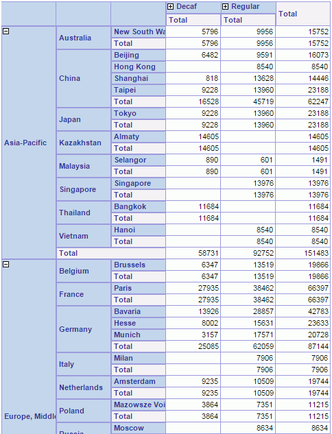
Suppose you have a crosstab which shows Product Type Name and Category as the column groups, Region, Country, and State as the row groups, and displays summaries for Quantity.
- In the Inspector, set the Expand Data property of the crosstab to true.
- Select the DBField Country and set its Expand Data property to false.
- Set the Expand Detail Data property of Product Type Name to false.
- Open the crosstab in the continuous page mode in Page Report Studio.
-
Select the icons with a plus or minus sign to expand and collapse the details of the Region and Product Type Name groups. Since Expand Data of Country is "false", you cannot expand the details of this group; Expand Detail Data of Product Type Name is "false" so the details of this group are not expanded by default.
 Back to top