 Previous Topic
Label Properties
This topic describes the properties of a Label object.
Designer provides some properties only when you use the object in certain report types. You can get details from the Available For column in the property table.
| Property Name | Available For | Description |
|---|---|---|
| General | ||
| Class Type | Query Page Report | Shows the class type of the object. Read only. |
| Instance Name | Query Page Report | Shows the instance name of the object. Read only. |
| Reference | Query Page Report | Shows the instance name of the field if the label is related to a field. Read only. |
| Text Format | ||
| Auto Fit | Page Report, Web Report, Library Component | Specifies whether to automatically adjust the width and height of the object according to its content.
Data type: Boolean
|
| Auto Map Field Name | Page Report, Web Report, Library Component | Designer enables this property when the label is related to a field. You can use it to specify whether to apply the display name of the field as the label text, and map the label text to the dynamic display name of the field at runtime if the Server administrator defines it. Data type: Boolean |
| Bold | Page Report, Web Report, Library Component | Specifies whether to apply bold formatting to the text in the object. Data type: Boolean |
| Convert HTML Tag | Query Page Report | Specifies whether to parse the HTML tag elements that are included in the text of the object as the web browser translates them into HTML in the report. Data type: Boolean
|
| Font Face | Page Report, Web Report, Library Component | Specifies the font face of the text in the object. Choose an option from the drop-down list.
Data type: Enumeration |
| Font Size | Page Report, Web Report, Library Component | Specifies the font size of the text in the object. Type an integer value to change the size. Data type: Integer |
| Horizontal Alignment | Page Report, Web Report, Library Component | Specifies the horizontal justification of the text in the object. Choose an option from the drop-down list.
Data type: Enumeration
|
| Ignore HTML Tag | Page Report, Web Report, Library Component | Specifies whether to ignore the HTML tag elements that are included in the text of the object at runtime and in HTML output, so they display exactly as what they are. When you set this property to "false", Report Engine transfers the HTML tag elements to the web browser and they are translated into HTML by the web browser. Data type: Boolean |
| Italic | Page Report, Web Report, Library Component | Specifies whether to italicize the text in the object. Data type: Boolean |
| Maximum Width | Query Page Report | Specifies the maximum width of the text you want to display in the object. Type a numeric value to change the width. This property often works together with the Auto Fit property. When you set Auto Fit of the object to "true" and the value of Maximum Width is not equal to 0, the text extends in the object until the width is this value. Data type: Float |
| Reduce Width When Auto Fit | Page Report, Web Report, Library Component | Specifies whether to reduce the width of the object according to its content when you specify to automatically adjust its width (set the object's Auto Fit property to "true") and the actual width of the content is smaller than that of the object. Data type: Boolean
|
| Strikethrough | Page Report, Web Report, Library Component | Specifies whether to draw a line through the text in the object.
Data type: Boolean |
| Text | Page Report, Web Report, Library Component | Specifies the text in the label. Type a string to display as the label text.
Data type: String
|
| Underline | Page Report, Web Report, Library Component | Specifies whether to add a horizontal line under the text in the object. Data type: Boolean |
| Vertical Alignment | Page Report, Web Report, Library Component | Specifies the vertical justification of the text in the object. Choose an option from the drop-down list.
Data type: Enumeration
|
| Word Wrap | Page Report, Web Report, Library Component | Specifies whether to wrap the text according to the width of the object.
Data type: Boolean |
| Geometry (not available when the label is in a crosstab or heat map) | ||
| Height | Page Report, Web Report, Library Component | Specifies the height of the object. Type a numeric value to change the height. Data type: Float |
| Width | Page Report, Web Report, Library Component | Specifies the width of the object. Type a numeric value to change the width. Data type: Float |
| X | Page Report, Web Report, Library Component | Specifies the horizontal coordinate of the object's top left corner, relative to its parent container, when the object is not in static position in the container. Type a numeric value to change the coordinate.
Data type: Float |
| Y | Page Report, Web Report, Library Component | Specifies the vertical coordinate of the object's top left corner, relative to its parent container, when the object is not in static position in the container. Type a numeric value to change the coordinate.
Data type: Float |
| Color | ||
| Background | Page Report, Web Report, Library Component | Specifies the background color of the object. Choose a color from the drop-down list, or select Custom to customize a color in the Pick a Color dialog box. You can also type a hexadecimal RGB or RGBA value (for example, 0x00ff11 or 0xff00ff11) to specify a color. Data type: String |
| Foreground | Page Report, Web Report, Library Component | Specifies the foreground color of the object. Choose a color from the drop-down list, or select Custom to customize a color in the Pick a Color dialog box. You can also type a hexadecimal RGB value (for example, 0xff0000) to specify a color. Data type: String |
| CSS | ||
| Class | Page Report, Web Report, Library Component | Specifies the name of the Class Selector to apply to the object, which you define in the CSS file of the style the report applies.
For example, if you define the CSS file as follows:
To apply the Class Selector in the file to the object, type C in the value cell. Data type: String |
| ID | Page Report, Web Report, Library Component | Specifies the name of the ID Selector to apply to the object, which you define in the CSS file of the style the report applies. For example, to apply the ID Selector in the preceding sample CSS file to the object, type W in the value cell. Data type: String |
| Style | Page Report, Web Report, Library Component | Specifies the style you want to apply to the object. You can specify the style in two ways:
Data type: String |
| Excel (not available when the label is in a crosstab) | ||
| Column Index | Page Report, Web Report | Specifies the X coordinate of the object relative to its parent container in the Excel and CSV outputs, measured in cells. Data type: Integer
|
| Row Index | Page Report, Web Report | Specifies the Y coordinate of the object relative to its parent container in the Excel and CSV outputs, measured in cells. Data type: Integer
|
| Padding (not available when the label is in a heat map or displays as a Checkbox or Radio Button web control) | ||
| Bottom Padding | Page Report, Web Report, Library Component | Specifies the space between the content in the object and the bottom border of the object. Type a numeric value to change the padding. Data type: Float |
| Left Padding | Page Report, Web Report, Library Component | Specifies the space between the content in the object and the left border of the object. Type a numeric value to change the padding. Data type: Float |
| Right Padding | Page Report, Web Report, Library Component | Specifies the space between the content in the object and the right border of the object. Type a numeric value to change the padding. Data type: Float |
| Top Padding | Page Report, Web Report, Library Component | Specifies the space between the content in the object and the top border of the object. Type a numeric value to change the padding. Data type: Float |
| Border Radius (available when the label displays as a Text Field, Password, Text Area, Button, or Image Button web control) | ||
| Bottom Left Radius | Page Report, Web Report | Specifies the radius for the bottom left joint of the borders. Type a numeric value to change the radius. Data type: Float |
| Bottom Right Radius | Page Report, Web Report | Specifies the radius for the bottom right joint of the borders. Type a numeric value to change the radius. Data type: Float |
| Top Left Radius | Page Report, Web Report | Specifies the radius for the top left joint of the borders. Type a numeric value to change the radius. Data type: Float |
| Top Right Radius | Page Report, Web Report | Specifies the radius for the top right joint of the borders. Type a numeric value to change the radius. Data type: Float |
| Border (not available when the label is in a heat map) | ||
| Border Color | Page Report, Web Report, Library Component | Specifies the color for the border of the object. Choose a color from the drop-down list, or select Custom to customize a color in the Pick a Color dialog box. You can also type a hexadecimal RGB value (for example, 0xff0000) to specify a color. Data type: String |
| Border Thickness | Page Report, Web Report, Library Component | Specifies the width for the border of the object. Type a numeric value to change the thickness.
Data type: Float |
| Bottom Line | Page Report, Web Report, Library Component | Specifies the line style for the bottom border of the object. Choose an option from the drop-down list.
Data type: Enumeration |
| Box Shadow | Page Report, Web Report | Designer displays this property only when the label displays as a Button or Image Button web control. It is mapped to the box-shadow CSS property, as specified by w3.org. Select the ellipsis  in the value cell to specify the drop shadows you want to attach to the button in the Box Shadow Generator dialog box. in the value cell to specify the drop shadows you want to attach to the button in the Box Shadow Generator dialog box.Data Type: String |
| Left Line | Page Report, Web Report, Library Component | Specifies the line style for the left border of the object. Choose an option from the drop-down list.
Data type: Enumeration |
| Right Line | Page Report, Web Report, Library Component | Specifies the line style for the right border of the object. Choose an option from the drop-down list.
Data type: Enumeration |
| Shadow | Page Report, Web Report, Library Component | Specifies whether to add a drop shadow effect to the border.
Data type: Boolean |
| Shadow Color | Page Report, Web Report, Library Component | Specifies the color of the border shadow. Choose a color from the drop-down list, or select Custom to customize a color in the Pick a Color dialog box. You can also type a hexadecimal RGB value (for example, 0xff0000) to specify a color. Data type: String |
| Top Line | Page Report, Web Report, Library Component | Specifies the line style for the top border of the object. Choose an option from the drop-down list.
Data type: Enumeration |
| Pattern | ||
| Pattern Color | Page Report, Web Report, Library Component | Specifies the color in which to draw a pattern to fill the object. Choose a color from the drop-down list, or select Custom to customize a color in the Pick a Color dialog box. You can also type a hexadecimal RGB value (for example, 0xff0000) to specify a color. Data type: String |
| Pattern Style | Page Report, Web Report, Library Component | Specifies the style of the pattern. Choose an option from the drop-down list.
Data type: String |
| Others | ||
| Bind Column | Page Report, Web Report, Library Component | Specifies the field to bind with the label so users can use the label's shortcut menu to filter and sort records of the bound field at runtime. When you bind a label with a field, you can further set the label's Filterable and Sortable properties to "true" to display the corresponding buttons beside the label for easy filtering and sorting.
Data type: String
|
| Detail Report | Query Page Report | Specifies the detail report that you want to link the object to. Select the ellipsis in the value cell to set the detail report. See Linking to a Detail Report.
Data type: String
|
| Detail Target Frame | Query Page Report | Designer displays this property when the object is in the group header/footer panel of a banded object, and enables it after you set Go to Detail of the object to "true". You can use it to specify the target window or frame to display the detail information. Choose an option from the drop-down list.
Data type: String |
| Enable Hyperlink in Excel | Page Report, Web Report, Library Component | Specifies whether to enable the link that you have added on the object in the Excel output. Data type: Boolean
|
| Enable Hyperlink in HTML | Page Report, Web Report, Library Component | Specifies whether to enable the link that you have added on the object in the HTML output. Data type: Boolean
|
| Enable Hyperlink in PDF | Page Report, Web Report, Library Component | Specifies whether to enable the link that you have added on the object in the PDF output. Data type: Boolean
|
| Export to CSV | Page Report, Web Report, Library Component | Specifies whether to include the object in the CSV output.
Data type: Boolean
|
| Export to Excel | Page Report, Web Report, Library Component | Specifies whether to include the object in the Excel output.
Data type: Boolean
|
| Export to HTML | Page Report, Web Report, Library Component | Specifies whether to include the object in the HTML output.
Data type: Boolean |
| Export to PDF | Page Report, Web Report, Library Component | Specifies whether to include the object in the PDF output.
Data type: Boolean
|
| Export to PostScript | Page Report, Web Report, Library Component | Specifies whether to include the object in the PostScript output.
Data type: Boolean
|
| Export to Report Result | Page Report, Web Report, Library Component | Specifies whether to include the object when you preview the report in the Page Report Result format for a page report or Web Report Result for a web report in Designer, and when users run the report in the same format or use the library component at runtime.
Data type: Boolean |
| Export to RTF | Page Report, Web Report, Library Component | Specifies whether to include the object in the RTF output.
Data type: Boolean
|
| Export to Text | Page Report, Web Report, Library Component | Specifies whether to include the object in the Text output.
Data type: Boolean
|
| Export to XML | Page Report, Web Report, Library Component | Specifies whether to include the object in the XML output.
Data type: Boolean
|
| Filter Options | Page Report, Web Report, Library Component | When the label has a Bind Column, you can set this property to specify the filter commands that you want to display on its shortcut menu at runtime. Select the ellipsis in the value cell to set the options. Data type: Integer |
| Filterable | Page Report, Web Report, Library Component | Specifies whether to display a filter button beside the label at runtime, so users can select the button to filter the records based on values of the field that you specify via the Bind Column property.
Data type: Boolean |
| Go to Detail | Query Page Report | Designer displays this property when the object is in the group header/footer panel of a banded object. You can use it to specify whether to show the detail information about the group when users select the object in Page Report Studio. See Obtaining the Group Details in a Banded Object.
Data type: Boolean |
| Invisible | Page Report, Web Report, Library Component | Specifies whether to hide the object in the design area and in the report. Report Engine performs all calculations that involve the object regardless of whether the object is visible or not. Data type: Boolean |
| Link | Page Report, Web Report, Library Component | Specifies the target that you want to link the object to, which can be another report, a website, an email address, or a Blob data type field. Select the ellipsis in the value cell to set the link target. See Adding Links in Reports. Data type: String |
| Logic Column | Page Report, Web Report, Library Component | Designer displays this property when the object is in a table. You can use it to specify whether to show the object in the next visible table cell in the same row when the column that holds the object is hidden. Choose an option from the drop-down list.
Data type: Enumeration
|
| Position | Page Report, Web Report, Library Component | Designer enables this property when the object is in a flow layout container, such as the report body or a tabular cell, text box, or KPI. You can use it to specify the position of the object in the container. Choose an option from the drop-down list. Data type: Enumeration
|
| Record Location | Page Report, Web Report, Library Component | Specifies the calculation point for the properties of the object that are controlled by formulas. This property takes effect only when the object is in a banded object. Choose an option from the drop-down list.
See Example 2: Showing a Label on Every Page Except the Last. Data type: Enumeration |
| Sortable | Page Report, Web Report, Library Component | Specifies whether to display a sort button beside the label at runtime, so users can select the button to sort records of the field you specify via the Bind Column property in ascending or descending order.
Data type: Boolean
|
| Suppress | Page Report, Web Report, Library Component | Specifies whether to suppress the object in the design area and in the report. If you suppress an object, Report Engine skips all formulas and calculations that involve the object. This property has higher priority over Invisible. Data type: Boolean |
| Suppress Aggregate | Query Page Report | Designer displays this property only when the label is in a crosstab (excluding when the label is an aggregation label). You can use it to specify whether to hide the Total row or column in the crosstab.
Data type: Boolean |
| Suppress When No Records | Page Report, Web Report, Library Component | Specifies whether to suppress the object in the report when no record is returned to its parent data component.
Data type: Boolean |
| Transfer Style | Page Report, Web Report, Library Component | Specifies whether to apply the style group of the primary report to the linked report, when the object is linked to another report. Data type: Boolean |
| White Space | Page Report, Web Report | Designer displays this property only when the label displays as a Text Area web control. It is mapped to the white-space CSS property, as specified by w3.org. Report's default behavior is doing nothing for the white spaces. You can select how you want the web browser to handle white spaces in the text area. |
| Annotation Background | Page Report, Web Report, Library Component | Specifies the background color of the annotation. Choose a color from the drop-down list, or select Custom to customize a color in the Pick a Color dialog box. You can also type a hexadecimal RGB value (for example, 0xff0000) to specify a color. Data type: String |
| Annotation Font Face | Page Report, Web Report, Library Component | Specifies the font face of the annotation text. Choose an option from the drop-down list.
Data type: Enumeration |
| Annotation Font Size | Page Report, Web Report, Library Component | Specifies the font size of the annotation text. Type an integer value to change the size.
Data type: Integer |
| Annotation Foreground | Page Report, Web Report, Library Component | Specifies the foreground color of the annotation. Choose a color from the drop-down list, or select Custom to customize a color in the Pick a Color dialog box. You can also type a hexadecimal RGB value (for example, 0xff0000) to specify a color. Data type: String |
| Annotation Height | Page Report, Web Report, Library Component | Specifies the height of the annotation. Designer truncates the content that is beyond the defined annotation size. Type a numeric value to change the height.
Data type: Float |
| Annotation Relative X | Page Report, Web Report, Library Component | Specifies the horizontal coordinate of the annotation icon relative to the top right corner of the object from which the attachment is linked. Type a numeric value to change the coordinate.
Data type: Float |
| Annotation Relative Y | Page Report, Web Report, Library Component | Specifies the vertical coordinate of the annotation icon relative to the top right corner of the object from which the attachment is linked. Type a numeric value to change the coordinate.
Data type: Float |
| Annotation Text | Page Report, Web Report, Library Component | Specifies the annotation text you want to display for the attachment when you select the annotation type as Text. Data type: String |
| Annotation Text Strikethrough | Page Report, Web Report, Library Component | Specifies whether to draw a line through the annotation text. Data type: Boolean |
| Annotation Text Underline | Page Report, Web Report, Library Component | Specifies whether to add a horizontal line under the annotation text. Data type: Boolean |
| Annotation Tooltip | Page Report, Web Report, Library Component | Specifies the tool tip of the annotation icon. Type a string to display as the annotation tip. Data type: String |
| Annotation Type | Page Report, Web Report, Library Component | Specifies how you want to display the annotation for the attachment. Choose an option from the drop-down list.
Data type: Enumeration |
| Annotation Width | Page Report, Web Report, Library Component | Specifies the width of the annotation. Designer truncates the content that is beyond the defined annotation size. Type a numeric value to change the width.
Data type: Float |
| Customized Annotation Icon | Page Report, Web Report, Library Component | Specifies the annotation icon you want to display for the attachment when you select the annotation type as Customized Icon. The value of this property can be a valid physical path or URL. When you use a formula of Blob or Clob type to control the property, Designer embeds the byte stream into the PDF document as an icon. Data type: String |
| Ignore When No Attachment | Page Report, Web Report, Library Component | Specifies whether to ignore the PDF attachment of the object when it cannot be found. When this property is "false" and Designer cannot load the file during exporting the report to a PDF/A compliant document, the export process will fail. Data type: Boolean |
| PDF Attachment | Page Report, Web Report, Library Component | Specifies the file you want to add as attachment of the object in the PDF/A compliant output of the report. Select the ellipsis in the value cell to choose the file using the Select PDF Attachment dialog box. Data type: String |
| PDF Attachment Name | Page Report, Web Report, Library Component | Specifies the name of the PDF attachment you add to the object. Data type: String |
| Predefined Annotation Icon | Page Report, Web Report, Library Component | Specifies the annotation icon you want to display for the attachment when you select the annotation type as Built-in Icon. For compatibility with PDF/A-3, Designer embeds the predefined icons into the PDF document. Choose an option from the drop-down list. Data type: Enumeration |
| TOC (available when the label is in a banded object) | ||
| Anchor Display Value | Query Page Report | Specifies the text you want to display as the object's TOC entry label, when you set the object's TOC Anchor property to "true". Data type: String |
| TOC Anchor | Query Page Report | Specifies whether to include the object in the TOC of the report. Data type: Boolean |
| Accessibility | ||
| Abbr | Page Report, Web Report, Library Component | This property is mapped to the HTML attribute abbr, as specified by w3.org. Data type: String
|
| Axis | Page Report, Web Report, Library Component | This property is mapped to the HTML attribute axis, as specified by w3.org. Data type: String
|
| External AccessKey | Query Page Report | This property is mapped to the HTML attribute accesskey, as specified by w3.org. Data type: String |
| External CSS Class Selector | Query Page Report | Specifies the name of the Class Selector for the object in the HTML output. Data type: String |
| External Dir | Query Page Report | This property is mapped to the HTML attribute dir, as specified by w3.org. Data type: String |
| External ID | Query Page Report | This property is mapped to the HTML attribute id, as specified by w3.org. Data type: String |
| External Style | Query Page Report | This property is mapped to the HTML attribute style, as specified by w3.org. Data type: String |
| External TabIndex | Query Page Report | This property is mapped to the HTML attribute tabindex, as specified by w3.org. Data type: Integer |
| External Title | Query Page Report | This property is mapped to the HTML attribute title, as specified by w3.org. Data type: String |
| Headers | Page Report, Web Report, Library Component | This property is mapped to the HTML attribute headers, as specified by w3.org. Data type: String
|
| HrefLang | Query Page Report | This property is mapped to the HTML attribute hreflang, as specified by w3.org. You can use it to specify the base language of the resource designated by a link on the object, such as the target you define via the Link property. Data type: String |
| Language | Query Page Report | This property is mapped to the HTML attribute lang, as specified by w3.org. Data type: String |
| LongDesc | Query Page Report | This property is mapped to the HTML attribute longdesc, as specified by w3.org. Data type: String |
| Scope | Page Report, Web Report, Library Component | This property is mapped to the HTML attribute scope, as specified by w3.org. Choose an option from the drop-down list to specify the set of data cells for which the current header cell provides header information in the accessible HTML output.
Data type: Enumeration
|
| Tag Name | Page Report, Web Report, Library Component | Specifies the header tag name of the object for labeling its heading order in the accessible PDF output. Choose an option from the drop-down list. When setting this property, you should nest the headers properly based on the following rules so that Adobe can accept the heading tag sequence.
Data type: Enumeration
|
 For labels in web reports and library component, only these properties can be rendered in Web Report Studio and JDashboard:
- Link
- Properties available to the Label object in the Web Report Studio Inspector panel.
 Back to top
Auto Fit , Maximum Width, Word Wrap
Suppose you have a label as follows:
Label product sales by region
You want to show it like this:
Label product
sales by region
You can set the following properties:
- Auto Fit: true
- Maximum Width: 1
- Word Wrap: true
Setting Auto Fit to "true" enables the content to grow horizontally but stop when the width becomes 1, and setting Word Wrap to "true" enables the remaining content to wrap downward if no space is left horizontally.
Bind Column
By default, the Sort and Filter shortcut menu commands are only available on fields (including DBField, formula, and summary) in banded objects or tables at runtime. Designer provides you with the option to enable the two menu commands on labels in banded objects or tables, by binding them with fields.
- Select a label in a banded object or table.
- In the Report Inspector, locate the Bind Column property. Designer lists all the fields you have used in the banded object or table in the property's value drop-down list. Select one to bind with the label.
- If you want to display the sort and filter buttons beside the label at runtime, which provide another convenient way for sorting and filtering, go on to set the Sortable and Filterable properties of the label to true.
- Save the report and publish it to Server.
- Run the report and you can then right-click the label or the proper button beside the label to sort or filter the records of the bound field.
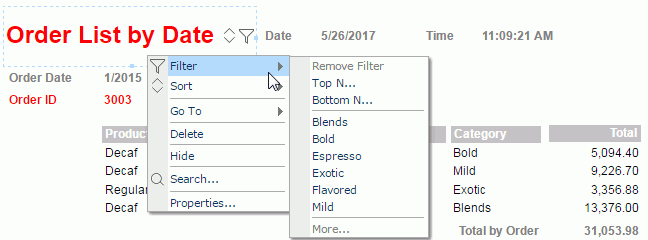
Filter Options
When you run a page report that uses query resources in Page Report Studio, if you right-click a filterable label (a label with a Bind Column) in a banded object or table, or a data field (including DBField, formula, and summary) in the report, you get the Filter submenu. This submenu can list commands such as Remove Filter, Top N, Bottom N, and More, which you can customize by setting the Filter Options property of the field or filterable label.
- Select the field or label and locate its Filter Options property in the Report Inspector.
- Select the ellipsis in the value cell. Designer displays the Filter Options dialog box.
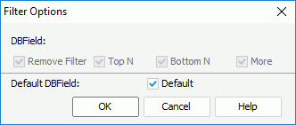
- Select the commands you want to show on the Filter submenu of the field or label in Page Report Studio.
- Select OK. Designer then generates the value for the property, which is equal to the sum of the selected option values. The options and their corresponding values are:
Remove Filter: 1
Top N: 2
Bottom N: 4
More: 8
Default: 16
In the Filter Options dialog box, Designer enables the other four options only when you clear Default. If you select Default, they are disabled, but their values still affect the value of the Filter Options property. If you select Default (Filter Options >= 16), which commands are available on the Filter submenu in Page Report Studio is determined by settings in the Page Report Studio profile on Server (Profile > Customize Profile > Page Report Studio > Properties > Default > Filter Menu).