 Previous Topic
Formatting Gauge Chart
Designer provides different format options for different gauge subtypes: Gauge Solid 2-D, Gauge Dial 2-D, Gauge Bar 2-D, Gauge Activity 2-D, and Gauge Bubble 2-D. This topic describes how you can format the different gauges and the labels in a gauge chart.
This topic contains the following sections:
- Formatting a Solid Gauge
- Formatting a Dial Gauge
- Formatting a Bar Gauge
- Formatting an Activity Gauge
- Formatting a Bubble Gauge
- Formatting the Pointer/Gauge/Target Labels
Formatting a Solid Gauge
- Right-click any range in an arc in the solid gauge and select Format Solid Gauge on the shortcut menu, or double-click any arc range in the solid gauge. Designer displays the Format Solid Gauge dialog box.
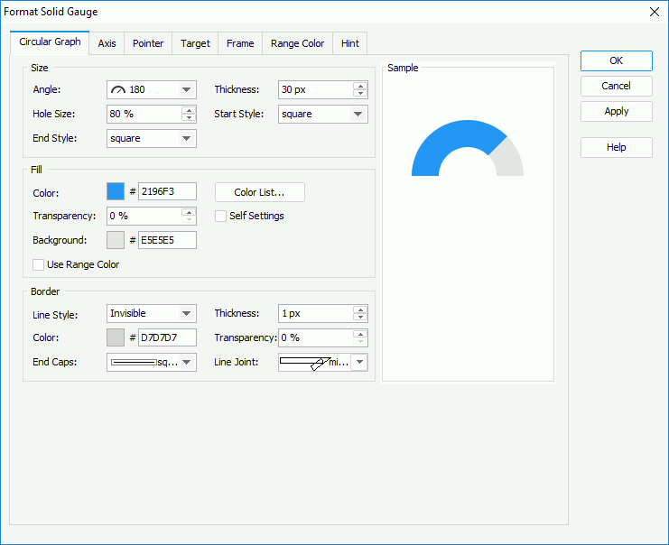
- In the Circular Graph tab, specify properties for the arcs in the solid gauge.
- In the Size box, set the angle of the arcs (you can select the angle from the drop-down list or select Customized to open the Customize Gauge Angle dialog box to specify the start angle and stop angle), the width of the arcs, the hole size of the arcs (meaning the relative size of an arc in a percentage of the total arc size), and the styles of the start graph and end graph of the arcs.
- In the Fill box,
- To apply the colors that you define for the ranges to the arcs, select Use Range Color.
- To specify colors for the arcs separately, leave Use Range Color cleared.
- Make your choice for the Self Settings option. When Self Settings is cleared (the default behavior), Designer synchronizes the color pattern that you specify here with the Pattern List property of the chart in the Report Inspector, which data markers of other subtypes can also apply if the chart is a combo chart. When you select Self Settings, it indicates that the color pattern is private to the current data markers themselves (the arcs in this case), which Designer remembers and applies to data markers of the new type automatically if you change the type of the chart later.
- Specify the color and transparency to fill the ranges in the arcs that are in the same data series as the arc range you have selected on to open the Format Solid Gauge dialog box (to change the color, select the color indicator and select a color from the color palette, or type the hexadecimal RGB value of a color in the text box).
- You can also select Color List to specify the color pattern for arc ranges in the same data series respectively in the Color List dialog box.
 The colors you define for the ranges also apply to the corresponding pointers if you specify to display value pointers in the solid gauge in the Pointer tab.
 - In the Background text box, set the background color of the arcs.
- In the Border box, set the line style, thickness, color, transparency, ending style, and line joint mode for border of the arcs.
- In the Axis tab, specify properties of the axis in the solid gauge.
- In the Axis subtab, set properties of the axis.
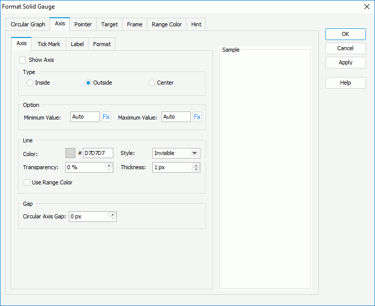
- Select Show Axis to display axis in the solid gauge. Only when you select the option, it is meaningful to set the other options for the axis in this tab.
- In the Type box, specify the position of the axis, which can be inside, outside, or in the center of the arcs.
- In the Option box, specify the minimum and maximum values to display on the axis, or use a formula to control the values. By default, Designer calculates the minimum and maximum values based on the real values in the chart using certain algorithm, which is the meaning of the default value "Auto"; if you set either value to 0, Designer applies it as "Auto".
- In the Line box, specify the color and transparency of the axis, or select Use Range Color to apply the color that you define for the ranges to the axis. Specify the style and thickness of the axis.
- In the Gap box, specify the gap between the axis and the arc if the axis shows inside or outside the arcs.
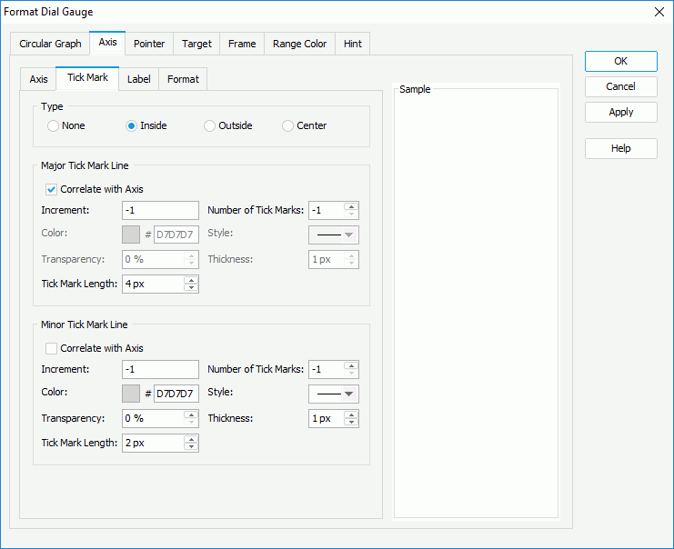
- In the Tick Mark subtab, specify properties of the tick marks on the axis.
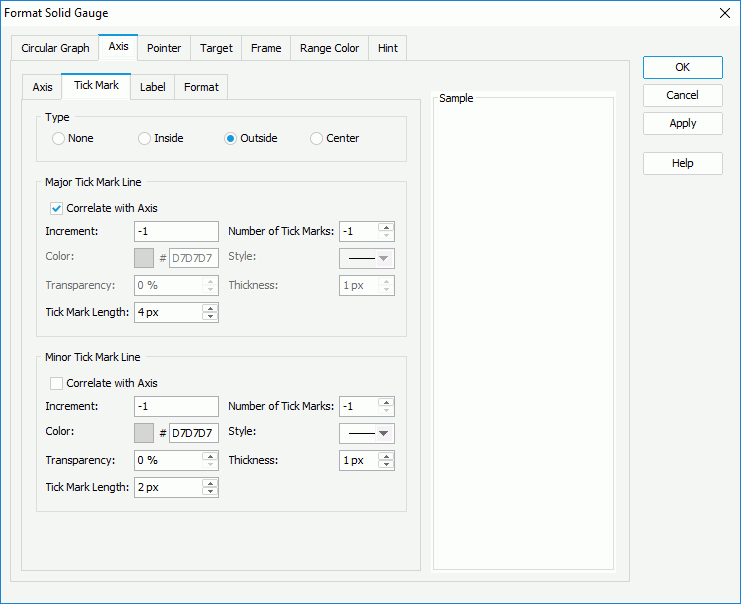
- To display tick marks on the axis, select how to show it in the Type box: inside, outside, or in the center of the axis.
- In the Major Tick Mark Line and Minor Tick Mark Line boxes, specify the distance between two adjacent tick marks on the axis, how many tick marks to display on the axis, and the color, style, transparency, thickness, and the length of the tick marks respectively.
- Select Correlate with Axis if you want to apply the line properties that you define for the axis in the Axis subtab to the tick mark lines.
- In the Label subtab, specify properties for the data labels on the axis.
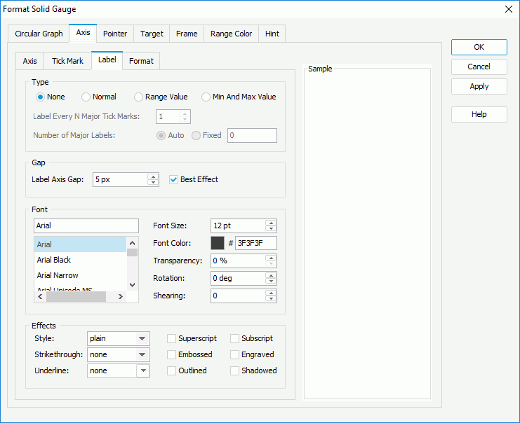
- In the Type box, specify the type of the data labels.
- None
Select if you do not want to display tick mark labels on the axis. It is meaningless to specify all the other tick mark label properties if you select this type. - Normal
Select it and the data labels display as you specify: in the Label Every N Major Tick Marks combo box, set the frequency at which to label the major tick marks; select Auto if you want to show all major tick mark on the axis, or Fixed to show only the specified number of major tick mark labels. - Range Value
Select to show the range values that you define in the Range Color tab in the data labels. - Min and Max Values
Select to show the minimum value and maximum value that you define in the Axis subtab in the data labels.
- None
- In the Gap box, specify the distance between the data labels and the axis in pixels. Select Best Effect if you want to adjust the position of the labels automatically so as to place them in the best way; while, Designer hides some labels when they overlap for the best effect.
- In the Font box, specify the font properties of the data labels, including the font face, size, color, transparency, rotation angle, and shearing angle.
- In the Effects box, apply some special effects to the data labels, such as italicizing the labels and adding a horizontal line under the labels.
- In the Type box, specify the type of the data labels.
- In the Format subtab, specify the data format of the data labels on the axis.
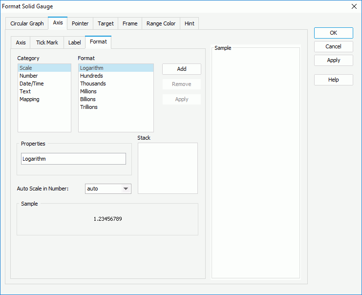
- Select a category from the Category box, then select a format from the Format box and select Add to add it to the Stack box. Select here for more information about each format.
- When the formats Designer provides in the Format box cannot meet your requirement, you can define the format in the Properties text box and add it as the format of the selected category. You can add more than one format, but for each category, only one format is allowed.
- If you do not need a format anymore, select it in the Stack box and select Remove to clear it.
- Set the Auto Scale in Number option to specify whether to automatically scale the big and small Number values.
- In the Axis subtab, set properties of the axis.
- In the Pointer tab, specify properties for the pointers of the arcs in the solid gauge.
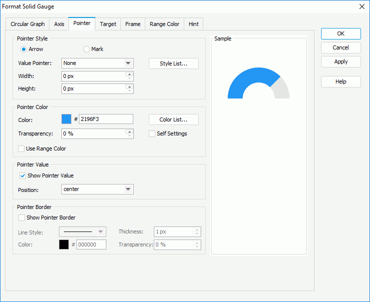
- In the Pointer Style box,
- To use arrow as the pointer style, select Arrow, then select the arrow style and specify the width and height of the arrow. You can also select Style List to specify the style for pointers in the same data series respectively in the Style List dialog box.
- To use mark as the pointer style, select Mark, then select the mark style, specify the width and height of the mark, the position of the pointers relative to the arcs, and the distance between the pointers and the arcs in pixels. You can also select Style List to specify the style for pointers in the same data series respectively in the Style List dialog box.
- In the Pointer Color box,
- To apply the colors that you define for the ranges to the pointers, select Use Range Color.
- To specify colors for the pointers separately, leave Use Range Color cleared.
- Make your choice for the Self Settings option. When Self Settings is cleared (the default behavior), Designer synchronizes the color pattern that you specify here with the Pattern List property of the chart in the Report Inspector, which data markers of other subtypes can also apply if the chart is a combo chart. When you select Self Settings, it indicates that the color pattern is private to the current data markers themselves (the pointers in this case), which Designer remembers and applies to data markers of the new type automatically if you change the type of the chart later.
- Specify the color and transparency to fill the pointers in the same data series as the arc range you have selected on to open the Format Solid Gauge dialog box.
- You can also select Color List to specify the color pattern for pointers in the same data series respectively in the Color List dialog box.
The colors you define for the pointers also apply to the corresponding ranges in the arcs. - In the Pointer Value box, specify whether to show values for the pointers and the position of the values relative to the pointers. If you select customized from the Position drop-down list, you can customize the position of the pointer values by dragging any pointer value in the design area.
- In the Pointer Border box, select Show Pointer Border if you want to display border for the pointers, then set properties of the border including line style, thickness, color, and transparency.
- In the Pointer Style box,
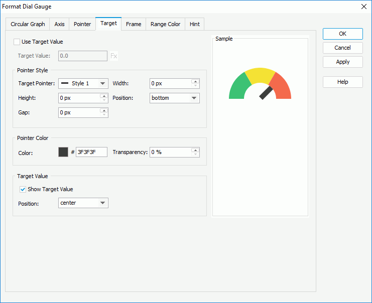
- In the Target tab, specify properties of the target in the solid gauge.
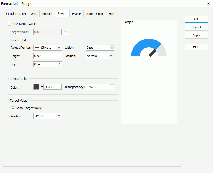
- Select Use Target Value if you want to use target value for the solid gauge, then specify the target value in the Target Value text box or use a formula to control the value.
- In the Pointer Style box, select the style of the target pointer from the Target Pointer drop-down list. Specify the width and height of the target pointer, the position of the target pointer relative to the arcs, and the distance between the target pointer and the arcs.
- In the Pointer Color box, specify the color and transparency of the target pointer.
- In the Target Value box, specify whether to show the target value on the solid gauge and the position of the target value relative to the arcs. If you select customized from the Position drop-down list, you can customize the position of the target value by dragging it in the design area.
- In the Frame tab, specify properties for the frame of the solid gauge.

- In the Size box, specify the size of the frame.
- In the Fill box, specify the color and transparency to fill the frame.
- In the Border box, specify properties for the border of the frame, including the type, color, line style, transparency, thickness, ending style, line joint mode, fill pattern, and dash size.
- In the Gauge Group Name box, specify whether to show names for the arcs in the solid gauge which are values of the field on the category axis, and the position of the names relative to the arcs. If the solid gauge contains no category field, the group name shows "Report" by default.
- In the Range Color tab, specify the value ranges for the solid gauge and the color and name of each range.
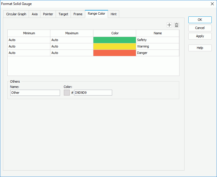
- By default, Designer provides three predefined value ranges and calculates the minimum and maximum values for each range using certain algorithm according to the minimum and maximum values that you specify on the axis in the Axis subtab, which is the meaning of the default value "Auto". You can select in the corresponding columns to edit the minimum and maximum values, colors from the color palette, and names for the ranges according to your own requirements.
- Select Add
 to add and define more ranges.
 - To delete a range, select it and select Remove
 .
. - In the Others box, specify the name and color for the values that do not fall into any of the ranges you define.
If you only edit the minimum and maximum values for one range but keep the default "Auto" value for all the rest ranges, Designer regards that there is only one value range in the solid gauge; therefore, you should either keep the default "Auto" value for all ranges to let Designer calculates them for you, or edit them all to apply your own values. - In the Hint tab, specify properties of the chart hint. A hint displays the value a range/pointer of an arc in the solid gauge represents when you hover over the range/pointer in Designer view mode, in HTML output, or at runtime.
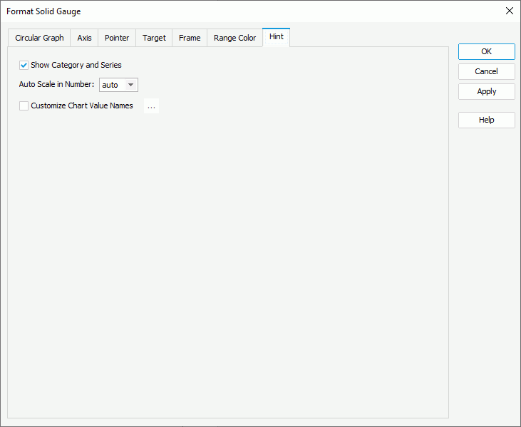
- Clear Show Category and Series if you do not want to include the category and series values in the hint.
- Specify whether to scale big and small numbers in the hint.
- Select Customize Chart Value Name to use customized names for the fields on the value axis in the hint and select the ellipsis
 to customize the names as you want.
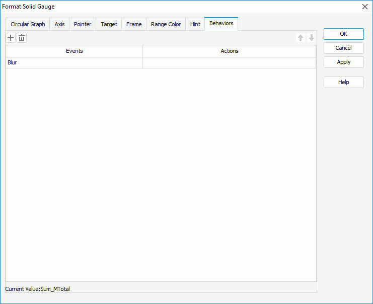
You should not edit the Show Tips property of the Chart Paper object in the Report Inspector which is "true" by default, if you want to display the hint. - For a solid gauge chart in a library component, you can specify web behaviors for it in the Behaviors tab, to enable users to trigger different web actions when they perform specific operations such as Click and Mouse Over on the arcs or pointers in the solid gauge at runtime.
- Select OK to accept the changes and close the dialog box.
 Back to top
Formatting a Dial Gauge
- Right-click any pointer in a dial of the dial gauge and select Format Dial Gauge on the shortcut menu, or double-click any pointer in the dial gauge. Designer displays the Format Dial Gauge dialog box.
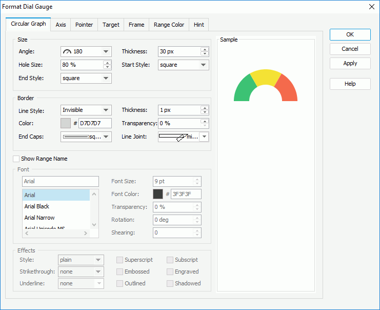
- In the Circular Graph tab, specify properties for the dials in the dial gauge.
- In the Size box, set the angle of the dials (you can select the angle from the drop-down list or select Customized to open the Customize Gauge Angle dialog box to specify the start angle and stop angle), the width of the dials, the relative size of a dial, and the styles of the start graph and end graph of the dials.
- In the Border box, set the line style, thickness, color, transparency, ending style, and line joint mode for border of the dials.
- Select Show Range Name if you want to show the names of the ranges that you define in the Range Color tab in the dials, then specify the font style and effects of the range names in the Font and Effects boxes.
- In the Axis tab, specify properties of the axis in the dial gauge.
- In the Axis subtab, set properties of the axis.
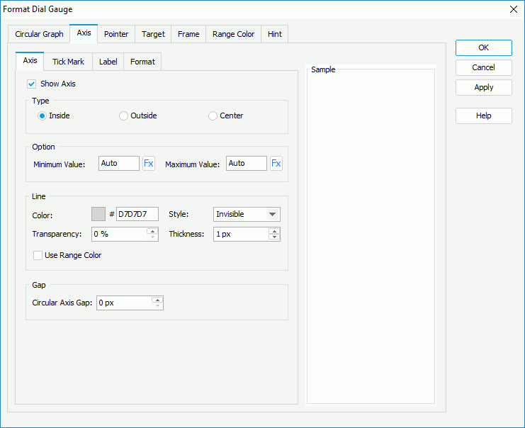
- Select Show Axis to display axis in the dial gauge. Only when you select the option, it is meaningful to set the other options for the axis in this tab.
- In the Type box, specify the position of the axis, which can be inside, outside, or in the center of the dials.
- In the Option box, specify the minimum and maximum values to display on the axis, or use a formula to control the values. By default, Designer calculates the minimum and maximum values based on the real values in the chart using certain algorithm, which is the meaning of the default value "Auto"; if you set either value to 0, Designer applies it as "Auto".
- In the Line box, specify the color and transparency of the axis, or select Use Range Color to apply the color that you define for the ranges to the axis. Specify the style and thickness of the axis.
- In the Gap box, specify the gap between the axis and the dials if the axis shows inside or outside the dials.
- In the Tick Mark subtab, specify properties of the tick marks on the axis.
- To display tick marks on the axis, select how to show it in the Type box: inside, outside, or in the center of the axis.
- In the Major Tick Mark Line and Minor Tick Mark Line boxes, specify the distance between two adjacent tick marks on the axis, how many tick marks to display on the axis, and the color, style, transparency, thickness, and length of the tick marks respectively.
- Select Correlate with Axis if you want to apply the line properties that you define for the axis in the Axis subtab to the tick mark lines.
In the Label subtab, specify properties for the data labels on the axis.
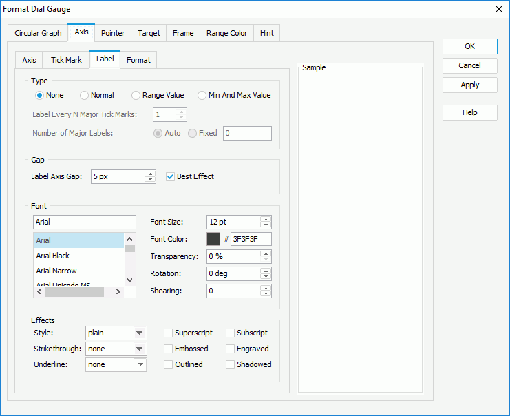
- In the Type box, specify the type of the data labels.
- None
Select if you do not want to display tick mark labels on the axis. It is meaningless to specify all the other tick mark label properties if you select this type. - Normal
Select it and the data labels display as you specify: in the Label Every N Major Tick Marks combo box, set the frequency at which to label the major tick marks; select Auto if you want to show all major tick mark on the axis, or Fixed to show only the specified number of major tick mark labels. - Range Value
Select to show the range values that you define in the Range Color tab in the data labels. - Min and Max Values
Select to show the minimum value and maximum value that you define in the Axis subtab in the data labels.
- None
- In the Gap box, specify the distance between the data labels and the axis in pixels. Select Best Effect if you want to adjust the position of the labels automatically so as to place them in the best way; while, Designer hides some labels when they overlap for the best effect.
- In the Font box, specify the font properties of the data labels, including the font face, size, color, transparency, rotation angle, and shearing angle.
- In the Effects box, apply some special effects to the data labels, such as italicizing the labels and adding a horizontal line under the labels.
- In the Type box, specify the type of the data labels.
- In the Format subtab, specify the data format of the data labels on the axis.
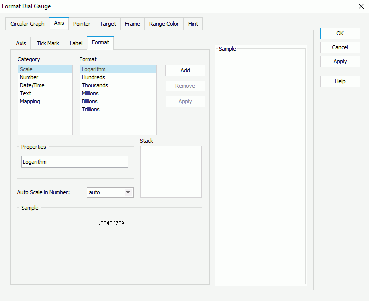
- Select a category from the Category box, then select a format from the Format box and select Add to add it to the Stack box. Select here for more information about each format.
- When the formats Designer provides in the Format box cannot meet your requirement, you can define the format in the Properties text box and add it as the format of the selected category. You can add more than one format, but for each category, only one format is allowed.
- If you do not need a format anymore, select it in the Stack box and select Remove to clear it.
- Set the Auto Scale in Number option to specify whether to automatically scale the big and small Number values.
- In the Axis subtab, set properties of the axis.
- In the Pointer tab, specify properties for the pointers of the dials in the dial gauge.
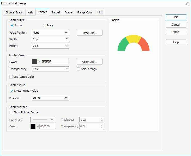
- In the Pointer Style box,
- To use arrow as the pointer style, select Arrow, then select the arrow style and specify the width and height of the arrow. You can also select Style List to specify the style for pointers in the same data series respectively in the Style List dialog box.
- To use mark as the pointer style, select Mark, then select the mark style, specify the width and height of the mark, the position of the pointers relative to the dials, and the distance between the pointers and the dials in pixels. You can also select Style List to specify the style for pointers in the same data series respectively in the Style List dialog box.
- In the Pointer Color box,
- To apply the colors that you define for the ranges to the pointers, select Use Range Color.
- To specify color for the pointers separately, leave Use Range Color cleared.
- Make your choice for the Self Settings option. When Self Settings is cleared (the default behavior), Designer synchronizes the color pattern that you specify here with the Pattern List property of the chart in the Report Inspector, which data markers of other subtypes can also apply if the chart is a combo chart. When you select Self Settings, it indicates that the color pattern is private to the current data markers themselves (the pointers in this case), which Designer remembers and applies to data markers of the new type automatically if you change the type of the chart later.
- Specify the color and transparency to fill the pointers in the same data series as the pointer you have selected on to open the Format Dial Gauge dialog box.
- You can also select Color List to specify the color pattern for pointers in the same data series respectively in the Color List dialog box.
- In the Pointer Value box, specify whether to show values for the pointers and the position of the values relative to the pointers. If you select customized from the Position drop-down list, you can customize the position of the pointer values by dragging any pointer value in the design area.
- In the Pointer Border box, select Show Pointer Border if you want to display border for the pointers, then set properties of the border including line style, thickness, color, and transparency.
- In the Pointer Style box,
- In the Target tab, specify properties of the target in the dial gauge.
- Select Use Target Value if you want to use target value for the dial gauge, then specify the target value in the Target Value text box or use a formula to control the value.
- In the Pointer Style box, select the style of the target pointer from the Target Pointer drop-down list. Specify the width and height of the target pointer, the position of the target pointer relative to the dials, and the distance between the target pointer and the dials.
- In the Pointer Color box, specify the color and transparency of the target pointer.
- In the Target Value box, specify whether to show the target value on the dial gauge and the position of the target value relative to the dials. If you select customized from the Position drop-down list, you can customize the position of the target value by dragging it in the design area.
- In the Frame tab, specify properties for the frame of the dial gauge.
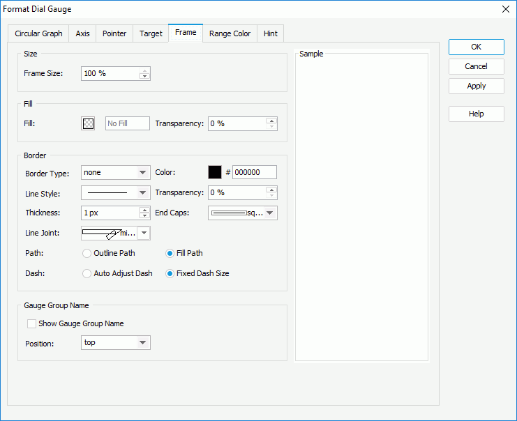
- In the Size box, specify the size of the frame.
- In the Fill box, specify the color and transparency to fill the frame.
- In the Border box, specify properties for the border of the frame, including the type, color, line style, transparency, thickness, ending style, line joint mode, fill pattern, and dash size.
- In the Gauge Group Name box, box, specify whether to show names for the dials in the dial gauge which are values of the field on the category axis, and the position of the names relative to the dials. If the dial gauge contains no category field, the group name shows "Report" by default.
- In the Range Color tab, specify the value ranges for the dial gauge and the color and name of each range.

- By default, Designer provides three predefined value ranges and calculates the minimum and maximum values for each range using certain algorithm according to the minimum and maximum values that you specify on the axis in the Axis subtab, which is the meaning of the default value "Auto". You can select in the corresponding columns to edit the minimum and maximum values, colors from the color palette, and names for the ranges according to your own requirements.
- Select Add to add and define more ranges.
- To delete a range, select it and select Remove .
- In the Others box, specify the name and color for the values that do not fall into any of the ranges you define.
If you only edit the minimum and maximum values for one range but keep the default "Auto" value for all the rest ranges, Designer regards that there is only one value range in the dial gauge; therefore, you should either keep the default "Auto" value for all the ranges to let Designer calculates them for you, or edit them all to apply your own values. - In the Hint tab, specify properties of the chart hint. A hint displays the value a pointer in the dial gauge represents when you point to the dial pointer in Designer view mode, in HTML output, or at runtime.

- Clear Show Category and Series if you do not want to include the category and series values in the hint.
- Specify whether to scale big and small numbers in the hint.
- Select Customize Chart Value Name to use customized names for the fields on the value axis in the hint and select the ellipsis to customize the names as you want.
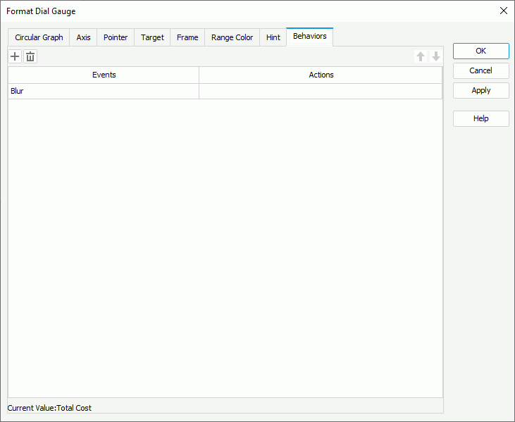
You should not edit the Show Tips property of the Chart Paper object in the Report Inspector which is "true" by default, if you want to display the hint. - For a dial gauge chart in a library component, you can specify web behaviors for it in the Behaviors tab, to enable users to trigger different web actions when they perform specific operations such as Click and Mouse Over on the dial pointers at runtime.
- Select OK to accept the changes and close the dialog box.
Formatting a Bar Gauge
- Right-click any range in a bar in the bar gauge and select Format Bar Gauge from the shortcut menu, or double-click any pointer in the bar gauge. Designer displays the Format Bar Gauge dialog box.
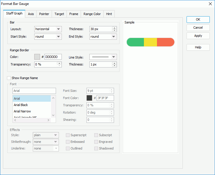
- In the Staff Graph tab, specify properties for the bars in the bar gauge.
- In the Bar box, specify the layout of the bars, vertical or horizontal, the thickness of the bars, and the style of the start graph and end graph of the bars.
- In the Range Border box, set the color, line style, transparency, and thickness of the bar border (to change the color, select the color indicator and select a color from the color palette, or type the hexadecimal RGB value of a color in the text box).
- Select Show Range Name if you want to show the names of the ranges that you define in the Range Color tab in the bars, then specify the font style and effects of the range names in the Font and Effect boxes.
- In the Axis tab, specify properties of the axis in the bar gauge.
- In the Axis subtab, set properties of the axis.
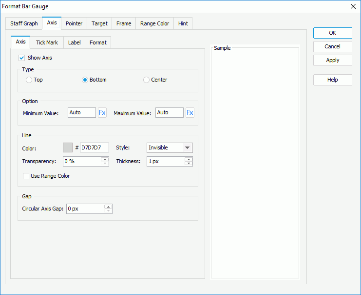
- Select Show Axis to display axis in the bar gauge. Only when you select the option, it is meaningful to set the other options for the axis in this tab.
- In the Type box, specify the position of the axis, which can be on the top or bottom of the bar, or in the center of the bar.
- In the Option box, specify the minimum and maximum values to display on the axis, or use a formula to control the values. By default, Designer calculates the minimum and maximum values based on the real values in the chart using certain algorithm, which is the meaning of the default value "Auto"; if you set either value to 0, Designer applies it as "Auto".
- In the Line box, specify the color and transparency of the axis, or select Use Range Color to apply the color that you define for the ranges to the axis. Specify the style and thickness of the axis.
- In the Gap box, specify the gap between the axis and the bars if the axis shows inside or outside the bars.
- In the Tick Mark subtab, specify properties of the tick marks on the axis.

- To display tick marks on the axis, select how to show it in the Type box: on the top or bottom of the axis if you specify to display the bars horizontally in the Staff Graph tab, or on the left or right of the axis if the bars display vertically, or in the center of the axis.
- In the Major Tick Mark Line and Minor Tick Mark Line boxes, specify the distance between two adjacent tick marks on the axis, how many tick marks to display on the axis, and the color, style, transparency, thickness, and length of the tick marks respectively.
- Select Correlate with Axis if you want to apply the line properties that you define for the axis in the Axis subtab to the tick mark lines.
In the Label subtab, specify properties for the data labels on the axis.
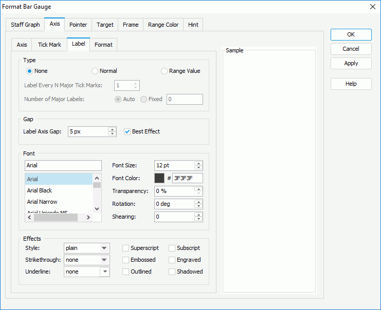
- In the Type box, specify the type of the data labels.
- None
Select if you do not want to display tick mark labels on the axis. It is meaningless to specify all the other tick mark label properties if you select this type. - Normal
Select it and the data labels display as you specify: in the Label Every N Major Tick Marks combo box, set the frequency at which to label the major tick marks; select Auto if you want to show all major tick mark on the axis, or Fixed to show only the specified number of major tick mark labels. - Range Value
Select to show the range values that you define in the Range Color tab in the data labels. - Min and Max Values
Select to show the minimum value and maximum value that you define in the Axis subtab in the data labels.
- None
- In the Gap box, specify the distance between the data labels and the axis in pixels. Select Best Effect if you want to adjust the position of the labels automatically so as to place them in the best way; while, Designer hides some labels when they overlap for the best effect.
- In the Font box, specify the font properties of the data labels, including the font face, size, color, transparency, rotation angle, and shearing angle.
- In the Effects box, apply some special effects to the data labels, such as italicizing the labels and adding a horizontal line under the labels.
- In the Type box, specify the type of the data labels.
- In the Format subtab, specify the data format of the data labels on the axis.
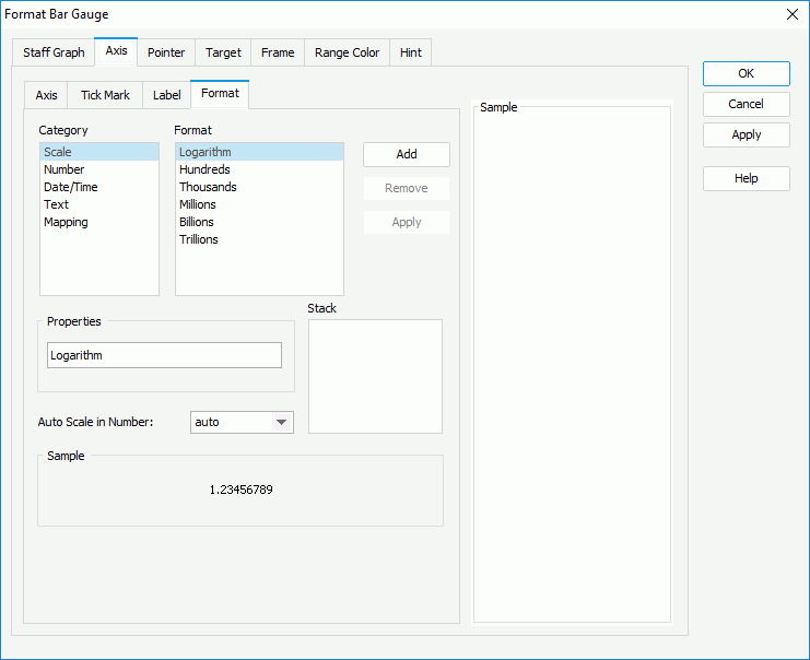
- Select a category from the Category box, then select a format from the Format box and select Add to add it to the Stack box. Select here for more information about each format.
- When the formats Designer provides in the Format box cannot meet your requirement, you can define the format in the Properties text box and add it as the format of the selected category. You can add more than one format, but for each category, only one format is allowed.
- If you do not need a format anymore, select it in the Stack box and select Remove to clear it.
- Set the Auto Scale in Number option to specify whether to automatically scale the big and small Number values.
- In the Axis subtab, set properties of the axis.
- In the Pointer tab, specify properties of the pointers in the bar gauge.
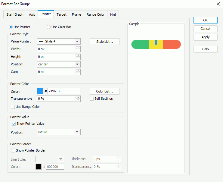
- Specify the way to show the pointer: Use Pointer or Use Color Bar.
- If you select Use Pointer, in the Pointer Style box, specify the style of the value pointers, the width and height of the pointers, the position of the pointers relative to the bars, and the distance between the pointers and the bars in pixels. You can also select Style List to specify the style for pointers in the same data series respectively in the Style List dialog box.
- In the Pointer Color box,
- To apply the colors that you define for the ranges to the pointers, select Use Range Color.
- To specify color for the pointers separately, leave Use Range Color cleared.
- Make your choice for the Self Settings option. When Self Settings is cleared (the default behavior), Designer synchronizes the color pattern that you specify here with the Pattern List property of the chart in the Report Inspector, which data markers of other subtypes can also apply if the chart is a combo chart. When you select Self Settings, it indicates that the color pattern is private to the current data markers themselves (the pointers in this case), which Designer remembers and applies to data markers of the new type automatically if you change the type of the chart later.
- Specify the color and transparency to fill the pointers in the same data series as the pointer you have selected on to open the Format Bar Gauge dialog box.
- You can also select Color List to specify the color pattern for pointers in the same data series respectively in the Color List dialog box.
- In the Pointer Value box, specify whether to show values for the pointers and the position of the values relative to the pointers. If you select customized from the Position drop-down list, you can customize the position of the pointer values by dragging any pointer value in the design area.
- In the Pointer Border box, select Show Pointer Border if you want to display border for the pointers, then set properties of the border including line style, thickness, color, and transparency.
- In the Target tab, specify properties of the target in the bar gauge.
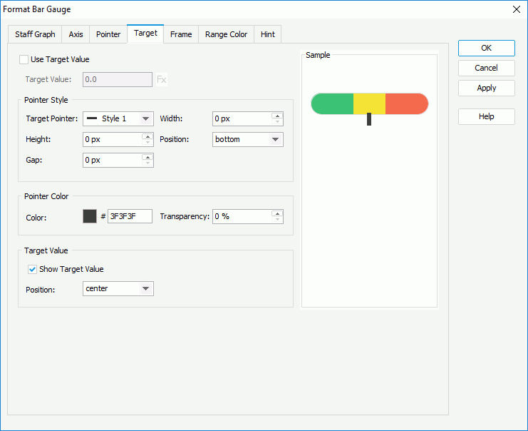
- Select Use Target Value if you want to use target value for the bar gauge, then specify the target value in the Target Value text box or use a formula to control the value.
- In the Pointer Style box, select the style of the target pointer from the Target Pointer drop-down list. Specify the width and height of the target pointer, the position of the target pointer relative to the bars, and the distance between the target pointer and the bars.
- In the Pointer Color box, specify the color and transparency of the target pointer.
- In the Target Value box, specify whether to show the target value on the bar gauge and the position of the target value relative to the bars. If you select customized from the Position drop-down list, you can customize the position of the target value by dragging it in the design area.
- In the Frame tab, specify properties for the frame of the bar gauge.
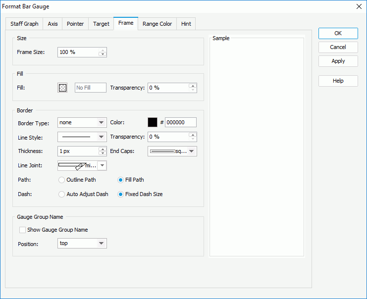
- In the Size box, specify the size of the frame.
- In the Fill box, specify the color and transparency to fill the frame.
- In the Border box, specify properties for the border of the frame, including the type, color, line style, transparency, thickness, ending style, line joint mode, fill pattern, and dash size.
- In the Gauge Group Name box, specify whether to show names for the bars in the bar gauge which are values of the field on the category axis, and the position of the names relative to the bars. If the bar gauge contains no category field, the group name shows "Report" by default.
- In the Range Color tab, specify the value ranges for the bar gauge and the color and name of each range.
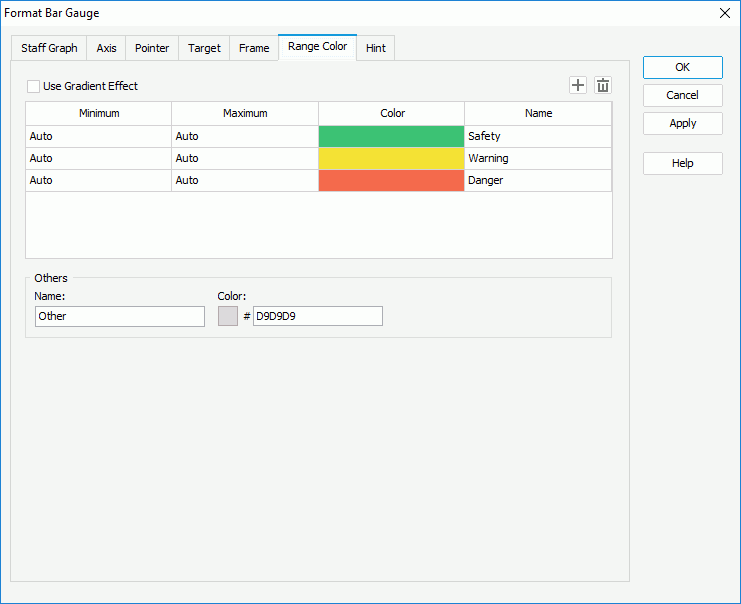
- By default, Designer provides three predefined value ranges and calculates the minimum and maximum values for each range using certain algorithm according to the minimum and maximum values that you specify on the axis in the Axis subtab, which is the meaning of the default value "Auto". You can select in the corresponding columns to edit the minimum and maximum values, colors from the color palette, and names for the ranges according to your own requirements.
- Select Add to add and define more ranges.
- To delete a range, select it and select Remove .
- In the Others box, specify the name and color for the values that do not fall into any of the ranges you define.
If you only edit the minimum and maximum values for one range but keep the default "Auto" value for all the rest ranges, Designer regards that there is only one value range in the bar gauge; therefore, you should either keep the default "Auto" value for all the ranges to let Designer calculates them for you, or edit them all to apply your own values. - In the Hint tab, specify properties of the chart hint. A hint displays the value a pointer in the bar gauge represents when you hover over the pointer in Designer view mode, in HTML output, or at runtime.

- Clear Show Category and Series if you do not want to include the category and series values in the hint.
- Specify whether to scale big and small numbers in the hint.
- Select Customize Chart Value Name to use customized names for the fields on the value axis in the hint and select the ellipsis to customize the names as you want.
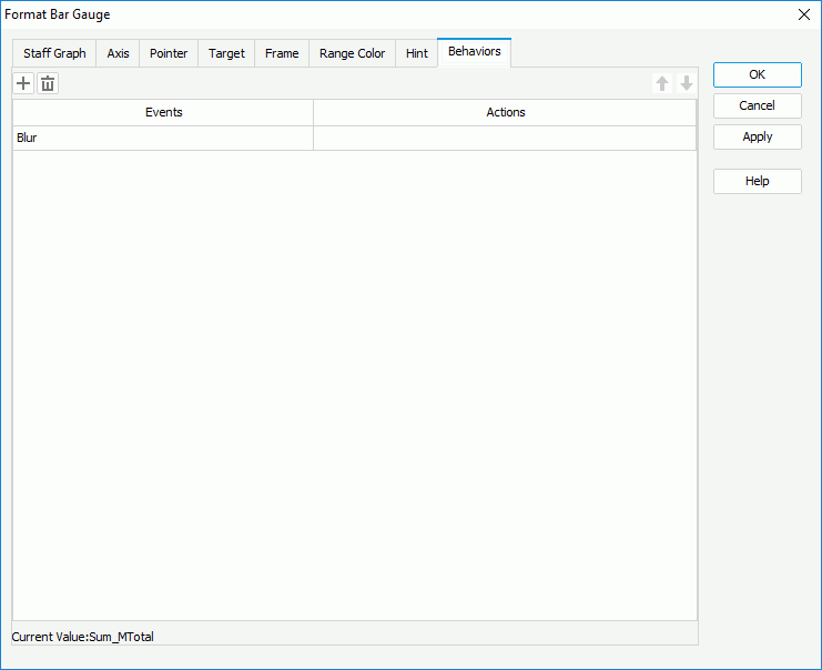
You should not edit the Show Tips property of the Chart Paper object in the Report Inspector which is "true" by default, if you want to display the hint. - For a bar gauge chart in a library component, you can specify web behaviors for it in the Behaviors tab, to enable users to trigger different web actions when they perform specific operations such as Click and Mouse Over on the pointers of the bar gauge at runtime.
- Select OK to accept the changes and close the dialog box.
Formatting an Activity Gauge
- Right-click any range in a circle in the activity gauge and select Format Solid Gauge from the shortcut menu, or double-click any circle range in the activity gauge. Designer displays the Format Activity Gauge dialog box.
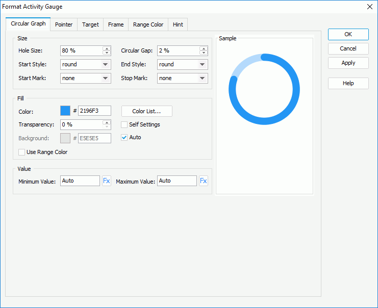
- In the Circular Graph tab, specify properties for the circles in the activity gauge.
- In the Size box, specify the hole size of the circles (meaning the relative size of a circle in a percentage of the total circle size), the distance between the circles, and the styles and marks for the start graph and end graph of the circles.
- In the Fill box,
- To apply the colors that you define for the ranges to the circles, select Use Range Color.
- To specify color for the circles separately, leave Use Range Color cleared.
- Make your choice for the Self Settings option. When Self Settings is cleared (the default behavior), Designer synchronizes the color pattern that you specify here with the Pattern List property of the chart in the Report Inspector, which data markers of other subtypes can also apply if the chart is a combo chart. When you select Self Settings, it indicates that the color pattern is private to the current data markers themselves (the circles in this case), which Designer remembers and applies to data markers of the new type automatically if you change the type of the chart later.
- Specify the color and transparency to fill the circles in the same data series as the circle you have selected on to open the Format Activity Gauge dialog box.
- You can also select Color List to specify the color pattern for circles in the same data series respectively in the Color List dialog box.
- By default, Designer applies the color that is lighter than the color of the circles as the background color of the circles automatically. If you want to customize the background color by yourself, clear Auto, then in the Background text box, set the background color of the circles (to change the color, select the color indicator and select a color from the color palette, or type the hexadecimal RGB value of a color in the text box).
- In the Value box, specify the minimum and maximum values to display in the activity chart, or use a formula to control the values. By default, Designer calculates the minimum and maximum values based on the real values in the chart using certain algorithm, which is the meaning of the default value "Auto"; if you set either value to 0, Designer applies it as "Auto".
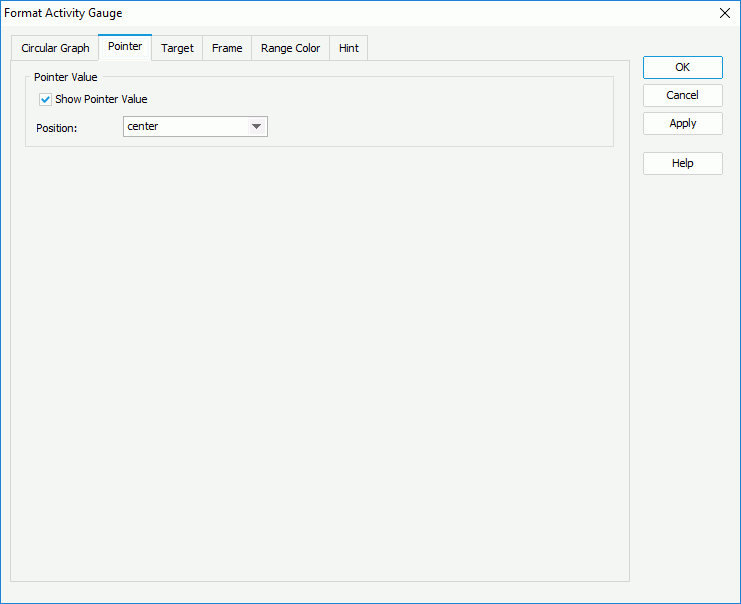
- In the Pointer tab, specify whether to show the pointer values and the position of the values relative to the pointers. If you select customized from the Position drop-down list, you can customize the position of the pointer values by dragging any pointer value in the design area.
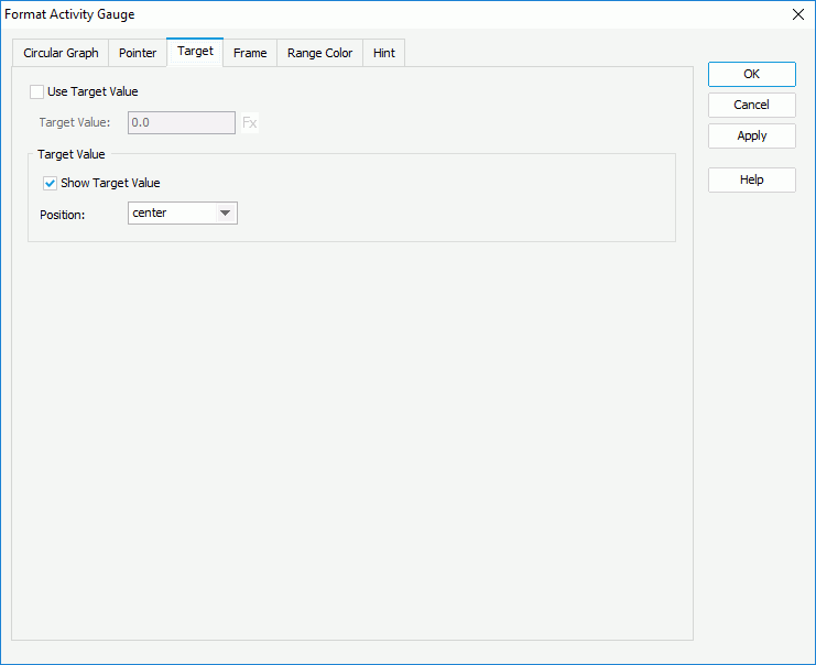
- In the Target tab, select Use Target Value if you want to use target value for the activity gauge and specify the target value in the Target Value text box or use a formula to control the value, then specify whether to show the target value on the activity gauge and the position of the target value relative to the circles. If you select customized from the Position drop-down list, you can customize the position of the target value by dragging it in the design area.
- In the Frame tab, specify properties for the frame of the activity gauge.
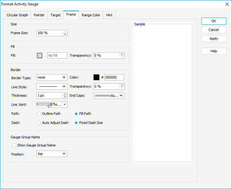
- In the Size box, specify the size of the frame.
- In the Fill box, specify the color and transparency to fill the frame.
- In the Border box, specify properties for the border of the frame, including the type, color, line style, transparency, thickness, ending style, line joint mode, fill pattern, and dash size.
- In the Gauge Group Name box, specify whether to show names for the circles in the activity gauge which are values of the field on the category axis, and the position of the names relative to the circles. If the activity gauge contains no category field, the group name shows "Report" by default.
- In the Range Color tab, specify the value ranges for the activity gauge and the color and name of each range.

- By default, Designer provides three predefined value ranges and calculates the minimum and maximum values for each range using certain algorithm according to the minimum and maximum values that you specify for the activity chart in the Circular Graph tab, which is the meaning of the default value "Auto". You can select in the corresponding columns to edit the minimum and maximum values, colors from the color palette, and names for the ranges according to your own requirements.
- Select Add to add and define more ranges.
- To delete a range, select it and select Remove .
- In the Others box, specify the name and color for the values that do not fall into any of the ranges you define.
If you only edit the minimum and maximum values for one range but keep the default "Auto" value for all the rest ranges, Designer regards that there is only one value range in the activity gauge; therefore, you should either keep the default "Auto" value for all the ranges to let Designer calculates them for you, or edit them all to apply your own values. - In the Hint tab, specify properties of the chart hint. A hint displays the value a data range in a circle of the activity gauge represents when you point to the range in Designer view mode, in HTML output, or at runtime.
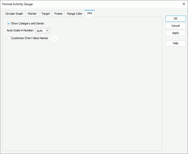
- Clear Show Category and Series if you do not want to include the category and series values in the hint.
- Specify whether to scale big and small numbers in the hint.
- Select Customize Chart Value Name to use customized names for the fields on the value axis in the hint and select the ellipsis to customize the names as you want.
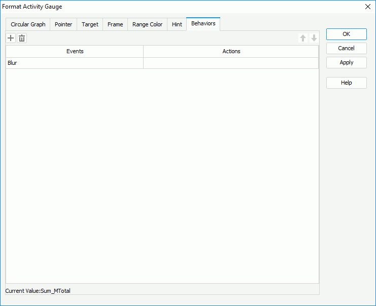
You should not edit the Show Tips property of the Chart Paper object in the Report Inspector which is "true" by default, if you want to display the hint. - For an activity gauge chart in a library component, you can specify web behaviors for it in the Behaviors tab, to enable users to trigger different web actions when they perform specific operations such as Click and Mouse Over on the data ranges of the circles in the activity gauge at runtime.
- Select OK to accept the changes and close the dialog box.
Formatting a Bubble Gauge
- Right-click any bubble in the bubble gauge and select Format Bubble Gauge on the shortcut menu, or double-click any bubble in the bubble gauge. Designer displays the Format Bubble Gauge dialog box.
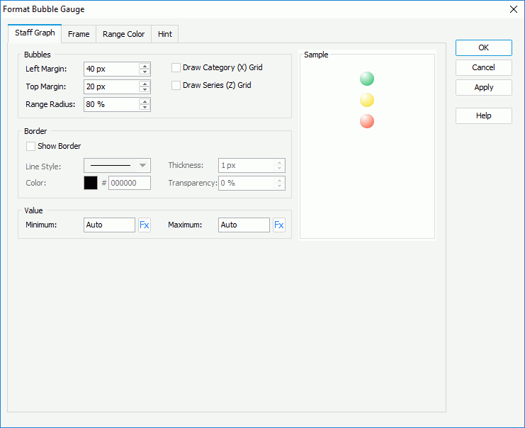
- In the Staff Graph tab, set properties for the bubbles in the chart.
- In the Bubbles box, specify the gap between the left/top labels and left/top bubbles, the radius of the bubbles (meaning the relative size of a bubble in a percentage of the total bubble size), and whether to draw horizontal/vertical grids.
- In the Border box, select Show Border if you want to show the border of the bubbles, then set properties of the border including the line style, thickness, color, and transparency.
- In the Value box, specify the minimum and maximum values to display in the bubble chart, or use a formula to control the values. By default, Designer calculates the minimum and maximum values based on the real values in the chart using certain algorithm, which is the meaning of the default value "Auto"; if you set either value to 0, Designer applies it as "Auto".
- In the Frame tab, specify properties for the frame of the bubble gauge.
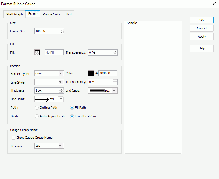
- In the Size box, specify the size of the frame.
- In the Fill box, specify the color and transparency to fill the frame.
- In the Border box, specify properties for the border of the frame, including the type, color, line style, transparency, thickness, ending style, line joint mode, fill pattern, and dash size.
- In the Gauge Group Name box, specify whether to show names for the bubbles in the bubble gauge which are values of the field on the category axis, and the position of the names relative to the bubbles. If the bubble gauge contains no category field, the group name shows "Report" by default.
- In the Range Color tab, specify the value ranges for the bubble gauge and the color and name of each range.
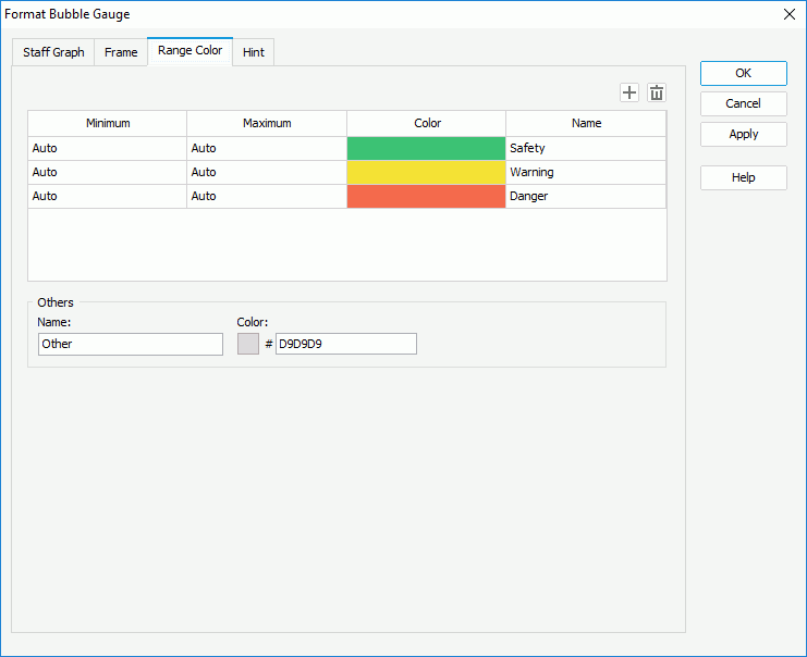
- By default, Designer provides three predefined value ranges and calculates the minimum and maximum values for each range using certain algorithm according to the minimum and maximum values that you specify for the bubble chart in the Staff Graph tab, which is the meaning of the default value "Auto". You can select in the corresponding columns to edit the minimum and maximum values, colors from the color palette, and names for the ranges according to your own requirements.
- Select Add to add and define more ranges.
- To delete a range, select it and select Remove .
- In the Others box, specify the name and color for the values that do not fall into any of the ranges you define.
If you only edit the minimum and maximum values for one range but keep the default "Auto" value for all the rest ranges, Designer regards that there is only one value range in the bubble gauge; therefore, you should either keep the default "Auto" value for all the ranges to let Designer calculates them for you, or edit them all to apply your own values. - In the Hint tab, specify properties of the chart hint. A hint displays the value a bubble in the bubble gauge represents when you point to the bubble in Designer view mode, in HTML output, or at runtime.
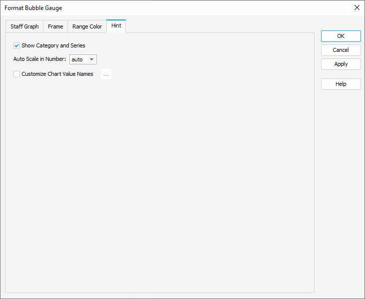
- Clear Show Category and Series if you do not want to include the category and series values in the hint.
- Specify whether to scale big and small numbers in the hint.
- Select Customize Chart Value Name to use customized names for the fields on the value axis in the hint and select the ellipsis to customize the names as you want.
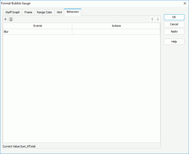
You should not edit the Show Tips property of the Chart Paper object in the Report Inspector which is "true" by default, if you want to display the hint. - For a bubble gauge chart in a library component, you can specify web behaviors for it in the Behaviors tab, to enable users to trigger different web actions when they perform specific operations such as Click and Mouse Over on the bubbles of the bubble gauge at runtime.
- Select OK to accept the changes and close the dialog box.
Formatting the Gauge/Pointer/Target Labels
When a solid, dial, activity, or bar gauge chart displays the gauge labels, pointer labels, and target labels, you can format the labels accordingly, for example, edit the size and border of the labels, change the label font size, font color, and so on.
- Right-click any label of the required type and select Format Gauge Label/Format Pointer Label/Format Target Label from the shortcut menu, or double-click any label of the required type in the gauge chart. Designer displays the Format Gauge Label dialog box, Format Pointer Label dialog box, or Format Target Label dialog box.
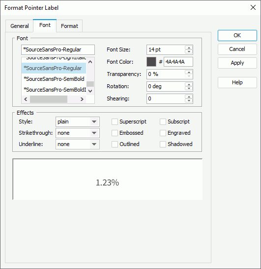
The following takes the Format Pointer Label dialog box as an example.
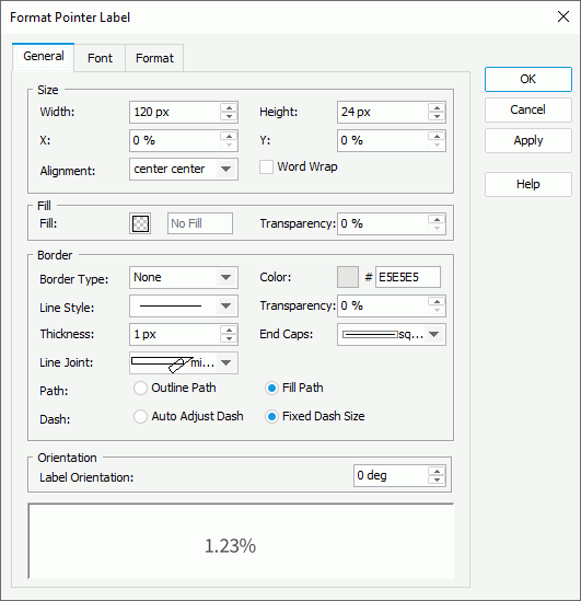
- In the General tab, specify the general properties of the labels in the chart.
- In the Size box, set the width and height of the labels, the horizontal and vertical coordinate of the top left corner of the labels relative to their parent container, the alignment of the text in the labels, and whether to wrap the label text.
- In the Fill box, specify the color or effects and the transparency to fill the labels.
- In the Border box, specify properties for the border of the labels, including the type, color, line style, transparency, thickness, ending style, line joint mode, fill pattern, and dash size.
- In the Orientation box, specify the angle to rotate the labels.
- In the Font tab, specify the font properties of the labels, including the font face, size, color, transparency, rotation angle, and shearing angle. You can also apply some special effects to the labels, such as italicizing the labels and adding a horizontal line under the labels.
- In the Format tab, specify the data format of the labels.
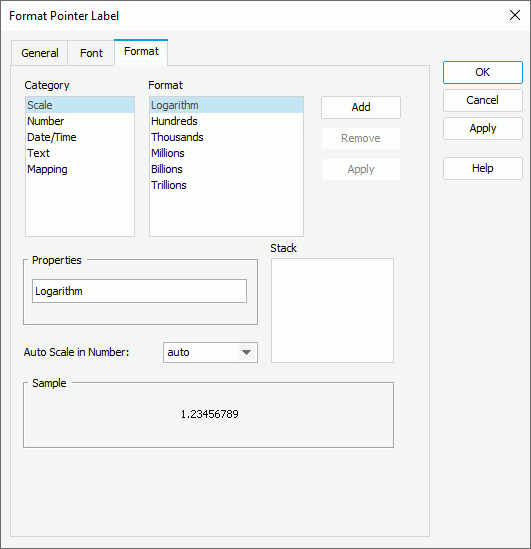
- Select a category from the Category box, then select a format from the Format box and select Add to add it to the Stack box. Select here for more information about each format.
- When the formats Designer provides in the Format box cannot meet your requirement, you can define the format in the Properties text box and add it as the format of the selected category. You can add more than one format, but for each category, only one format is allowed.
- If you do not need a format anymore, select it in the Stack box and select Remove to clear it.
- Set the Auto Scale in Number option to specify whether to automatically scale the big and small Number values.
- Select OK to accept the changes and close the dialog box.