 Previous Topic
Create Geographic Map Dialog Box
You can use the Create Geographic Map dialog box to insert a geographic map into a report. This topic describes the options in the dialog box.
Designer displays the Create Geographic Map dialog box when you navigate to Insert > Map > Geographic Map, or drag the Geographic Map icon  from the Components panel into a report, and provides you with different options in the dialog box according to the type of the report into which you are inserting the geographic map: web report/library component or page report.
Create Geographic Map Dialog Box - For Web Report and Library Component
When you use the Create Geographic Map dialog box for creating a geographic map in a web report or library component, Designer displays the following screens in the dialog box:
Designer displays these buttons in all the screens:
Back
Select to go back to the previous screen.
Next
Select to go to the next screen.
Finish
Select to finish your work and close the dialog box.
Cancel
Select to close the dialog box without saving any changes.
Help
Select to view information about the dialog box.
Data Screen
Use this screen to specify the dataset for the geographic map.
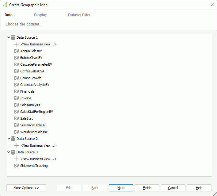
Business view box
This box lists the predefined business views in the current catalog. Select one and Designer automatically creates a dataset based on it for the geographic map.
- <New Business View...>
Select to create a business view in the catalog using the Business View Editor dialog box. Designer does not display this option when you use the dialog box in a library component.
More Options/Less Options
Select to show or hide the options for specifying the dataset you want to use. Designer does not display this pair of buttons when you use the dialog box in a library component.
- New Dataset
Select to create a dataset based on a business view in the current catalog. - Existing Dataset
Select to use a dataset from the ones that you have created in the current report.- <New Dataset...>
Select to create a dataset in the New Dataset dialog box.
- <New Dataset...>
- Current Dataset
Designer disables this option because a geographic map cannot use inherited dataset.
Edit
Select to edit the specified business view in the Business View Editor dialog box or dataset in the Dataset Editor dialog box. Designer does not display this button when you use the dialog box in a library component.
Display Screen
Use this screen to specify the data fields you want to display in the geographic map.
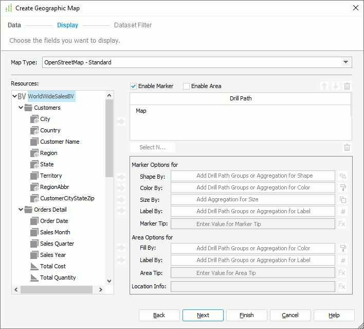
Map Type
This drop-down list contains the types using which you can create the geographic map. Select the type you need.
- OpenStreetMap - Standard
This type displays the street map. - OpenCycleMap - Cycle Map
This type displays the cycle route map. - OpenCycleMap - Transport Map
This type displays the transport map. - Google Maps - Roadmap
This type displays Google road map. - Google Maps - Satellite
This type displays Google Earth satellite images. - Google Maps - Terrain
This type displays a physical map based on terrain information.
Resources
This box lists the available data fields that you can use to create the geographic map.
 Add button
Select to add the specified field in the Resources box to the geographic map.
Enable Marker
Select to enable specifying marker options for all the groups.
Enable Area
Select to enable specifying area options for all the groups.
You must select one option between Enable Marker and Enable Area at least and Designer selects Enable Marker by default.
Drill Path
This box lists the group objects that you add to group data in the geographic map. Select a group and you can specify its marker and/or area options.
 Move Up button
Select to move the specified group to a higher group level.
 Move Down button
Select to move the specified group to a lower group level.
 Remove button
Select to delete the specified field from the geographic map.
Select N
Select to open the Select N dialog box to specify the Select N condition for the selected group level.
Web Behaviors
Designer displays this button when you use the dialog box for creating a geographic map in a library component. Select it to open the Web Behaviors dialog box to specify web behaviors to the markers and/or areas of the selected group level.
Marker Options
Designer enables the options when you select Enable Marker. You can specify the marker options for the selected group level.
- Shape By
This text box shows the field that you add to control the shapes of the markers for the selected group level. You can only add the group object that represents the currently selected group level, a group object of a higher level than the current level in the Drill Path box, or an aggregation object. You can also leave the text box blank.
Select to specify the shapes of the markers.- If you do not add any field to control the shape, select a shape from the shape list, or select the Advanced checkbox and select Advanced to open the Advanced dialog box to specify an image as the shape of the markers.
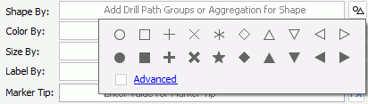
- If you add a field to control the shape, Designer displays the Edit Shapes dialog box for you to specify the shapes for the markers.
- If you do not add any field to control the shape, select a shape from the shape list, or select the Advanced checkbox and select Advanced to open the Advanced dialog box to specify an image as the shape of the markers.
- Color By
This text box shows the field that you add to control the colors of the markers for the selected group level. You can only add the group object that represents the currently selected group level, group objects of higher levels than the current level in the Drill Path box, or an aggregation object. When you add more than one group object, you can adjust their order by dragging and dropping them in the text box. You can also leave the text box blank.
Select to specify the colors of the markers.- If you do not add any field to control the color, select a color from the color palette for the markers.
- If you add one or more group objects to control the color, Designer displays the Edit Color dialog box for you to specify colors for the markers.
- If you add an aggregation object to control the color, Designer displays the Edit Gradient Color dialog box for you to specify a gradient color for the markers.
- Size By
This text box shows the field that you add to control the size of the markers for the selected group level. You can only add one aggregation object.
Select to specify the size of the markers.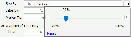
- Zoom percentage bar
Specify the zoom percentage based on the default size. - Reset
Select to restore the default size.
- Zoom percentage bar
- Label By
Specify the field to control the labels shown above the markers for the selected group level. You can add more than one field. If you add several fields, you can adjust the order of the fields by dragging and dropping them in the text box.
Select to specify the font style of the label text.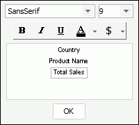
Select the font of the label text.
Select the font size of the label text.
Select to apply bold formatting to the label text.
Select to italicize the label text.
Select to add a horizontal line under the label text.
Select to specify the color of the label text.
Designer enables this button when you select a field in the preview box below. Select it and select the data format of the field values to display in the label from the drop-down menu. If you have added more than one field to control the label, you can select the fields from the preview box and select the button to set their value format one by one.- Auto Scale in Number
Designer displays this option when the selected field is Number data type. You can use it to specify whether to automatically scale the field values that fall into the two ranges:- When 1000 <= value < 10^15, Designer applies the following quantity unit symbols of the International System of Units to scale the values: K (10^3), M (10^6), G (10^9), and T (10^12).
- When 0 < value < 0.001 or value >= 10^15, Designer uses scientific notation to scale the values.
By default, Designer selects "auto" for this option, meaning, Designer applies the setting that you specify for the same property on the geographic map in the Report Inspector for the values. If you select "true", Designer applies the specified format to the integer part of the values after scaling them. However, if the specified format conflicts with the logic of Auto Scale in Number, for example, the values display in percentage, Designer ignores the Auto Scale in Number setting. Select "false" if you do not want to scale the values.
- Auto Scale in Number
- Preview box
This box displays the fields that you have added to control the label with the specified font effects. - OK
Select to apply the specified font style and close the dialog box.
- Marker Tip
This text box shows the tip information that you specify for the markers. Select in the text box and type the tip. You can also select and select a field or a formula from the drop-down list to control the tip. The tip displays when users hover the mouse on the markers at runtime.
Area Options
Designer enables the options when you select Enable Area. You can specify the area options for the selected group level.
- Fill By
This text box shows the fields that you add to control the colors used to fill the areas of the selected group level. You can only add the group object that represents the currently selected group level, group objects of higher levels than the current level in the Drill Path box, or an aggregation object. When you add more than one group object, you can adjust their order by dragging and dropping them in the text box. You can also leave the text box blank.
Select to specify the colors to fill the areas.- If you do not add any field to control the color, select a color from the color palette for the areas.
- If you add one or more group objects to control the colors, Designer displays the Edit Color dialog box for you to specify colors for the areas.
- If you add an aggregation object to control the colors, Designer displays the Edit Gradient Color dialog box for you to specify a gradient color for the areas.
- Label By
This text box shows the field that you add to control the label shown above the areas for the selected group level. You can add more than one field. When you add several fields, you can adjust their display order in the label by dragging and dropping them in the text box.
Select to specify the font style of the label text.
- Area Tip
This text box shows the tip information that you specify for the areas. Select in the text box and type the tip. You can also select and select a field or a formula from the drop-down list to control the tip. The tip displays when users hover the mouse on the areas at runtime.
Location Info
This text box shows the mapping location that you specify for the markers and/or areas of the selected group level. Select in the text box and type the location information. You can also select and select a field or a formula from the drop-down list to control the location information. You need to make sure the field contains values that match the folder names in <install_root>\gisinfo\geocode.
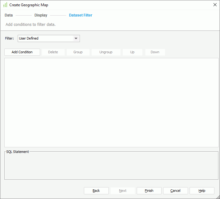
Dataset Filter Screen
Use this screen to filter the dataset the geographic map applies.
Designer displays the same options in the Dataset Filter screen as those in the Edit Dataset Filter dialog box.
 Back to top
Create Geographic Map Dialog Box - For Page Report
When you use the Create Geographic Map dialog box for creating a geographic map in a page report, Designer displays the following screens in the dialog box:
Designer displays these buttons in all the screens:
Back
Select to go back to the previous screen.
Next
Select to go to the next screen.
Finish
Select to finish your work and close the dialog box.
Cancel
Select to close the dialog box without saving any changes.
Help
Select to view information about the dialog box.
Data Screen
Use this screen to specify the dataset for the geographic map.
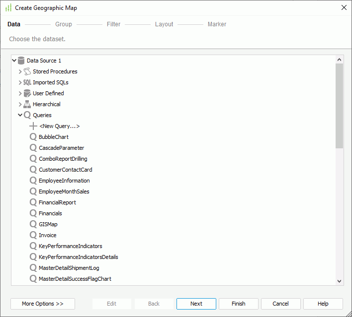
Data resource box
This box lists the predefined data resources in the current catalog. Select one and Designer automatically creates a dataset based on it for the geographic map.
- <New XXX...>/<Add XXX...>
Select to create or add a data resource of the same type in the catalog.
More Options/Less Options
Select to show or hide the options for specifying the dataset you want to use.
- New Dataset
Select to create a dataset based on a data resource in the current catalog. - Existing Dataset
Select to use a dataset from the ones that you have created in the current report.- <New Dataset...>
Select to create a dataset using the New Dataset dialog box.
- <New Dataset...>
- Current Dataset
Designer disables this option because a geographic map cannot use inherited dataset.
Edit
Select to edit the specified query in the Query Editor dialog box or dataset in the Dataset Editor dialog box.
Group Screen
Use this screen to specify the criteria for grouping data in the geographic map.
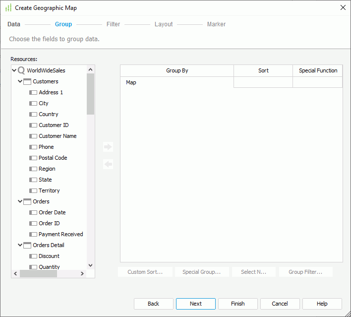
Resources
This box lists the available data fields that you can use as group-by fields in the geographic map.
Add button
Select to add the specified field in the Resources box as a group-by field in the geographic map.
 Remove button
Select to remove the specified group-by field from the geographic map.
Group By
This column shows the group-by fields on which you select to group data in the geographic map.
Sort
This column shows how you want to sort groups at each group level. You can select from the following options:
- Ascend
Select to sort groups at the specified group level in an ascending order (A, B, C). - Descend
Select to sort groups at the specified group level in a descending order (C, B, A). - No Sort
Select to sort groups at the specified group level in their original order in database. - Special Group
Select to open the User Defined Group dialog box to define grouping information. - Custom Sort
Select to open the Custom Sort dialog box to set how to sort the groups at the specified group level.
Special Function
This column shows the special functions that you select for the group-by fields of the Numeric, String, Date, and Time data types. Select a special function from the drop-down list to specify to which level to group the data of the specified field, or select Customize to set the function in the Customized Function dialog box.
Custom Sort
Designer enables this button after you have selected Custom Sort from the Sort column to define the sort manner of groups for the specified group level. Select it to specify how to sort the groups.
Special Group
Designer enables this button after you have selected Special Group from the Sort column to define a special group. Select it to specify how to group your information.
Select N
Select to open the Select N dialog box to specify the Select N condition for the specified group level.
Group Filter
Select to open the Group Filter dialog box to specify the group filter condition.
Filter Screen
Use this screen to narrow down the data to display in the geographic map.
Designer displays the same options in the Filter screen as those in the Edit Filter dialog box.
Layout Screen
Use this screen to specify the layout of the geographic map.
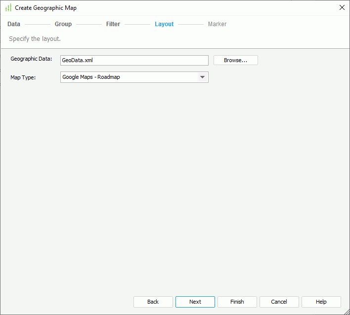
Geographic Data
Specify the geographical data for the geographic map using an XML file. Select Browse to select the XML file.
Map Type
This drop-down list contains the types using which you can create the geographic map. Select the type you need.
- Google Maps - Roadmap
This type displays Google road map. - Google Maps - Satellite
This type displays Google Earth satellite images. - Google Maps - Terrain
This type displays a physical map based on terrain information. - OpenStreetMap - Standard
This type displays the street map. - OpenCycleMap - Cycle Map
This type displays the cycle route map. - OpenCycleMap - Transport Map
This type displays the transport map.
Marker Screen
Use this screen to specify settings for the markers bound with the group levels.
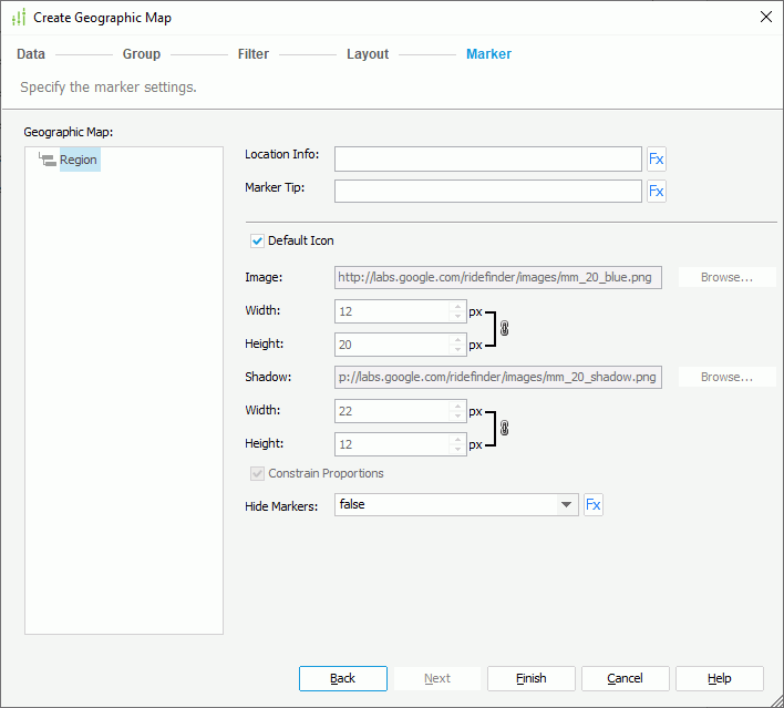
Geographic Map
This box lists all the groups that you add for the geographic map. Select a group to specify its marker settings.
Location Info
Specify the mapping location for the markers of the selected group level. Select in the text box and type the location information. You can also select and select a field or a formula from the drop-down list to control the location information. You need to make sure that the specified field contains the values matching the "nm" field in the geographic data XML file used by the geographic map.
Marker Tip
Specify the tip information for the markers of the selected group level. Select in the text box and type the tip. You can also select and select a field or a formula from the drop-down list to control the tip. The tip displays when users hover the mouse on the markers at runtime.
Default Icon
Select to use the default icon for the markers of the selected group level. Clear it if you want to customize the icon.
Image
Specify the image for the markers of the selected group level. You can type the URL for a web image or select Browse to specify a local image.
- Width
Specify the width of the image. - Height
Specify the height of the image.
Shadow
Designer enables this option when you select a Google Maps type for the geographic map. Type the URL for a web image or select Browse to specify a local image as the shadow image of the markers.
- Width
Specify the width of the shadow image. - Height
Specify the height of the shadow image.
Constrain Proportions
If you select this option, when you set the width or height of the marker image/shadow, Designer adjusts the other accordingly in a certain proportion.
Hide Markers
Specify whether to show the markers of the selected group level. You can also select and select a formula from the drop-down list to control the status.