Previous Topic
Working with Template Editor in Page Report Studio
Report provides a template editor - Report Studio for building page reports more intuitively and conveniently. This topic describes how to use Report Studio.
This topic contains the following sections:
- Accessing Template Editor
- Using Toolbar Buttons
- Using the Components Panel
- Inserting a Summary Table
- Inserting a Group Type Table
- Working with Tables
- Inserting Columns in a Table
- Inserting a Banded Object
- Working with Banded Objects
- Inserting a Crosstab
- Working with Crosstabs
- Inserting a Chart
- Inserting a Blank Data Component
- Inserting a Label
- Inserting an Image
- Inserting a Tabular
- Inserting a Page Panel
- Inserting a TOC Page Panel
- Inserting a Page Break
- Configuring Page Layout and Pageless Mode
- Inserting a Special Field
- Updating Object Properties Using Inspector
- Setting Up Data Container Links
- Changing Component Position
- Facilitating Batch Operations Through Multi-Select for Resources and Report Objects
- Moving Objects by Dragging
- Resizing Objects
- Removing Objects
- Returning to Page Report Studio
Accessing Template Editor
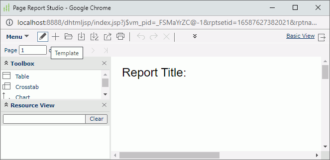
You can access the template editor Report Studio by selecting the Template button  on the toolbar in the Interactive View of Page Report Studio.
Server displays a message asking whether you want to leave the page. Select Leave after making sure you have saved any changes that you made to the report in Page Report Studio. Server then leaves Page Report Studio and displays Report Studio.
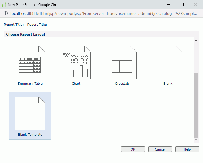
You can also open Report Studio by selecting Blank Template when you create a page report or report tab.
 Back to top
Using Toolbar Buttons
The following table describes how you can use the buttons on the toolbar of Report Studio.
| Button | Description |
|---|---|
 Undo Undo |
Select to undo the last operation. |
 Redo Redo |
Select to reverse the operation of Undo. |
 Delete Delete |
Select to remove the selected objects. |
 Font Face Font Face |
Select to update the font face of the selected text, label, or field. |
 Font Size Font Size |
Select to update the size of the selected text, label, or field. |
 Bold Bold |
Select to make the selected text, label, or field bold. |
 Italic Italic |
Select to make the selected text, label, or field italic. |
 Underline Underline |
Select to underline the selected text, label, or field. |
 Strikethrough Strikethrough |
Select to add a strikethrough to the selected text, label, or field. |
 Background Color Background Color |
Select to open the Color Picker dialog box in which you can specify a background color for the selected text, label, or field. |
 Foreground Color Foreground Color |
Select to open the Color Picker dialog box in which you can specify a foreground color for the selected text, label, or field. |
 Left Left |
Select to align the content in the specified object to the left border of the object. |
 Center Center |
Select to align the content in the specified object to the center of the object. |
 Right Right |
Select to align the content in the specified object to the right border of the object. |
 Justify Justify |
Select to adjust the horizontal spacing so as to align the content evenly along both the left and right margins in the specified object. |
 Merge Merge |
Select to merge the selected adjacent tabular or table cells that form a rectangular into one cell. |
 Unmerge Unmerge |
Select to unmerge the table cells that you merged. |
 Split Split |
Server enables the Split button when you select a tabular cell. Select the Split button and then select an item from the drop-down menu:
|
 Resources Panel Resources Panel |
Select/Clear to display/close the Resources panel. |
 Components Panel Components Panel |
Select/Clear to display/close the Components panel. |
 Inspector Panel Inspector Panel |
Select/Clear to display/close the Inspector panel. |
 Return Return |
Select to return to Page Report Studio. |
Using the Components Panel
The Components panel displays all the components that you can add to your reports.
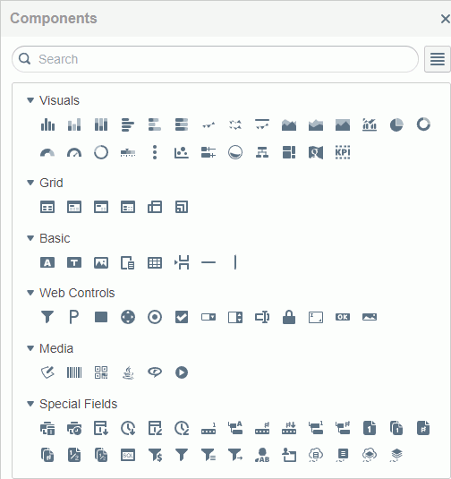
You can search for components in the Components panel easily using the search bar. Type the keyword. Server displays the components that contains the keyword.
You can display the components in the Components panel in either the list view or grid view by selecting the List View button  or Grid View button
  on the right of the search bar. In the grid view, server displays the icons of the items. In the list view, Server displays the icons and names of the items.
Inserting a Summary Table
- Drag Summary Table in the Grid category from the Components panel to the template edit area. Server displays the Format Summary Table panel on the left of the template edit area.
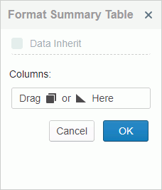
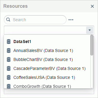
- From the drop-down menu in the Resources panel, select a business view or dataset from which you want to add data to the table. Server displays the business view or dataset with its resources.
If you are inserting the table in another data component, by default it will inherit the dataset of the parent data component. In this case, if you want to use a new business view or dataset, clear Data Inherit in the Format Summary Table panel, and then you can select a business view or dataset in the Resources panel.
-
You can add group and aggregation objects in summary tables. Drag a group or aggregation object to a Columns line in the Format Summary Table panel.
-
Drag more group and aggregation objects to the Format Summary Table panel.
- Adjust the order of the group and aggregation fields by dragging one field to above or below another.
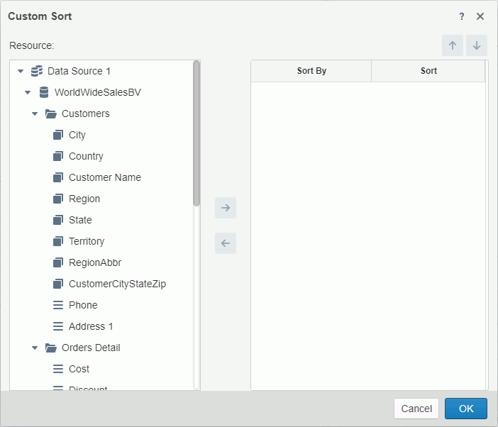
- To sort a group field, select the Sort button
 and then select an order from the drop-down list. If you select Custom Sort, you can sort the group field according to other fields in the Custom Sort dialog box.
- To remove a field that you added, drag it out of its line.
- Select OK. Server adds the summary table to the template edit area and closes the Format Summary Table panel.
Inserting a Group Type Table
- Drag a group type table - Table (Group Above), Table (Group Left Above), or Table (Group Left) - in the Grid category from the Components panel to the template edit area. Server displays the Format Table panel on the left of the template edit area.
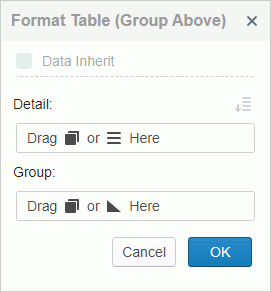
- From the drop-down menu in the Resources panel, select a business view or dataset from which you want to add data to the table. Server displays the business view or dataset with its resources.
If you are inserting the table in another data component, by default it will inherit the dataset of the parent data component. In this case, if you want to use a new business view or dataset, clear Data Inherit in the Format Table panel, and then you can select a business view or dataset in the Resources panel.
- Drag a group or detail object from the Resources panel to a Detail line in the Format Table panel as a detail field.
- Follow the previous step to add more detail fields if you want.
- Adjust the order of the detail fields by dragging one field to above or below another.
- To sort the added detail fields in the table by the values of other fields, select the Custom Sort button
 and set the sort manner in the Custom Sort dialog box.
- Drag a group object from the Resources panel to a Group line as a group field.
- Drag more groups if you want.
- Drag an aggregation object from the Resources panel to a Group line as an aggregation field. To add an aggregation in a group, drag the aggregation under the group field.
- Add more aggregation fields if you want.
- By default, Server places aggregations in the table footer if the aggregations are not under any group or in the group footer if the aggregations are under a group. You can change the position between the footer panel and the header panel by selecting between the Footer button
 and header button
  .
.
- Adjust the order of the group and aggregation fields by dragging one field to above or below another.
- To sort a group field in the table, select the Sort button and then select an order from the drop-down list. If you select Custom Sort, you can sort the group field according to other fields in the Custom Sort dialog box.
- To remove a field that you added, drag it out of its line.
- Select OK in the Format Table panel. Server adds the table with the data you selected in the template edit area and closes the Format Table panel.
Working with Tables
After you add a table in the template edit area, you can drag data fields from the Resources panel to it directly, open the format table panel to update fields, and insert or remove table panels.
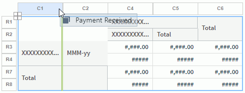
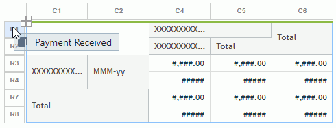
Selecting a table, column, or panel
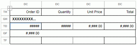
Select anywhere in the table. Server displays the plus button  at the top left of the table, labels for each column (GC/DC/SC/CC), and labels for each panel (TH/GH/TD/GF/TF).
Select  to select the table. This also applies to selecting other components when they have the plus button .
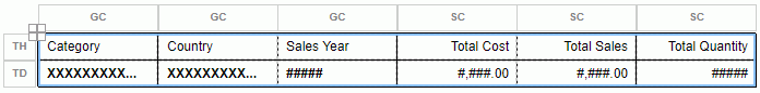
You can select a column by selecting the label of the column. Column labels include GC/DC/SC/CC. GC is group column, DC detail column, SC summary column, and CC common column. You can right-click the label of a column to access the shortcut menu of the column.
You can select a panel by selecting the label of the panel. Panel labels include TH/GH/TD/GF/TF. TH is table header, GH group header, TD table detail panel, GF group footer, and TF table footer. You can right-click the label of a panel to access the shortcut menu of the panel.
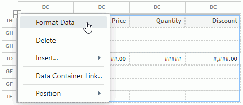
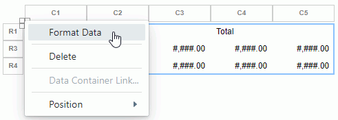
Accessing the format table panel
Right-click the plus button  of the table, the label of a panel, or the label of a column, and then select Format Data. Server displays the format table panel. Except that you cannot change the dataset of the table, you can follow the Inserting a Summary Table or Inserting a Group Type Table section to use the format table panel for a summary table or group table.
Adding and removing table panels
To insert a new panel of the same type before or after a panel, or remove a panel, right-click the label of the panel (TH/GH/TD/GF/TF), and then select the corresponding item from the shortcut menu.
 You cannot remove a detail panel (DT) when it is the only detail panel in a table.
When a table has one or more groups, you can add new groups by dragging group fields from the Resources panel. To do this:
- Select a group header label GH in the table to select the group header panel.
- Drag a group object from the Resources panel to the upper or lower section in the GH label until Server displays double green lines above the top border of the panel or below the bottom border of the panel, and then release the mouse.
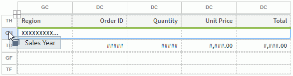
Server displays the new group at a higher level than the selected group.
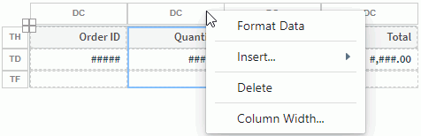
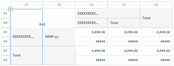
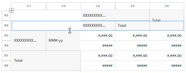
Resizing table columns or panels
You can change the width of a column and the height of a panel in tables by dragging or using the shortcut menu commands.
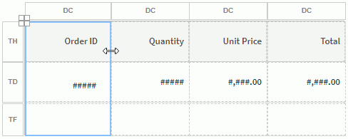
To adjust the width of a table column, do either:
- Select the label of the column to select the column, hover over the right border of the column until the mouse pointer turns to a double-headed arrow, and then drag the border to adjust the column width.
- Right-click the label of the column, and then select Column Width. Server displays the Column Width dialog box. Change the width to a bigger or smaller number to widen or narrow the column.
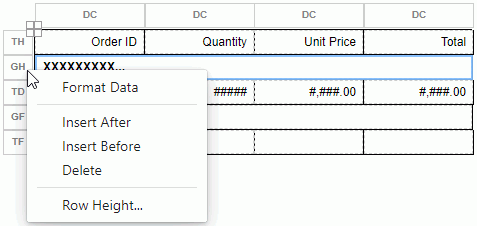
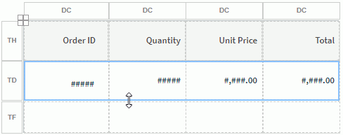
To adjust the height of a table panel, do either:
- Select the label of the panel to select the panel, hover over the bottom border of the panel until the mouse pointer turns to a double-headed arrow, and then drag the border to adjust the panel height.
- Right-click the label of the panel, and then select Row Height. Server displays the Row Height dialog box. Change the height to a bigger or smaller number to increase or decrease the panel height.
Inserting Columns in a Table
A table can contain four types of columns: detail column, summary column, group column, and common column. You can insert table columns by either dragging fields from the Resources panel or using shortcut menu commands.
Inserting table columns by dragging fields
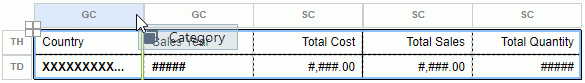
- To insert a group column in a table, drag a group field from the Resources panel to near the left or right border of a group column label GC until Server displays double green lines beside the left or right border of the column, and then release the mouse.
Server adds the new group column as the top-level group column in the table.
- To insert a summary column in a summary table, drag an aggregation field from the Resources panel to near the left or right border of a summary column label SC until Server displays double green lines beside the left or right border of the column, and then release the mouse. Server adds the new summary column in the table.
-
To insert a detail column in a group type table, drag a group/detail/aggregation field from the Resources panel to near the left or right border of a detail column label DC until Server displays double green lines beside the left or right border of the column, and then release the mouse. Server adds the new detail column on the left or right of the current column in the table.
Inserting a blank common column as the last column
- Right-click the plus button of the table and select Insert > Common Column from the shortcut menu. Server adds a blank common column as the rightmost column in the table.
- Drag a data field from the Resources panel to the column header to add it in the new column.
Inserting a blank common column before or after a specific column
- Right-click the label of the column and select Insert > Common Column Before/Common Column After from the shortcut menu. Server adds a blank common column before/after the selected column.
- Drag a data field from the Resources panel to the column header to add it in the new column.
Inserting a detail or summary column as the last column
- Right-click the plus button of the table, then select Insert > Detail Column/Summary Column from the shortcut menu. Server displays corresponding insert column dialog box.
- Select the resource you want to use for the new column.
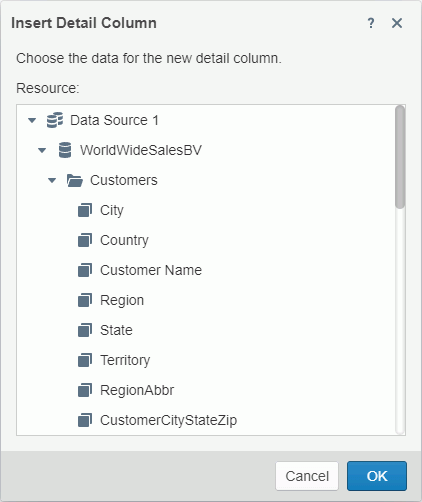
-
Select OK. Server displays the detail/summary column as the rightmost column in the table.
Inserting a detail or summary column before or after a specific column
- Right-click the label of the column and select Insert > Detail Column/Summary Column from the shortcut menu. Server displays the corresponding insert column dialog box.
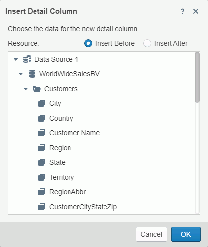
- By default, Server selects Insert Before which means to place the new column before the selected column. If you want to place the new column after the selected column, select Insert After.
- Select the resource you want to use for the new column.
- Select OK. Server displays the detail/summary column before or after the selected column in the table as you want.
Updating group columns using the shortcut menu
- Right-click the label of any column or the plus button of the table, then select Insert > Group Column from the shortcut menu. Server displays the Insert Group Column dialog box, with the existing groups the table contains listed in an indented structure in the right box. You can edit the groups if you want.
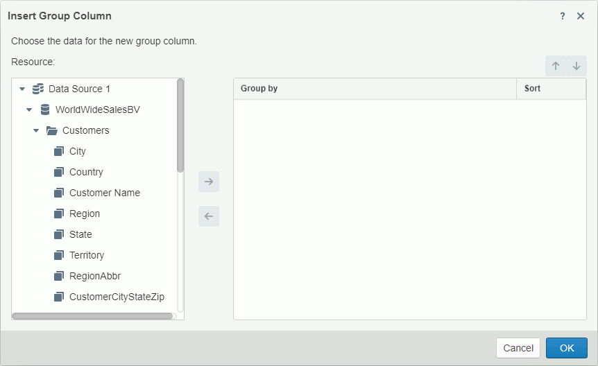
- From the Resource box on the left, select the group object you want to use for the new group column and select the Add button
 to add it to the right box as the group-by field.
 - Specify the sort direction of the new group in the Sort column.
- Repeat the preceding steps to add more group columns if you want.
- You can make use of the Move Up button
 and Move Down button
  to adjust the group levels.
 - Select OK to update the group columns.
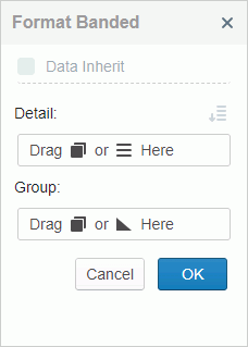
Inserting a Banded Object
- Drag Banded Object in the Grid category from the Components panel to the template edit area. Server displays the Format Banded panel on the left of the template edit area.
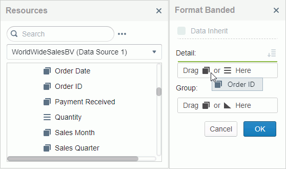
- From the drop-down menu in the Resources panel, select a business view or dataset from which you want to add data to the banded object. Server displays the business view or dataset with its resources.
If you are inserting the banded object in another data component, by default it will inherit the dataset of the parent data component. In this case, if you want to use a new business view or dataset, clear Data Inherit in the Format Banded panel, and then you can select a business view or dataset in the Resources panel.
- Drag a group or detail object from the Resources panel to a Detail line as a detail field.
- Follow the previous step to add more detail fields if you want.
- Adjust the order of the detail fields by dragging one field to above or below another.
- To sort the added detail fields in the banded object by the values of specified fields, select the Custom Sort button and set the sort manner in the Custom Sort dialog box.
- From the Resource box select a field and select the Add button to add it to the right box as the sort-by field. You can remove an added sort-by field by selecting it and then selecting the Remove button
 .
. - Select a sort order from the Sort column. Server sorts the detail fields in the banded object based on the values of the sort-by field in ascending or descending order.
- Repeat the preceding two steps to add more sort-by fields.
- Select the Move Up button or Move Down button to adjust the order of the sort-by fields, which defines the sort priority of the fields.
- Select OK to accept the sort settings.
- From the Resource box select a field and select the Add button
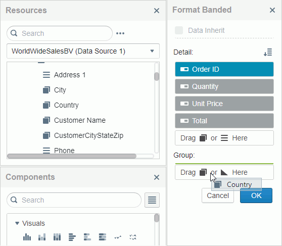
- Drag a group object from the Resources panel to a Group line as a group field in the banded object.
- Drag more groups if you want.
- Drag an aggregation object from the Resources panel to a Group line as an aggregation field in the banded object. To add an aggregation in a group, drag the aggregation under the group field.
- Add more aggregation fields if you want.
- By default, Server places aggregations in the banded footer if the aggregations are not under any group or in the group footer if the aggregations are under a group. You can change the position between the footer panel and the header panel by selecting between the Footer button and header button .
- Adjust the order of the group and aggregation fields by dragging one field to above or below another.
- To sort a group field in the banded object, select the Sort button and then select an order from the drop-down list. If you select Custom Sort, you can sort the group field according to other fields in the Custom Sort dialog box.
- To remove a field that you added, drag it out of its line.
- Select OK in the Format Banded panel. Server adds the banded object with the data you selected in the template edit area and closes the Format Banded panel.
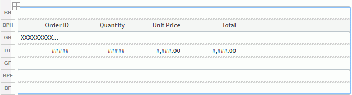
Working with Banded Objects
After you add a banded object in the template edit area, you can drag data fields from the Resources panel to it directly, open the Format Banded panel to update fields, and hide or insert banded panels.
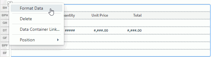
To access the Format Banded panel, right-click the plus button at the top left of the banded object or the label of a panel (BH/BPH/GH/DT/GF/BPF/BF), and then select Format Data. Server displays the Format Banded panel. Except that you cannot change the dataset of the banded object, you can follow the Inserting a Banded Object section to use the Format Banded panel.
To hide or remove a panel, or insert a new panel of the same type before or after the panel, right-click the label of the panel (BH/BPH/GH/DT/GF/BPF/BF), and then select the corresponding item from the shortcut menu.
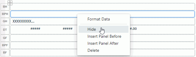
You cannot remove a detail panel (DT) when it is the only detail panel in a banded object.
Inserting a Crosstab
- Drag Crosstab in the Grid category from the Components panel to the template edit area. Server displays the Format Crosstab panel on the left of the template edit area.
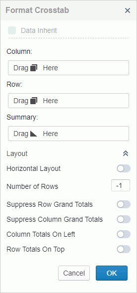
- From the drop-down menu in the Resources panel, select a business view or dataset from which you want to add data to the crosstab. Server displays the business view or dataset with its resources.
If you are inserting the crosstab in another data component, by default it will inherit the dataset of the parent data component. In this case, if you want to use a new business view or dataset, clear Data Inherit in the Format Crosstab panel, and then you can select a business view or dataset in the Resources panel.
- Drag group objects one by one to a Column or Row line as the column or row headers.
- When you see the Show Total button
 in a Column or Row line, you can select the button if you want to display the total of the group field. Then, Server changes the button to the Suppress Total button
  . Later you can select the Suppress Total button to not display the total of the group field.
 - To sort a group field, select the Sort button and then select an order from the drop-down list. If you select Custom Sort, you can sort the group field according to other fields in the Custom Sort dialog box.
- Drag aggregation objects one by one to a Summary line as the summary fields.
- Adjust the order of the group or aggregation fields by dragging one field to above or below another.
- To remove a field that you added, drag it out of its line.
- You can customize the layout properties of the crosstab. Select the double arrow button
 in the Layout line to expand the properties.
 - By default, the crosstab uses vertical layout. You can specify the number of rows to hold the aggregate fields.
- If you want to use horizontal layout for the crosstab, select Horizontal Layout. Then, specify the number of columns to hold the aggregate fields.
- To hide the grand total row in the crosstab, select Suppress Row Grand Totals.
- To hide the grand total column, select Suppress Column Grand Totals.
- To position the subtotal and grand total columns on the left of the detail aggregations, select Column Totals On Left.
- To position the subtotal and grand total rows on the top of the detail aggregations, select Row Totals On Top.
- Select OK. Server adds the crosstab to the template edit area and closes the Format Crosstab panel.
Working with Crosstabs
After you add a crosstab in the template edit area, you can drag data fields from the Resources panel to it directly, open the Format Crosstab panel to update fields, and more.
To access the Format Crosstab panel, right-click the plus button at the top left of the crosstab, and then select Format Data. Server displays the Format Crosstab panel. Except that you cannot change the dataset of the crosstab, you can follow the Inserting a Crosstab section to use the Format Crosstab panel.
Inserting groups and aggregations in a crosstab by dragging fields
Before inserting fields in crosstabs, first select the crosstab so that Server displays the dataset of the crosstab in the Resources panel for you to select fields from. Also, the row and column labels are available to help you insert row and column headers.
- To insert a column header in a crosstab, drag a group field from the Resources panel to near the left or right border of a group column label Cn (n is a number) until Server displays double green lines at the left or right border of the column, and then release the mouse. Server adds the new group column on the left or right of the column.
- To insert a row header in a crosstab, drag a group field from the Resources panel to near the top or bottom border of a group row label Rn (n is a number) until Server displays double green lines at the top or bottom border of the row, and then release the mouse. Server adds the new group row above or below the row.
- To insert an aggregation in a crosstab, drag an aggregation field from the Resources panel to an aggregation cell until Server displays double green lines, and then release the mouse. Server adds the new summary where the double green lines was.
Resizing crosstab rows or columns
You can change the width of a column and the height of a row in crosstabs by dragging.
To adjust the width of a crosstab column, select the label of the column to select the column, hover over the right border of the column until the mouse pointer turns to a double-headed arrow, and then drag the border to adjust the column width.
To adjust the height of a crosstab row, select the label of the row to select the row, hover over the bottom border of the row until the mouse pointer turns to a double-headed arrow, and then drag the border to adjust the row height.
Inserting a Chart
- Drag a chart type in the Visuals category from the Components panel to the template edit area. Server displays the Bind Data to Chart panel on the left of the template edit area.
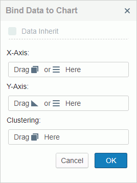
- From the drop-down menu in the Resources panel, select a business view or dataset from which you want to add data to the chart. Server displays the business view or dataset with its resources.
If you are inserting the chart in another data component, by default it will inherit the dataset of the parent data component. In this case, if you want to use a new business view or dataset, clear Data Inherit in the Bind Data to Chart panel, and then you can select a business view or dataset in the Resources panel.
- Add a group object
 or a detail object
  from the Resources box to display it on the category axis of the chart.
 - Add a group object to display on the series axis. The labels for the category and series axes vary with different chart types, for example, they are X-Axis and Clustering for a clustered bar chart.
- To sort a group field, select the Sort button and then select an order from the drop-down list. If you select Custom Sort, you can sort the group field according to other fields in the Custom Sort dialog box.
- If you want to define the Select N condition for values on the category/series axis of the chart, select the Category/Series Option button
 . Server displays the Grouping Option dialog box.
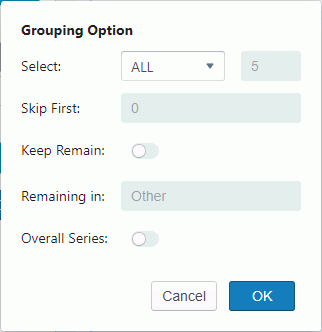
- Set the Select condition to All, Top N, or Bottom N. If you select All, Server displays all category/series values in the chart and disables all the other options. If you select Top N or Bottom N, Server displays a text box next to it, and you can type an integer N here, to display the first or last N category/series values in the chart.
- If you have selected Top N or Bottom N, you can type a number M in the Skip First text box. Then, Server skips the first M category/series values and begins with M+1. Server merges the skipped values into the remaining Categories/Series group.
- If you have selected Top N or Bottom N, you can select Keep Remain, and then type a string in the Remaining in field, so that Server merges the category/series values beyond the first or last N range into the group with the name as the string.
- If you have selected Top N or Bottom N, and you are specifying the Select N condition for the category axis, you can also select Overall Series to calculate the top or bottom N category values based on the series values.
- Select OK to accept the settings.
- Drag either aggregation objects or detail objects one by one to the Y-Axis as the summary fields.
- Adjust the order of the group or aggregation fields by dragging one field to above or below another.
- To remove a field that you added, drag it out of its line.
- Select OK. Server adds the chart to the template edit area and closes the Bind Data to Chart panel.
After you add a chart in the template edit area, you can open the Bind Data to Chart panel to update fields in the chart. Right-click the plus button at the top left of the chart, and then select Format Data. Server displays the Bind Data to Chart panel. Except that you cannot change the dataset of the chart, you can follow the Inserting a Chart section to use the panel.
Inserting a Blank Data Component
You can add a blank data component into your report and then drag data fields into it directly, without using the corresponding Format XXX panel.
- Follow step 1 and 2 in the Inserting a Summary Table section to drag a data component and select a dataset for it.
- Select OK in the Format XXX panel. Server adds the data component in the template edit area without data.
- Drag resources from the Resources panel to the data component as you want.
Inserting a Label
You can add labels in your report.
- Drag Label in the Basic category from the Components panel to the template edit area. Server adds a label.
- Double-click the label. Server selects the text in the label.
- Type the text you want.
- Select outside of the label to accept the new text.
- Update the font face, font size, font style, background/foreground color, and alignment for the label using the toolbar.
- Update more properties using the Inspector panel.
Inserting an Image
You can add images in your report.
- Drag Image in the Basic category from the Components panel to the template edit area. Server displays the Insert Image dialog box.
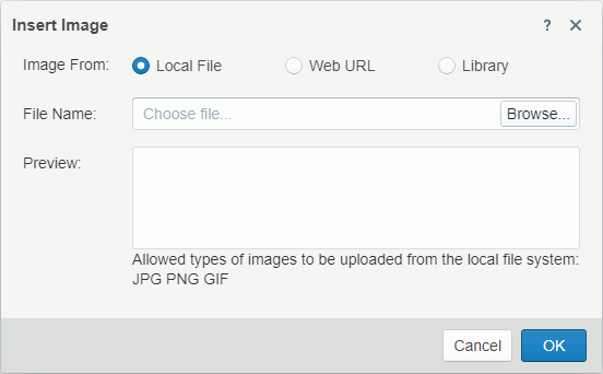
- Specify the image you want to insert.
- To use an image in the local file system, select Local File. Then select Browse to find the image.
- To use an image on a website, select Web URL. Then type or paste the image URL in the File URL text box.
- To use an image in the image library of Server, select Library. Then select the image in the My Pictures box.
- Select OK to insert the image.
Inserting a Tabular
You can add tabulars in your report. Drag Tabular in the Basic category from the Components panel to the template edit area. Server displays a one-cell tabular. Select it and you can then split the tabular using the Split button on the toolbar.
After you select adjacent tabular cells that form a rectangular, you can select the Merge button to combine the cells into one cell.
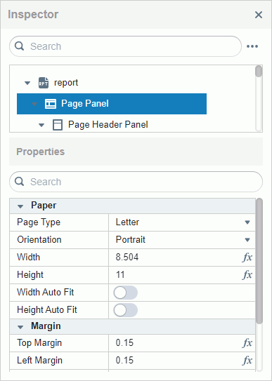
Inserting a Page Panel
You can insert a Page Panel either before or after an existing page panel. By default, it utilizes the current page settings. To modify page settings, navigate to Properties in the Inspector.
Drag Page Panel in the Basic category from the Components panel to the template edit area.

Drag and drop a component into the report body. Server displays it in the corresponding page panel. You can drag a component to a different page panel and drop it. To delete a page panel, select it and then select the Delete button X on the toolbar.

Inserting a TOC Page Panel
You can insert a TOC (Table of Contents) page panel before or after an existing page panel. Drag TOC Panel in the Basic category from the Components panel to the template edit area. The insertion point is determined by the location in the report body area:
- If the landing point is in the upper or middle part, the TOC page is inserted above the current page panel.
- If the landing point is in the lower half in the vertical direction, the TOC page is inserted below the current page panel.
A report can only contain one TOC page panel. To delete it, select the TOC page panel and click the Delete button X on the Toolbar.
Inserting a Page Break
To insert a page break, drag the Page Break control in the Basic category from the Components panel and drop it into the report body area. The placement depends on the landing point:
Above a component: If the landing point is on the upper to top Y part of the node in the vertical direction of the first child component, the page break is inserted above the node.
Below a component: If the landing point is on the lower to top Y part of the node in the vertical direction, the page break is inserted below the node.
To delete a page break, select it and then select the Delete button X on the toolbar.
Drag a page break above a component:

Drag a page break below a component:

Configuring Page Layout and Pageless Mode
You can manage the pageless mode through the Page Layout property in page panel properties. When you turn off the Page Layout property, the report transitions into pageless layout mode; otherwise, it remains in page layout mode.

The TOC Page Panel does not display the Page Layout property. By default, the Page Layout property is enabled.
When a Page Panel disables the Page Layout, all other Page Panels automatically disable Page Layout, and vice versa.
In pageless mode, the margin settings of page panels are disregarded. The height of the page panel adapts to the content's height, while the width equals the maximum width of the template view portion and content.
Editing Expandable Groups in Pageless Mode
Only crosstabs and banded objects support the expandable groups feature.
Editing Expandable Groups for Crosstabs
When the Expand Data property is activated for a Crosstab, the grouping data of the crosstab can be expanded and collapsed.

Expandable groups:

Editing Expandable Groups for Banded Objects
Banded objects require a built-in web control to support the expandable groups feature. You should drag and drop Expand/Collapse Group in the Web Controls category from the Components panel onto the group header panel of banded objects.

Expand/Collapse Group (displayed as Group Control Image in Inspector) properties:

Expandable groups in a banded object:

Inserting a Special Field
The Components panel provides a comprehensive list of special fields, as outlined below:

- Select the four squares button on the top right to switch between Grid View and List View.
In the List View, you can know the names of the special fields well.

- Drag a special field and drop it into the report body or within a component (banded object or table) of the current page panel.
- Select a special field and then modify its properties using the Inspector panel to suit your requirements.

You can only insert the TOC Page Number into a TOC Page Header and/or a TOC Page Footer. Additionally, you can only insert the Export Page Number and Export Total Page Number into the page header and page footer.
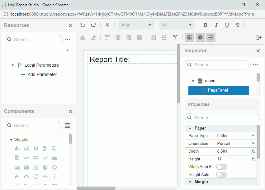
Updating Object Properties Using Inspector
You can update the properties of report objects using the Inspector panel. For more information about the properties, refer to Setting Report Object Properties Using the Inspector Panel.
The Inspector panel contains an objects box displaying the objects in the template edit area and a Properties table that has two columns: in the left column are the names of the properties available to the selected object, and in the right column are the values of the properties.
Select an object in the template edit area or an item in the objects box of Inspector, and then specify the values of the properties you want in the Properties table of Inspector. You can use these methods to specify property values:
- Type values manually.
- Select values from the value drop-down lists. When you are specifying a color, Server displays the Color Picker dialog box after you select Custom. You can then define a color within a wider range in the dialog box.
- For a Boolean type property, select the left/right end of the radio button in the value field to set the value to false/true.
- Select the formula button
 , and then select a field from the drop-down list.
In Inspector, you can search for report objects and properties easily using respective search bars. Type the keyword. Server displays the objects or properties that contain the keyword. To clear the keyword, remove it or select the Delete button in the search bar.
You can expand or collapse the report objects in Inspector by selecting the More Options button  on the right of the first search bar and selecting Expand All or Collapse All.
Setting Up Data Container Links
When two data containers in a parent-child relationship apply different datasets, you can use a data container link to set up data relation between them.
A data container includes:
- A set of link conditions that dynamically filters data in child data containers.
- A set of parameter links that assign fixed values to parameters of both data containers, so you do not need to specify values for the parameters at runtime.
Generally, a data container link functions the same as a subreport link. The only difference is that you do not need to specify the child component in a data container link, because you have already selected the child data container as the target of the link at the very beginning.
Assume that you have a banded object showing the customer information, then you insert a table into the detail panel of the banded object using another dataset, which displays the order information. Now you want to set up a data link between the banded object and the table, so that when you view the report, you can get a table according to the customer name.
You can achieve this by taking the steps:
- Select the table and right-click it.
- On the shortcut menu, select Data Container Link. Server displays the Link Data Container dialog box.
- In the Condition tab, select the Customer Name field from the dataset of the banded object in the left box.
- Select the Add button
 .
. - In the right box, Server applies the "=" operator by default.
- Select Customer Name from the drop-down list in the Fields (Child) column. A link condition based on the Customer Name field is now created between the two data components.
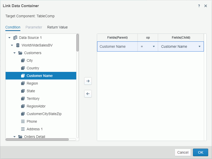
- Select OK to apply the link.
Changing Component Position
Report templates use a flow layout model. That is, paragraphs and components in the report body can flow from one page to another, maintaining their sequence, and the Position property controls whether a component is a part of the flow or separates from it. Besides the report body, tabular cells, text boxes, and KPIs can also act as flow layout containers.
In a flow layout container, Server positions objects relative to one another or absolutely based on their Position property values. The Position property controls the position of components in the flow layout container. It does not affect components in other areas such as table cells.
You can set the Position property to one of these values:
- Static
Server positions the component at the location where you insert it. It disables the X and Y coordinate properties. You cannot move the component other than by moving its insertion point. This can happen when the text flow preceding the insertion point expands. - Relative
Server positions the component at an offset to the position where you insert it. Server defines the offset by the X and Y coordinate property values. The Relative value is not available for some types of components. - Absolute
Server locates the component at the position that you specify by dragging or by setting its X and Y coordinate property values. The component insertion point does not change, for instance by inserting text before it.The position of an object in a banded object can only be absolute.
To change the position property of a component, select the component, then:
- Right-click the component and on the shortcut menu, select an item from the Position submenu.
- In the Inspector panel, set its Position property value.
Facilitating Batch Operations Through Multi-Select for Resources and Report Objects
Report Studio enhances user experience by enabling multi-select functionality for fields in the resource panel. You can now effortlessly select multiple fields using Click, Shift + Click, and Ctrl + Click. Once selected, fields can be seamlessly dragged and dropped into the Bind Data/Format Data panel or into various components such as banded objects, tables, or crosstabs.
In reports, you have the flexibility to select multiple components or sibling objects within a parent component using simple Click or Ctrl + Click actions. Alternatively, you can perform multiple selection operations within the Inspector. This empowers you to efficiently align, move, and resize multiple objects or components simultaneously, streamlining your workflow.
Moving Objects by Dragging
You can move objects in the template edit area conveniently by dragging them to a new position. When a component has the plus button  at the top left, you can drag to move the component.
Resizing Objects
To resize an independent object, such as a table, a label, and a special field, select it, hover over the right/bottom border or the bottom right corner of the object until Server displays a double-headed arrow, drag the arrow, and then release the mouse.
Removing Objects
You can remove objects using the Delete button on the toolbar. For a data component, you can also do this to remove it: select it, right-click the plus button at the top left, and then select Delete from the shortcut menu.
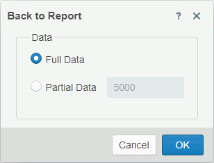
Returning to Page Report Studio
You can return to Page Report Studio with the updates you made to the report by selecting the Return button . Server displays the Back to Report dialog box. Specify whether you want to view full or partial data of the report. If you select Partial Data, you can then specify the number of records you want to display in the report. Then select OK. Server returns to Page Report Studio and displays the number of report data as you want.